Yep, I've found all the files I used for the Sig School on the old forums. So I figured I'd repost ")
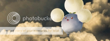
To begin with, meet Wilber:

You'll be seeing him a lot from now onwards, so get to know him He likes bananas, or so I've heard.
Ok, let's get the installation sorted. For some people, this'll be easy, but for others not so. I could do this in five minutes or less, but I know others who could spend hours slaving over it
I'm assuming we're all on Windows here, if you're not, shout out now and I'll do my best to help you out shortly.
To download GIMP, click here: http://downloads.sourceforge.net/gimp-w ... -setup.exe
Save the file to your desktop, and once it's downloaded install it to wherever you wish to. I put mine in my H:// drive, but I doubt you have that Keep in mind where you installed it!!!! (Important!  )
)
Right... now, you -should- have a GIMP icon on your desktop or, if you chose not to have a shortcut, somewhere on your start menu. Don't open it yet!
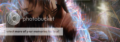
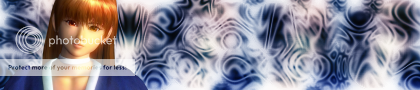
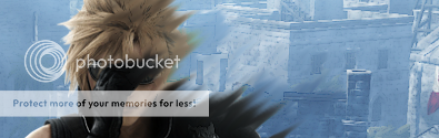
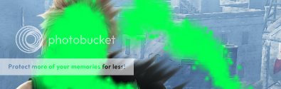
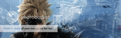
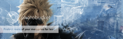
We have a few other things to get first. The first being an add-on called "GreyCStoration". Its an extremely powerful add-on that can transform an image's quality completely. Allow me to show you an example.
Before:

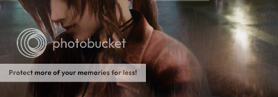
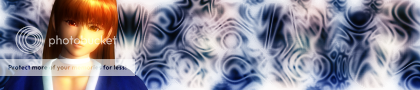
After:

The easiest place to see the difference is her hair, just to point that out.
Other demonstrations are here, just roll your mouse over the picture to see the difference:
http://cimg.sourceforge.net/greycstorat ... _fire.html
http://cimg.sourceforge.net/greycstorat ... print.html
To download this plug-in, follow these steps:
Click here: http://sourceforge.net/project/download ... p&11833054
Save the file to your desktop, and then once it has done double click on it. If you know how to, extract the file. If not, then do as follows: Look for a button on the top left called "Extract all", or similar. Click that then follow the onscreen instructions. Open your extracted file, then copy the file called "GREYCstoration_gimp_pc_win32" and paste it to this directory: "...\GIMP-2.0\lib\gimp\2.0\plug-ins". You'll need to remember where you installed GIMP, just like I said above.
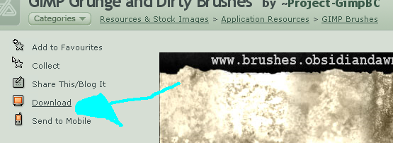
The other thing we'll need from the internet is an assortment of brushes. From Paint, you'll know that you have a Square and a Circle Brush, of differing sizes. However, on more advanced programs such as GIMP or Photoshop, these brushes can be, prepare yourselves, any size, colour or shape. You can save a picture of yourself and use that as a brush if you so wish. These brushes are used in the same way as on paint, by painting colours or erasing to name a few functions, GIMP and Photoshop use them for much more.
The brushes we'll need are easily found on deviantART. (www.deviantart.com)
I'll pick out some that you probably will need, be it in beginning signatures or the later ones.
Download them by clicking on the download button, as shown here:
http://project-gimpbc.deviantart.com/ar ... s-70037228
http://abikk.deviantart.com/art/Abik-s- ... -106297193
http://harryginnymustliveon.deviantart. ... -105515131
http://project-gimpbc.deviantart.com/ar ... s-62762572
http://insaneisenough.deviantart.com/ar ... 1-27870855
If you want any more, bookmark/favourite this link for future reference:
http://browse.deviantart.com/resources/ ... s/?order=9
These brushes will come in a .zip folder, which you extract in the same way as you did the GreyCStoration. Copy these brushes to the folder: "...\GIMP-2.0\share\gimp\2.0\brushes"
Finally, let's open GIMP and rearrange it to show you the functions that you'll need. The default GIMP will, or should, be a bunch of icons at the top dictating the different functions, with a nice empty space under the primary and secondary (black and white by default) colours. We can, however, allow GIMP to display many other things, such as what brush you're using, in this blank space.
Opening GIMP should bring you to a window like this: http://i180.photobucket.com/albums/x290 ... /gimp1.png
To start with, click the Eraser, the red/pink square shaped thingy highlighted in the screenshot above. A new window should open with the options that the Eraser has. However, you want to click between the "Eraser <", and drag it to the dockable dialogs area. It should merge the windows together.
http://i180.photobucket.com/albums/x290 ... /gimp2.png
Then click File, Dialogs, Layers. Then do the same, but click Brushes instead of Layers. Next, drag the same area on the new window (between the text and the arrow at the top) to the line indicated by the red arrow on the screenshot.
http://i180.photobucket.com/albums/x290 ... /gimp3.png
Do this with both windows, and you should end up with a GIMP program that looks like this:
http://i180.photobucket.com/albums/x290 ... /gimp4.png
And for today, that's all I have things to do too you know This concludes the lesson on GIMP setup.
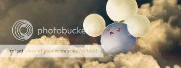
To begin with, meet Wilber:
You'll be seeing him a lot from now onwards, so get to know him
He likes bananas, or so I've heard.Ok, let's get the installation sorted. For some people, this'll be easy, but for others not so. I could do this in five minutes or less, but I know others who could spend hours slaving over it
I'm assuming we're all on Windows here, if you're not, shout out now and I'll do my best to help you out shortly.
To download GIMP, click here: http://downloads.sourceforge.net/gimp-w ... -setup.exe
Save the file to your desktop, and once it's downloaded install it to wherever you wish to. I put mine in my H:// drive, but I doubt you have that
Keep in mind where you installed it!!!! (Important! )Right... now, you -should- have a GIMP icon on your desktop or, if you chose not to have a shortcut, somewhere on your start menu. Don't open it yet!
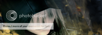
We have a few other things to get first. The first being an add-on called "GreyCStoration". Its an extremely powerful add-on that can transform an image's quality completely. Allow me to show you an example.
Before:
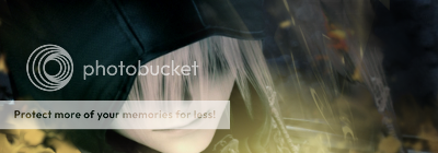
After:
The easiest place to see the difference is her hair, just to point that out.
Other demonstrations are here, just roll your mouse over the picture to see the difference:
http://cimg.sourceforge.net/greycstorat ... _fire.html
http://cimg.sourceforge.net/greycstorat ... print.html
To download this plug-in, follow these steps:
Click here: http://sourceforge.net/project/download ... p&11833054
Save the file to your desktop, and then once it has done double click on it. If you know how to, extract the file. If not, then do as follows: Look for a button on the top left called "Extract all", or similar. Click that then follow the onscreen instructions. Open your extracted file, then copy the file called "GREYCstoration_gimp_pc_win32" and paste it to this directory: "...\GIMP-2.0\lib\gimp\2.0\plug-ins". You'll need to remember where you installed GIMP, just like I said above.
The other thing we'll need from the internet is an assortment of brushes. From Paint, you'll know that you have a Square and a Circle Brush, of differing sizes. However, on more advanced programs such as GIMP or Photoshop, these brushes can be, prepare yourselves, any size, colour or shape. You can save a picture of yourself and use that as a brush if you so wish. These brushes are used in the same way as on paint, by painting colours or erasing to name a few functions, GIMP and Photoshop use them for much more.
The brushes we'll need are easily found on deviantART. (www.deviantart.com)
I'll pick out some that you probably will need, be it in beginning signatures or the later ones.
Download them by clicking on the download button, as shown here:
http://project-gimpbc.deviantart.com/ar ... s-70037228
http://abikk.deviantart.com/art/Abik-s- ... -106297193
http://harryginnymustliveon.deviantart. ... -105515131
http://project-gimpbc.deviantart.com/ar ... s-62762572
http://insaneisenough.deviantart.com/ar ... 1-27870855
If you want any more, bookmark/favourite this link for future reference:
http://browse.deviantart.com/resources/ ... s/?order=9
These brushes will come in a .zip folder, which you extract in the same way as you did the GreyCStoration. Copy these brushes to the folder: "...\GIMP-2.0\share\gimp\2.0\brushes"
Finally, let's open GIMP and rearrange it to show you the functions that you'll need. The default GIMP will, or should, be a bunch of icons at the top dictating the different functions, with a nice empty space under the primary and secondary (black and white by default) colours. We can, however, allow GIMP to display many other things, such as what brush you're using, in this blank space.
Opening GIMP should bring you to a window like this: http://i180.photobucket.com/albums/x290 ... /gimp1.png
To start with, click the Eraser, the red/pink square shaped thingy highlighted in the screenshot above. A new window should open with the options that the Eraser has. However, you want to click between the "Eraser <", and drag it to the dockable dialogs area. It should merge the windows together.
http://i180.photobucket.com/albums/x290 ... /gimp2.png
Then click File, Dialogs, Layers. Then do the same, but click Brushes instead of Layers. Next, drag the same area on the new window (between the text and the arrow at the top) to the line indicated by the red arrow on the screenshot.
http://i180.photobucket.com/albums/x290 ... /gimp3.png
Do this with both windows, and you should end up with a GIMP program that looks like this:
http://i180.photobucket.com/albums/x290 ... /gimp4.png
And for today, that's all
I have things to do too you know This concludes the lesson on GIMP setup.
Last edited by a moderator:


") ) and then add a 1 px Border just like you did with the text. Edit->Stroke Selection with a 1px line in black. Make sure its black!
) and then add a 1 px Border just like you did with the text. Edit->Stroke Selection with a 1px line in black. Make sure its black!


 Otherwise I’d post them for you.