• Welcome back to Pokécharms! We've recently launched a new site and upgraded forums, so there may be a few teething issues as everything settles in. Please see our Relaunch FAQs for more information.

Pokecharms Signature of the Week - #10 - Submissions

Status
Not open for further replies.
Pokecharms' Signature of the Week

Overview:
  • Each Thursday, a theme will be given in this thread.
  • You have until Monday to post your entries in this thread. If we have one or no entries, I will roll the theme over to the next week and give you guys the extra time.
  • In the evening, I will then post all the signatures in the first post, here, with a poll.
  • Anyone can vote for the one they think is best :)
    • I'd like to say though, don't vote for your own, if you entered.
    [/li]
  • On Wednesday, the poll will stop and the signature with the most votes will win. Its as simple as that :)
  • Every Wednesday, I will PM the winner and give them the opportunity to pick the theme for the coming week. I will post the next theme again on Thursday. If I do not get a reply, I will choose the theme.


Currently, the only thing you are competing for is the choice of the next theme. And of course, the entirely unique experience of competing with your fellow Charmsians, and the gloriously warm and damp feeling you get from destroying your competition.

Rules:
1. All signature entries may not be larger than 500X200, or 200X500 for vertical signatures.

2. You may only enter 1 signature per SOTW. Any exceptions will be made clear, and will only apply to said SOTW.

3. All signatures must abide by site rules, including no inappropriate content.

4. Do not use your entry to flame, harass, or insult other members.

5. You may only enter signatures that you have created. It also must be made post-reading this thread, no pre-mades. All content found to be ripped will be dealt with.

6. For your entry to qualify for voting, you must follow the specified theme.


The current theme is:

Sprites
Sprite signatures for this week :) I have a tutorial on them in my school if you need some inspiration.


Entries (in no particular order):

[list type=decimal]
[*][/list]

*insert moar here*


Hall of Fame:

#1 - Freestyle - Red -
ShockwaveSig.png


#2 - Gen V Pokemon - LoN -
sotwcharms2kibago.png


#3 - Fixed Render - Rayn -
kingydid.png


#4 - Teal - Database -
tealsig1.png


#5 - Gen III Pokemon - Chadwyck -
SotW2.png


#6 - Music - Rayn -
heor.png


#7 - Blizzard - kedpeanut -
280jsqo.png


#8 - Anime - Vshan -
ashpika.png


#9 - Freestyle - Tunduli -
2vxg1hx.jpg


Thanks for reading, get sigging! :)
 
Re: Pokecharms Signature of the Week

Poll is up, vote away guys! Feel free to comment on which you voted for and why, if you so wish. It only helps the artist in question ^^

The voting ends at this time on Wednesday.

I'll accept any more entries I get today, as well. I haven't been told of any potential latecomers, but just in case. I'll add you to the poll ASAP :)


Also, I was thinking of changing something. For the next one, I was gonna suggest just posting your outcomes in this thread. We don't really need to be anonymous with who did what, I feel. Thoughts?
 
Re: Pokecharms Signature of the Week - #1 Voting

Right, though I know it was "Freestyle" I have to say that the Mickey entry almost immediatly lost entries as a vertical - rather than horizontal - signature image; it reminds me more of an advertising banner than an actual signature. Added to that, the desgin itself is busy: the ice effect at the bottom simply appears out of place and only makes me wonder if it were added to cover up a mistake in the original image or of it's cropping.

With the Tree entry I personally feel that the background is too blurred - so much so that rather than enhancing the foreground as it should, it distracts from it. Couple this with the excessive lens flare that gives me an eye-ache means that I couldn't vote for it, although I'm sure the source picture itself was lovely.

The second entry with the boy uses to much of the distortion-brush, effectively hiding half of the guy's face as if there some sort of luminescent mist in the air. A too-bright background adds to this problem by making the entire image have a sensation of being overly muted.

Onto the Shock Wave signature, which I voted for. I think that the paint splashes in the background are unnecessary, being that - like with the Tree - they distract and detract from what is in the foreground; in particular the yellow of the paint obsucres part of the words. Whilst the use of blue eletircal energy is nice, it would have been better to see this perhaps carried into the text, rather than leaving it plain (and serif? this particular form of cursive looks quite out-of-place). Also, the random solid lines of yellow and blue around the text are quite... odd.

In truth the only reason I voted for the Shock Wave was because it was the one I had the least reservations about. Perhaps that's a bad habit.


(Tatile gets her bitch on.)
 
Last edited by a moderator:
Re: Pokecharms Signature of the Week - #1 Voting

Tatile said:
(Tatile gets her bitch on.)
Maybe so, but constructive criticism is welcomed :) At least, I welcome it ^^

Its comments like those which tells the artist what works and what doesn't, so they can take the pro's of the previous creation into the next one. I know comments like those help me most :)

Also, vertical signatures are actually a common theme for SOTW competitions - they are a part of the whole signature concept, at least from the creating point of view ^^ Like this one :)
 
Re: Pokecharms Signature of the Week - #1 Voting

Poll has ended, its a landslide victory for #1, with 9 votes, Red :)

ShockwaveSig.png


#2 - 2 votes - Vshan

finale.png


#3 - 3 votes - LoN

sotwcharms1summersunshine.png


#4 - 1 vote - Rayn

mickster.png


A new theme will be posted tomorrow; It'll be in the first post, and either edited into this post or replied to the thread :)
 

Sir Red

Charms' Caped Crusader
Re: Pokecharms Signature of the Week - #1 - Results

Terrific job to all of my competitors. Just topnotch work from everyone. Everyone's sig had a cool and unique feel to it, and it was fun looking at all of the different styles and techniques that every used in their sigs. And I'd like to thank Tatile for all of the constructive criticism that she gave all of us, it's very much appreciated on my part. -^^-

I can't wait to see what everyone comes up with next. :3
 
Re: Pokecharms Signature of the Week - #2 - Submissions

>>

<<

Well, its Thursday here, just. Our second theme is:

Gen V Pokemon

That's right, any of the newly released Isshu folks :)

LoN said:
Also, I was thinking of changing something. For the next one, I was gonna suggest just posting your outcomes in this thread. We don't really need to be anonymous with who did what, I feel. Thoughts?
Keeping PMing me your results, guys. But what I said here still stands, I am interested in your thoughts. Only had one bit of feedback so far D:
 

Sir Red

Charms' Caped Crusader
Re: Pokecharms Signature of the Week - #2 - Submissions

I think keeping it anonymous is better. That way people simple vote for the best sig, and judge things on nothing else. I mean, I can usually tell who made which sig, but still...I'm thinking that the anonymous way of going about things is the best. So those are my thoughts on the matter.

...thought? Shh... >>;;
 
Last edited by a moderator:
Re: Pokecharms Signature of the Week - #2 - Submissions

Well, I guess anonymity (I guess it's a word now lawl) is probably best, vote for the bestest sig and what not. Or be harsher, but a lot more helpful in some cases (Tatile pointed out some really bad mistakes that I probably shoulda thought about and wouldn't have been pointed out in my art thread).
Although seasoned siggy seekers could spot a certain style from a mile away. It doesn't really help that I like to have a certain size dimension to all my sigs... Maybe the next week can have a certain size thing. Yay rhyming.
 
Re: Pokecharms Signature of the Week - #2 - Voting

Keeping the anonymity for now, then. If we get any more people putting their heads in here and posting about it, I might consider changing it again :)

Anyways, the second poll is up! Vote for your favourites, and please post why if you can ^^
 
Re: Pokecharms Signature of the Week - #2 - Voting

Alright, let me get my sexy bitch outfit on...

Entry number 1:
Though it has a nice border, given the size of the key-image it just seems far too busy. The particular off-set mirror border used in this sig would work better, I should think, with a lighter signature where the off-set would be more noticable, but in this it gets lost in the abstract background. Similarly with the lightning: a nice effect, but given the size of the key-image it would possibly be better suited to a text-only signature. I don't particularly like the font used, either, as it's somewhat distracting because it draws the eye while at once being slightly harder to see.


Entry number 2:
Immediatly I think of snow, which is odd given that we know Shimama's type to electric. Other than that, there's nothing to truly "showcase" what this Pokemon is about - it seems almost like a standard background with a new subject added in, especially so considering last week's entries.

Entry number 3:
This I like. I didn't quite like it at first, but only because it was working with a sprite rather than an drawing-or-photo. The lighting effect draws focus to the subject without being overwhelming, and the use of a pokemon attack neatly draws the eye to the text - which of course reflects the lack of size of the key-image and so isn't distracting of it. The contrast of the shadowed areas helps to create a greater emphasis on the subject, again without being obivous. No true critiscm I can say here except for that perhaps the feet have been too blurred by the grass-attack.


Also, I'm all for keeping the anonymity for these until after judging. If anything, I'd worry about hurting people's feelings if I knew who I was addressing. Of course the other obvious problem would be popularity voting >.>
 

Teapot

Virtual Duck Enthusiast
Staff member
Administrator
Re: Pokecharms Signature of the Week - #2 - Voting

staraptor master said:
escusme, how to add pitchure in my posting? i want like oder, please answer... thank :D
You read the Newbie Help FAQ. That'll tell you everything you need.
 

Sir Red

Charms' Caped Crusader
Re: Pokecharms Signature of the Week - #2 - Voting

Seeing as I wasn't able to compete this week due to time constraints, I've come to critique and gush over this weeks signatures. :'D

First of all let me say that you all did a wonderful job, and even though I'm pretty sure I can tell who did which sig this didn't influence my voting at all. I'm impartial like that. ;3

Upon first glance I quite liked the first sig, and still do. The electric effects are very nicely done, and spice up the text in a very stellar way. The background really accents Zekrom well, and the unique border is pretty darn cool too. My big problem with it, though is that it seems like nothing was really down to assimilate the render into the sig. =\

The liked the choice of Shimama in the second, as it's so cute. :3 The brushstroke style background is very nice, and I happen to enjoy the white "snow" effect going on. And the text looks quite tasty, as is the word choice. My only peeve with it is that it seems kind of plain, as in no filters and blurs and such...maybe I'm just being a sig bitch...>>;;

I wasn't too sure about this one at first, seeing as it's a sprite sig, but the more I looked at it the more I started to notice how beautifully done it was. The subtle brushstrokes, the lighting, the font, the filters. It all just melded together very nicely and made for an overall gorgeous signature. Kibago was a nice choice too (even if it's so little :V) And this was the one I voted for. :3

Anyways, great job everyone who competed. I should be able to compete in the next competition. -^^-
 
Re: Pokecharms Signature of the Week - #2 - Results

Thank you for the critiques, Red. You're always a welcome voice to hear on the subject ^^


So, our second poll has ended. #3 was the winning entry, with 9 votes, and it was my own :)

sotwcharms2kibago.png


#1 - 6 votes - Vshan

adsgd.png


#2 - 6 votes - Rayn

zebracorm.png


Seeing as its my choice of theme this week, I already know what I've chosen - but I'll post it up tomorrow as always :)

The changes I have made, however, is this. I've extended the submissions, so you can submit up to Monday now. Hopefully this will give people more time to create what they wish - at least, thats the intended effect ^^

New theme will be arriving tomorrow, check back here :)
 
Re: Pokecharms Signature of the Week - #3 - Submissions

So, the third theme :)

A fixed render

You can do whatever you want, but you HAVE to use this render (link) in it.

Remember that you have until Monday to submit this time around :)
 
Re: Pokecharms Signature of the Week - #3 - Voting

Voting for the third SOTW is underway, pick your favourite ^^

I couldn't enter this week due to the fact I'm on holiday... So it took me a while to sort this all out on my BlackBerry :p It'll be the same scenario for next week too.
 
Re: Pokecharms Signature of the Week - #3 - Voting

People can change their votes, you know. And now you've gone and lost your anonymity :-\

That be said - Extra option is up in the poll. If you want to change your votes, it should be obvious how to :) Savvy?

Edit: Okayyy, guy above me removed his post *shrug*
 

Sir Red

Charms' Caped Crusader
Re: Pokecharms Signature of the Week - #3 - Voting

Due to GIMP dying on my multiple times I didn't compete this week. I still probably could have, but it's kind of heartbreaking to spend all that time and effort on a sig only for it to be all lost when you where nearly done. D: So, yeah... next week. >>

Anyways, awesome job to everyone this week. All three entries are wickedly amazing. Each one has it's grace and charm and it's detractions, making this to be closest week (in my opinion at least) thus far. ^^

The first sig had too many filters over Sora and seemed to detract from the render. That was the major problem that I had with it, otherwise it was nicely done. The colors and brush work is very nice. ^^

The second, outside of a fact that Sora seems to be a bit grainy on the outline at some points, is amazing. The background and color choice is brilliant and just compliments the render so nicely. And I love the Mickey Mouse ears. :3 This one was my choice this week.

I both like and am bothered by the background. =\ It's nice and the colors are cool, but the effects just look odd and mildly out of place. I adore the glow around Sora and the sparkles, though. Brilliant looking. :3

But seriously, all three were amazing this week. Kudos to the competitors. ^^
 
Re: Pokecharms Signature of the Week - #3 - Voting

Sir Red said:
Due to GIMP dying on my multiple times I didn't compete this week. I still probably could have, but it's kind of heartbreaking to spend all that time and effort on a sig only for it to be all lost when you where nearly done. D: So, yeah... next week. >>
You learn the hard way to save after every five layers or so after a while D: I've only just got that habit sorted :'(

But I agree - Definitely a close bunch this week!
 
Re: Pokecharms Signature of the Week - #3 - Voting

The third poll has ended, its a close victory for #2, with 6 votes, Rayn :)

kingydid.png


#1 - 5 votes - Toastie

SoraSig2.png


#3 - 2 votes - Vshan

swordc.png


A new theme will be posted tomorrow, as usual - It may be a little later than usual though because I'm still a-holiday-ing :p
 
Re: Pokecharms Signature of the Week - #4 - Submissions + Update

Rayn decided that our fourth SOTW would be:

Teal

Do what you will involving that colour :)

Note: I'd quite like it if you could post your entries in this thread for this week, if that's acceptable. I'm curious as to if it'll work any better, but more importantly it'll make my job a lot easier because I'm still doing this from my phone at the moment.

So if you can post entries here for this week, that'll be grand :) Depending on how it works, we'll keep it or go back for next week.
 
Re: Pokecharms Signature of the Week - #4 - Submissions + Update

Here's mine----
21401379.gif
 
Last edited by a moderator:
Re: Pokecharms Signature of the Week - #4 - Submissions + Update

Here's what I managed to do:

ContestEntry1.png


(EDIT:) Ahoohoo, whoops. I was too tired last night and didn't even notice that I forgot to put a border around my sig. ^^;

( Also, Tan, that laugh is kind of fun >>; )
 

Sir Red

Charms' Caped Crusader
Re: Pokecharms Signature of the Week - #4 - Submissions + Update

Here's my entry for this week:

DSsig.png


Also~ Welcome to the contest, Chad. ^^
 

Teapot

Virtual Duck Enthusiast
Staff member
Administrator
Re: Pokecharms Signature of the Week - #4 - Submissions + Update

I'll try my hand:

tealsig1.png
 
Re: Pokecharms Signature of the Week - #4 - Submissions + Update

I've been meaning to enter this compertition for ages now... Finally got 'round to it.

x6lds5.png
 
Re: Pokecharms Signature of the Week - #4 - Voting

Apologies for the delay to get this up - I'm gonna run the poll until Thursday and then put the next theme up as soon as its done to get us back on track.

Anyway, #4 poll is up :)
 
Re: Pokecharms Signature of the Week - #4 - Voting

I'm not going to put my bitch on this week *puts the corset and high-heels away* because it feels a little strange, given that people's names are attached to these.

I will, however, explain why I voted for Data's entry. Minimalism. Yes it could be argued that Vshan's is minimalist as well, but the animated quality of it, the neon-sign (which, by the way is very nice), is little of a personal contention for me. And perhaps the problem is that it says the artist's name upon it, the sig does not feel like it could be anyone's, it has an ownership stamped upon it.

No, no, for Data's it is the simplicity that appeals to me. The bubbles are reminiscent of night-cities, without being over powering. The text blends in with the background but is also independant enough to visible - it also happens to remind me of the famous line from Casablanca. Data has done a good job at showing off the colour teal, which I don't feel the others did - though that might not have been the purpose of this exercise, of course.
 
Re: Pokecharms Signature of the Week - #4 - Voting

I really liked Data's entry, it was beautifully done.

However, the entry I voted for was Chad's. It's very dynamic and fits together really well.

Vshan's was very clever, but focusses a bit too much on the sign.
 
Re: Pokecharms Signature of the Week - #5 - Submissions

So, our fourth poll has ended. #4 was the winning entry, with 6 votes, and it was Database's entry. Nice to see a new face :)

tealsig1.png


#1 - 1 vote - Vshan

21401379.gif


#2 - 3 votes - Chadwyck

ContestEntry1.png


#3 - 2 votes - Sir Red

DSsig.png


#5 - 0 votes - Aura

x6lds5.png


The new theme will be:

Gen III Pokemon

Get going, and keep posting submissions here - at least for this week. Once I'm back at base, so to speak, I'll decide whether to keep this or change it. But for its first go, it seems pretty successful.

Congrats again, Data :)
 
Re: Pokecharms Signature of the Week - #5 - Submissions

Woo, it was cool seeing how many interpretations of a color got in.

This week:
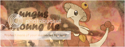
fungus.png
 
Re: Pokecharms Signature of the Week - #5 - Voting

Voting time! Only two options, but I personally love both. I have a feeling it'll be close this week :o
 
Re: Pokecharms Signature of the Week - #5 - Voting

Whilst Chad's is a very nice example of why Sableye can be creepy, the shifting colours of the background as well as the font itself make it rather hard to read.

Rayn's use of Shiny!Breloom is interesting. It calls for a more restricted colour palette to work properly, which Rayn has made the most of here. Though I'm not a fan of the text per se, I can fully understand why she chose it. The haze across the sig gives the impression of fungal spores in the air, but I am forced to wonder about the random lightning in the corner.


Also, two entries? For shame 'Charms. FOR SHAME. *huffs*
 
Re: Pokecharms Signature of the Week - #6 - Submissions

Only two entries, but two fantastic entries nonetheless.

There is only one winner, though, and that is #2 with 8 votes. Chadwyck, congratulations :D

SotW2.png


#1 - 3 votes - Rayn

fungus.png


The new theme will be:

Music

Get going, and keep posting submissions here. I don't see a reason as to keep anonymity, speak up if you strongly feel otherwise :) *changes rules*
 
Re: Pokecharms Signature of the Week - #6 - Submissions

I missed alot :o. What do you mean 'music'. Would a music artist count? Or maybe an instrument like a violin.
 
Re: Pokecharms Signature of the Week - #6 - Submissions

LoN said:
The current theme is:

Music
Anything you can tie into a musical theme is your requirement for this week :)

Yes, Lady Gaga would suffice. Yes, a violin would suffice. Yes, someone sat in a field blowing on some grass would also suffice.

Use your imagination :) Its a pretty broad topic, so I understand your query.
 
Status
Not open for further replies.
Top