For a site called “The Creative Pokemon Community” there’s a disappointing lack of tutorials. So I figured I should fill the void myself. This is going to be a series of guides on how I go about the creative process of drawing. Keep in mind there’s plenty of different ways to do this, so you should probably try to look around and take in other methods to try and find something that suits your needs best.
If anything doesn't make sense, feel free to ask questions and I’ll be happy to try and help you as best I can!
If anything doesn't make sense, feel free to ask questions and I’ll be happy to try and help you as best I can!
How To Draw Pretty Much Anything: Making The Sketch
The first point in any artwork is creating a general sketch. In order to do this, we’re going to need three basic things:
References are the bit that people usually forgo though, so allow me to make a case as to why you should use them. If you’re uncertain of what a reference is, it’s an image you have on hand of the thing you’re drawing to remind yourself of what the drawing looks like. It’s not something you copy, by the way.
It’s necessary to have a reference because our brains tend to take a lot of shortcuts when processing information. The world around us is so information dense that taking in everything as it is is exhausting, and you probably have more important things to do than memorize the exact wood grain of that table, right? This means we tend to often think we know everything about something, when in reality we have no idea how it works (this applies to a lot of things, not just drawing btw). To demonstrate this point, I’m going to draw a Pelipper from memory. Simple right? Well…
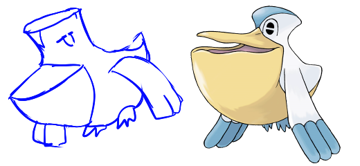
… Oh. Oh no. This is… kind of embarrassing. While I thought I knew what Pelipper looked like, I only knew the basics of the shape and some patterns, not the specific details of the design. This time, let’s see what happens to the drawing when I use the official art of Pelipper as a reference:
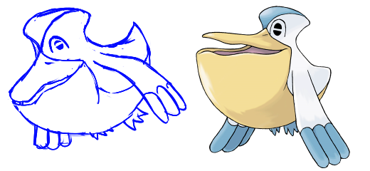
I dunno about you, but I think I’ve done much better this time around. It’s still not exactly right and in hindsight I should go back and tweak it’s proportions a little, but the point’s pretty clear yeah? Use references. Just, just do it. Please.
Of course, when you go about choosing a reference, some are much better than others. When possible, you should look for photographs from reality to use as references (or in the case of things that don’t exist, like Pokemon, official art, if you can). This is because when people draw things, they bring in their own interpretation of what that object is. So if you draw your own interpretation of someone else's interpretation of an object, there's a higher chance of getting proportions wrong. So whenever possible, try to use real images for references. If you can’t find a reference you want, go out and take photographs (for example, if you’re drawing a person, get in front of a mirror and put yourself in the pose you want).
“But Aura!” I hear you cry, “I’ve seen artist’s make great pictures and they don’t use references!”. Sure, I’ve seen people do this too. In these cases, I guarantee you that either a) they do have a reference, you just can’t see it, or b) they’ve drawn the subject matter so many times before that they know it really well, and thus a reference isn’t as useful (but still helps). It’s probably best to assume that you’re not in the second group, no matter what, because you can still improve the image by having a reference.
So, to put those three points into practice, let’s go about drawing everyone’s favourite(?) rodent, Pikachu.
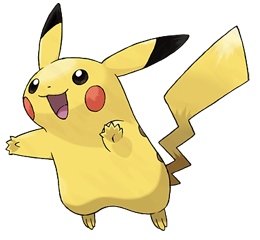
This is going to be our reference picture for the sketch. It’s not too complicated of a design for a Pokemon, but it still looks like a far cry from some basic shapes right? Maybe, but let’s try and break it down. First, since Pikachu is a living creature with a skeleton, we need to draw a stick figure. This will give us a rough break down of the pose we want to draw it from, and a good idea of where it’s joints, head, spine etc will all need to be. I’ll be using circles to denote joints and more complicated features, like hands.
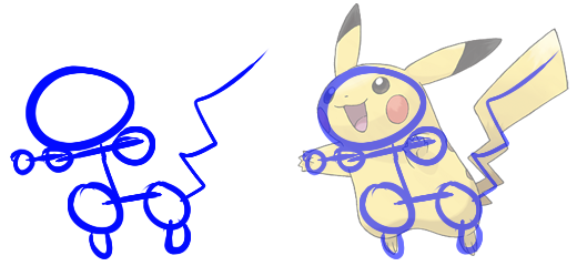
For this, I’ll try to draw the reference picture in the same pose, and I’ll include an image of my drawing over the top of the reference. I wouldn’t normally do this, but it’s just going to be there to help you understand what I’m doing. From here, we can draw basic shapes over the skeleton, to fill out the body. I’m going to be using rectangles for the limbs, torso, and tail, triangles for the ears, and circles of the hands, feet, head, and legs.
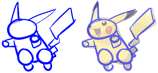
So as you can see, we can break Pikachu down to a collection of simple shapes. You can do this with pretty much anything, inanimate or otherwise (although if it’s inanimate or lacks bones, the stick figure stage is probably not that useful to you). By doing this, you can plan the pose, ensure proportions are correct, and avoid making mistakes when your drawing gets more detailed (and thus, harder to fix). From here, we can make Pikachu look like a cohesive whole by erasing certain lines in each shape (or drawing over the top, whichever you prefer).
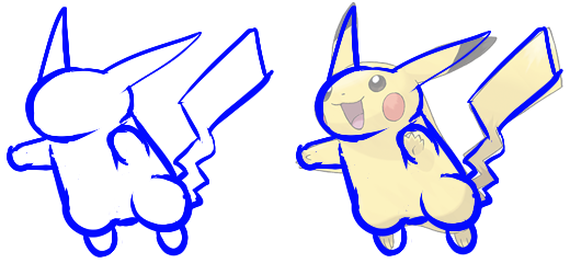
That looks a lot better, but it’s still not quite right. See, while we can break things down into rough shapes, not everything neatly fits into exactly one of those shapes. Take Pikachu’s ears for example – I drew them as triangles, but if you look closely, you can see they widen around the middle instead of just being straight lines. Same thing with it’s hands and feet – they’re not really circles, they’re more complex than that. The basic shapes are good for planning, but you will need to tweak them eventually to fit what you’re drawing.
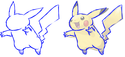
Now that looks a lot more like Pikachu! You can see from the official art that my drawing is differing from it, and that’s perfectly okay. Personally I think it’s kinda boring to just create the exact same image as your reference. Anyway, now that we’ve got most of the body fleshed out, we need to add the details to the design. These would be the face, and the markings. To do the face, I drew a grid on first to divide it up into sections. This ensure’s that I keep things in proportion when drawing the features.
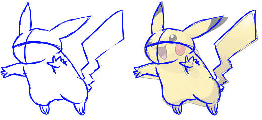
See what I mean? The nose is roughly in the middle of the grid, with the mouth sitting in the centre below it, and the eyes above the centre line. You want to make sure though that the grid is rounded because, generally speaking, faces are rounded, not flat. Depending on what you’re drawing, you might have to make the grid a little more complicated because they have more detailed facial features (such as humans – Pikachu has almost no nose by comparison). Pikachu’s features are pretty simple – a lot of lines and circles, with the mouth being roughly a half oval. Once we’ve drawn the facial features we don’t need the grid anymore, so get rid of that. I’m also just going to add some very basic shading on some certain parts of Pikachu, just because.
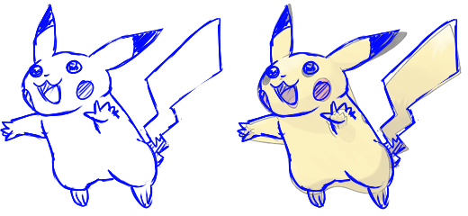
And with that, we’ve got a sketch of Pikachu! I’ve broken the process down quite a lot, but as you improve it will get a lot faster and easier. So from this, remember, break what you’re drawing down to plan it, and for the love of god use references.
Next time I’ll (probably) be tackling linework, so stick around for that.
The first point in any artwork is creating a general sketch. In order to do this, we’re going to need three basic things:
1. The ability to draw simple shapes (eg triangles, circles, rectangles, etc).
2. The ability to draw stick figures.
3. A reference picture (or multiple).
This isn't a particularly high bar for entry on skill honestly. I’m going to assume you can draw simple shapes, and probably stick figures too. Although I do need to point out that the stick figures we’ll be using for this are slightly more complicated than the average stick figure, but it’s nothing harder than some additional lines and some circles.2. The ability to draw stick figures.
3. A reference picture (or multiple).
References are the bit that people usually forgo though, so allow me to make a case as to why you should use them. If you’re uncertain of what a reference is, it’s an image you have on hand of the thing you’re drawing to remind yourself of what the drawing looks like. It’s not something you copy, by the way.
It’s necessary to have a reference because our brains tend to take a lot of shortcuts when processing information. The world around us is so information dense that taking in everything as it is is exhausting, and you probably have more important things to do than memorize the exact wood grain of that table, right? This means we tend to often think we know everything about something, when in reality we have no idea how it works (this applies to a lot of things, not just drawing btw). To demonstrate this point, I’m going to draw a Pelipper from memory. Simple right? Well…
… Oh. Oh no. This is… kind of embarrassing. While I thought I knew what Pelipper looked like, I only knew the basics of the shape and some patterns, not the specific details of the design. This time, let’s see what happens to the drawing when I use the official art of Pelipper as a reference:
I dunno about you, but I think I’ve done much better this time around. It’s still not exactly right and in hindsight I should go back and tweak it’s proportions a little, but the point’s pretty clear yeah? Use references. Just, just do it. Please.
Of course, when you go about choosing a reference, some are much better than others. When possible, you should look for photographs from reality to use as references (or in the case of things that don’t exist, like Pokemon, official art, if you can). This is because when people draw things, they bring in their own interpretation of what that object is. So if you draw your own interpretation of someone else's interpretation of an object, there's a higher chance of getting proportions wrong. So whenever possible, try to use real images for references. If you can’t find a reference you want, go out and take photographs (for example, if you’re drawing a person, get in front of a mirror and put yourself in the pose you want).
“But Aura!” I hear you cry, “I’ve seen artist’s make great pictures and they don’t use references!”. Sure, I’ve seen people do this too. In these cases, I guarantee you that either a) they do have a reference, you just can’t see it, or b) they’ve drawn the subject matter so many times before that they know it really well, and thus a reference isn’t as useful (but still helps). It’s probably best to assume that you’re not in the second group, no matter what, because you can still improve the image by having a reference.
So, to put those three points into practice, let’s go about drawing everyone’s favourite(?) rodent, Pikachu.
This is going to be our reference picture for the sketch. It’s not too complicated of a design for a Pokemon, but it still looks like a far cry from some basic shapes right? Maybe, but let’s try and break it down. First, since Pikachu is a living creature with a skeleton, we need to draw a stick figure. This will give us a rough break down of the pose we want to draw it from, and a good idea of where it’s joints, head, spine etc will all need to be. I’ll be using circles to denote joints and more complicated features, like hands.
For this, I’ll try to draw the reference picture in the same pose, and I’ll include an image of my drawing over the top of the reference. I wouldn’t normally do this, but it’s just going to be there to help you understand what I’m doing. From here, we can draw basic shapes over the skeleton, to fill out the body. I’m going to be using rectangles for the limbs, torso, and tail, triangles for the ears, and circles of the hands, feet, head, and legs.
So as you can see, we can break Pikachu down to a collection of simple shapes. You can do this with pretty much anything, inanimate or otherwise (although if it’s inanimate or lacks bones, the stick figure stage is probably not that useful to you). By doing this, you can plan the pose, ensure proportions are correct, and avoid making mistakes when your drawing gets more detailed (and thus, harder to fix). From here, we can make Pikachu look like a cohesive whole by erasing certain lines in each shape (or drawing over the top, whichever you prefer).
That looks a lot better, but it’s still not quite right. See, while we can break things down into rough shapes, not everything neatly fits into exactly one of those shapes. Take Pikachu’s ears for example – I drew them as triangles, but if you look closely, you can see they widen around the middle instead of just being straight lines. Same thing with it’s hands and feet – they’re not really circles, they’re more complex than that. The basic shapes are good for planning, but you will need to tweak them eventually to fit what you’re drawing.
Now that looks a lot more like Pikachu! You can see from the official art that my drawing is differing from it, and that’s perfectly okay. Personally I think it’s kinda boring to just create the exact same image as your reference. Anyway, now that we’ve got most of the body fleshed out, we need to add the details to the design. These would be the face, and the markings. To do the face, I drew a grid on first to divide it up into sections. This ensure’s that I keep things in proportion when drawing the features.
See what I mean? The nose is roughly in the middle of the grid, with the mouth sitting in the centre below it, and the eyes above the centre line. You want to make sure though that the grid is rounded because, generally speaking, faces are rounded, not flat. Depending on what you’re drawing, you might have to make the grid a little more complicated because they have more detailed facial features (such as humans – Pikachu has almost no nose by comparison). Pikachu’s features are pretty simple – a lot of lines and circles, with the mouth being roughly a half oval. Once we’ve drawn the facial features we don’t need the grid anymore, so get rid of that. I’m also just going to add some very basic shading on some certain parts of Pikachu, just because.
And with that, we’ve got a sketch of Pikachu! I’ve broken the process down quite a lot, but as you improve it will get a lot faster and easier. So from this, remember, break what you’re drawing down to plan it, and for the love of god use references.
Next time I’ll (probably) be tackling linework, so stick around for that.
Last edited: