• Welcome back to Pokécharms! We've recently launched a new site and upgraded forums, so there may be a few teething issues as everything settles in. Please see our Relaunch FAQs for more information.

Art of le Shocari

Re: Art of le Shocari(Taking Requests, HomeDawg)

Here's what I have so far:
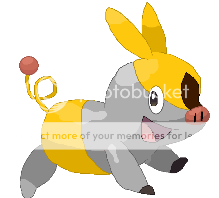
Pokabu.png


I changed the colors as requested, but the yellow patch above the nose blended in with the gold, so I changed it to brown so it wouldn't blend in. Hope that's okay.
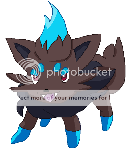

ShinyZorua.png


Shiny Zorua. Hopefully it's devious enough ^^
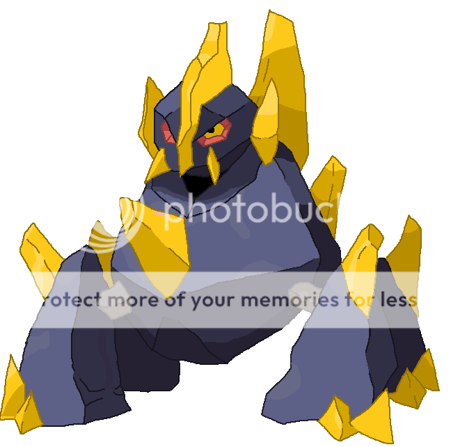

SpecialGigalith.png


Hope you like this~


Aian, I'm still working on the Futachi, but it'll be up in a day or two. This being said, I have 3 request slots open right now.
 
Re: Art of le Shocari(Taking Requests, HomeDawg)

Excellent pictures as ever, Shocari-chan!
These look absolutely fabulous- I especially like shiny Zorua~
His expression is terrific! ://D

Since you have request slots open can I has a request?
Would you please draw me a picture of a Chingling?
Not shiny or with additional accessories~ Is that okay?

Thanks in advance and keep up your fabulous drawings!
Kasumi xxx
 
Re: Art of le Shocari(Taking Requests, HomeDawg)

Hee, thanks so much, Sho~ I absolutely love the Gigalith, he looks like some kind of abnormal Shiny<3

Could you perhaps make a small version so I can use it in my sig?~

The blue Zorua is also reeaally good!~
 
Re: Art of le Shocari(Taking Requests, HomeDawg)

Tim Nordwind said:
Could you perhaps make a small version so I can use it in my sig?~

I second that request |D

But anyway, that Hitomoshi is soooooooooo cute! Thank you! As soon as I find out how to shrink it (or get a shrinked version, either way) it's going in my sig!
 
Re: Art of le Shocari(Taking Requests, HomeDawg)

OMGILOVEITSOMUCHTHANKYOUSHOCARIITSAWESOMEANDISHOULDPROBABLYSTOPSCREAMINGNOWSHOULDN'TI?! *breathes* Okay, I can speak normally now. Ahh my Zoura's so cute! She's like "I am going to steal your SOUL! So hold still now ~" I can't see anything wrong with her at all. You are God. God I say!

Gigalith is so cool. I agree, it does look like some abnormal shiny. Like a half shiny or something. Or like those plates are made of gold. Tepig is very cute, and he knows it.

...

God I say!
 
Re: Art of le Shocari(Taking Requests, HomeDawg)

Hey guys. Today, I don't have any of your requests('cos I've been sick and haven't been allowed near technology), but I do have these cute little drawings that I was able to snap pictures of with my webcam(scanner still is b0rked)

failteddiursa.png


lolmemeooebemu.jpg


For the next little while, I won't be able to work much on art, because I've got a lot of extracurricular stuff to do, but I'll try my best to get them done for you guys ^^
 
Re: Art of le Shocari(Taking Requests, HomeDawg)

*whacks head repeatedly trying to think of the name for the bottom Pokemon*

Either way, knowing the name or not, that Pokemon and the Teddiursa are well shaded. However, Teddiursa's head seems to be a little too tall.
 

Psycho Monkey

Member of the Literary Elite Four
Re: Art of le Shocari(Taking Requests, HomeDawg)

Secad said:
*whacks head repeatedly trying to think of the name for the bottom Pokemon*

Either way, knowing the name or not, that Pokemon and the Teddiursa are well shaded. However, Teddiursa's head seems to be a little too tall.

That's because Teddiursa is already being assimilated by the Gen V Pokemon who's name I have also forgotten at the moment ^_^''

Anyway, those are great Sho! Excellent job on both of them! I have a request, but I'll save it for when you have time to work on it.
 
Re: Art of le Shocari(Taking Requests, HomeDawg)

Secad said:
*whacks head repeatedly trying to think of the name for the bottom Pokemon*

Oobemu?

Anyway, the new drawings look great, and I especially like the Teddiursa. But the head does seem to be a little bit too small. I actually think it looks better.

Keep it up!
 
Re: Art of le Shocari(Taking Requests, HomeDawg)

Sorry I took so long guys ^^

Chingling.png


for Kasumi, hope you like it ^^

And...well, Aian knows I'll get it done eventually :p

I'm not going to do requests anymore for right now, due to...stuff.
 
Re: Art of le Shocari(Not Doing Requests for the time being)

*Kasumi dies of absolute respect and love for that Chingliiiiiing ♥*

That is positively amazing Sho-chan!
Words cannot fully express my love for him! The colours and the shading and his expression and hnnnnng <333
Everything is so right! :'//D

I LOVE IT I LOVE IT I LOVE IT!
Thank you so much!

Kasumi xxx
 
Re: Art of le Shocari(Not Doing Requests for the time being)

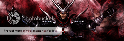
OichiSig.png


This is my first sig ever. I found a tutorial, and I liked the way it looked, so I tried it out. I used a render of Oichi from Samurai Warriors 2. The text is a bit iffy, but other than that, I'm very pleased by it.

I'm totally not taking requests for sigs, just throwing that out there.
 

Sir Red

Charms' Caped Crusader
Re: Art of le Shocari(Not Doing Requests for the time being)

Oh, I really like how that turned out, Sho. :> The effects on the sig are very nice, and the colors compliment the render very nicely. For your first sig, it's leagues ahead of where most people are for their first (or even their hundredth :x). So yeah, I hope you keep sigging as you're really very quite good. -^^-
 
Re: Art of le Shocari(Not Doing Requests for the time being)

I know I'm on break and all, but I decided to make a sig in downtime:

DevilKingSig.png


My second sig ^^

Basara!Nobunaga ftw >=D
 
Re: Art of le Shocari(Not Doing Requests for the time being)

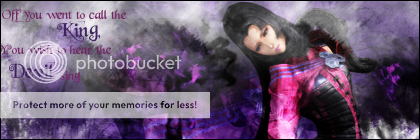
did Oichi from Basara, with and without text. Not sure which I like more.

DemonQueenSig.png


DemonQueenSig-Text.png
 

Psycho Monkey

Member of the Literary Elite Four
The sig looks great Sho! Excellent work! In my opinion, I'd go with the one without text. The text is a bit hard to read without staring at the sig for a few seconds to translate it.
 
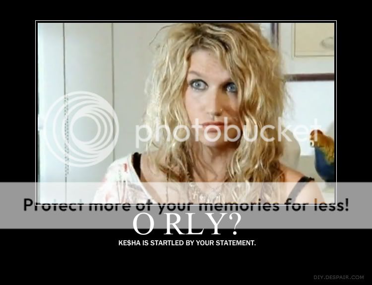
*confused expression* I can't tell whether you are a fan of Kesha or don't like her, lol.

These demotivationals don't strike me as funny. They use too many cliches and common memes, making them amusing but overdone. Perhaps you could pick someone or something out of the ordinary and find some witty saying.
 

Sir Red

Charms' Caped Crusader
DevilKingSig.png


I know you posted this a while ago, but I just wanted to comment on something small in it. :x

First off, I really like it. However, one thing that I think I would have really liked in this particular sig is if you had obscured the face in the background in some manner (smudging would work, as a displacement would effect everything else and that would harm the strong lines that work so well). So yeah, other than that I love the sig. The background is just amazing looking, if I do say so myself. :v

Also, with your text in sigs; I feel you often try to go for too fancy of a text (believe me, I've been there :x). Just try using a more common place looking font, possibly something thick and using the trick to get texture and shaded color in your font from LoN's Cloud tut can make it look fancier and whatnot. Plus, it's more legible that way. ;)
 
Sir Red said:
I know you posted this a while ago, but I just wanted to comment on something small in it. :x

First off, I really like it. However, one thing that I think I would have really liked in this particular sig is if you had obscured the face in the background in some manner (smudging would work, as a displacement would effect everything else and that would harm the strong lines that work so well). So yeah, other than that I love the sig. The background is just amazing looking, if I do say so myself. :v

Also, with your text in sigs; I feel you often try to go for too fancy of a text (believe me, I've been there :x). Just try using a more common place looking font, possibly something thick and using the trick to get texture and shaded color in your font from LoN's Cloud tut can make it look fancier and whatnot. Plus, it's more legible that way. ;)

This man speaks sense, listen to him. :)

The other thing you might wanna avoid is a centralised focal point, check out the Rule of Thirds.
 
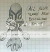
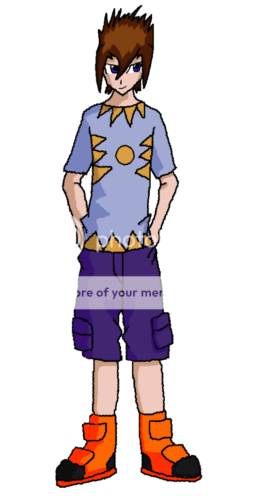
Be warned: my scanner has officially died and I need a new one. So I took a pic of the drawing, traced it in gimp, and proceeded to half-arsedly shade. This is my OC for Tailon's Digimon RP:

digidestined.png


Since his Mega is Dynasmon, I used some of Dynasmon's design for his outfit.

HALF-ARSED COLORING IS HALF-ARSED.
 
REVIVAL BECAUSE I DREW SOMETHING :O


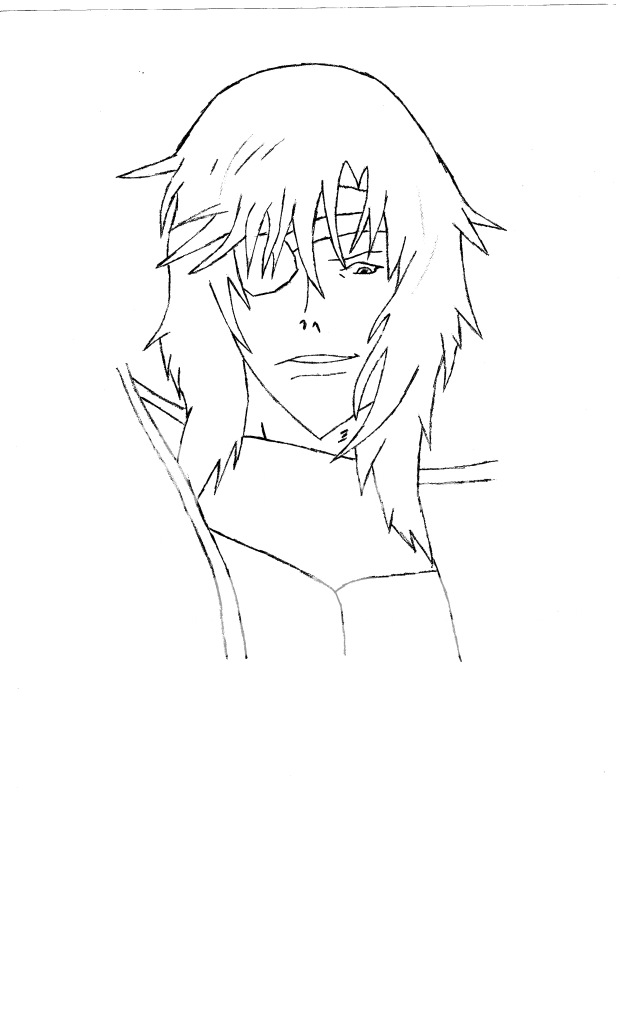
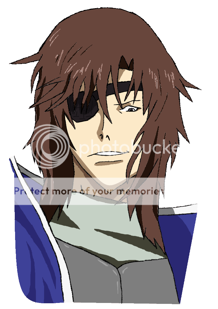
Based off of this image.


MasamuneLineArt.png


BasaraMasamune.png


Yeah. Colored version is colored crappily. I left my tablet up at the dorms and I can't go back and get it and I also don't want to wait until Jan 14 before I can color this.

It's been forever since I drew something. BEAR WITH ME.
 
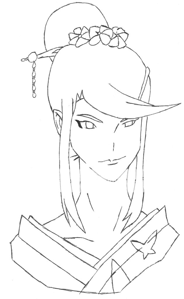
Nouhime-Lineart.png


Quite possibly my most favorite drawing I've ever done.

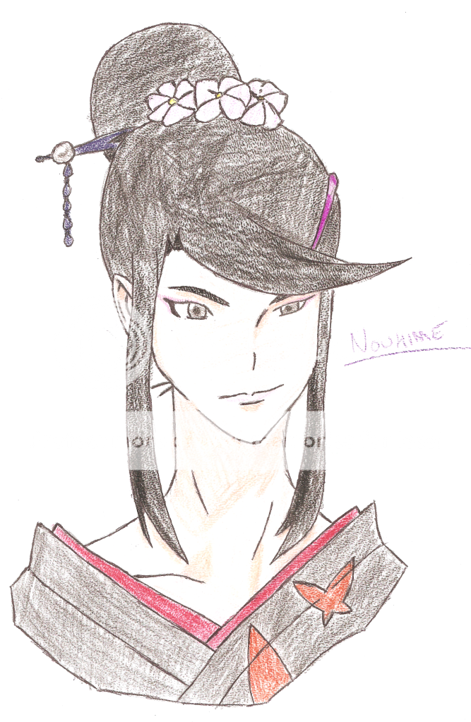
Nouhime-Colored.png


And the awesomely colored with colored pencils version that my scanner decided to fuck over.

:'D
 
I think this is really, really good, Sho. The linework is amazing in its simplicity, the proportions are just right- As is the perspective. You could try to use coloured markers instead of pencil in future drawings, but the coloured version looks good anyway ^^
 
So...I totally remembered I have a tablet :'D

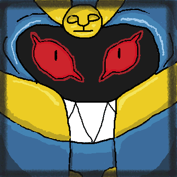
Cofagrigus.gif


Quite fond of this. The border was originally going to be the hands, but I decided against it and went with the shadows supposedly...drawing you in or something >>

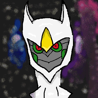
Arceus.gif


Yeah, it's the God of Goatliness with a thousand arms. The background is utterly failtastic, but hey: it looks damn good as a thumbnail.

:'D
 

Shiny Motley

2016 Singles Football
I rather like Confagrigus, as creepy as it is~

Something bothers me about Arcius, though. Perhaps it's the kinda not-too defined ish lines or something around its cheeks. Not quite sure, though D:
 
IMG_0142.jpg


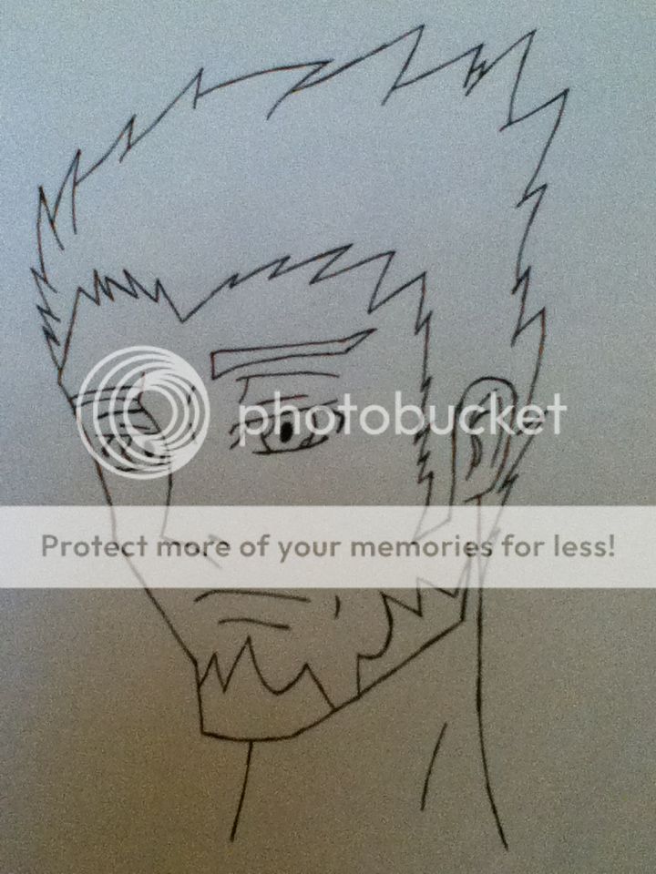
Sorry for the crappy quality. I'm at the dorms and the scanner's at home, so I had to take a pic with my ipod. I'll upload a better version later. And a colored version.

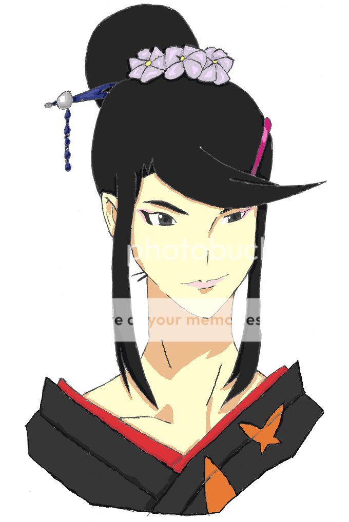
Anyway, it's Sakaki, one of my OC's for my Code Geass fic.
 
What a lovely collection of drawings you've got here. And to top it off a Lady Butterfly picture or three. :D (Yes, I'm old school, she'll always be Lady B to me |D). I think I prefer the traditional colours to the digital but as you've stated your scanner is acting up so I can understand why you've been using digital methods. ^^
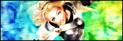
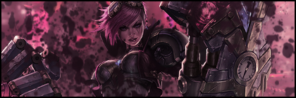
Lovely work, keep it up. :)
 
I may or may not have decided to make sigs at 3 am >>

lux_signature_by_shocari-d5zn70h.png


vi_signature_by_shocari-d5zn76x.png


I don't know what I was going for for either of them, but I do like that the colors for Lux match her abilities(ie rainbow death laz0rs)
 
Top