• Welcome back to Pokécharms! We've recently launched a new site and upgraded forums, so there may be a few teething issues as everything settles in. Please see our Relaunch FAQs for more information.

Jappio's Supposedly Awesome Sprites

Hello everyone. I just made this Fakemon for the sake of my tutorial video. In fact as we speak I am recording. Just basically showing the basics of posting. So yeah, that's what this is.

DudeDisplayVersion.png
 
More Scratch Tutorial:

http://www.youtube.com/watch?v=kxG5B00JqQQ

In this segment we start creating our sprite. We create our shape and lines and various details. Part 5, Coloring and Shading, will hopefully be up soon. I have voice and video recorded, need to edit it together though and fix stuff up.

Also been jumping around recording software, so this video will probably seem different than the others. Feel free to let me know what you think.
 
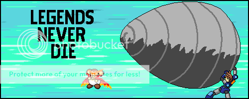
The Mega Man Legends series is one close to my heart. After 10 years of waiting for the Legends 3, I was happy to hear it was in developement. Yet now Capcom has canceled it and I want to do my part in fighting for it to come back.

So I made a little sprite image. Mega Man combined with Gurren Lagann? Surely something awesome can convince Capcom to again continue to make it!

Row row, fight the powah!

LegendsNeverDie.png


Data was some scratching. Mega Man and his Giga Drill are sprite overs from the show. I was lazy with the background and just used the background from the Ace Attorney games (Think of that laziness as just a way to show my support for another Capcom screw up, not localizing Investigations 2 :p)

So if your a fan of the Legends series, Mega Man, would be awesome 3DS games, or stopping corporations from killing off great franchises, you should all join the fight! There's a Facebook group getting people. We're already past 37,000 people, and we're always growing.

Let's just say I really think this can work. I've seen smaller fan gatherings get things done. This could mean the future of Mega Man, and who doesn't love the blue bomber?
 
These are so cool *-*
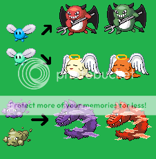
You should do a tutorial on how you do splices. Specifically the Gastly/etc. mixtures 'cause the way you make the bodies of the Pokemon all ghostly is so epic 8)
 
Last edited by a moderator:
I did do a tutorial on splices, three in fact. Bottom of my first post.

As for specifically that Ghastly style, I just don't think it's something important enough to get its won tutorial. In a way I it's similar to infrareds, so if you find a tutorial on those you might sort of get the idea how to do a Glastly splice.
 
I have finally done it. I have finished the spriting tutorial.

This is it, every video.

I will reiterate, you should watch all parts. The main meat I will admit are in parts 4 and 5, but useful information is in each, all of which can help you become a better spriter.

Scratching Tutorial

Part 1 - Intro
http://www.youtube.com/watch?v=9hqCERlVrAY

Part 2 - Concept and Planning
http://www.youtube.com/watch?v=NRAggLqfync

Part 3 - MS Paint Basics
http://www.youtube.com/watch?v=zssify8NIJw

Part 4 - Form and Line Art
http://www.youtube.com/watch?v=kxG5B00JqQQ

Part 5 - Coloring and Shading
http://www.youtube.com/watch?v=dX_VFCx-x-A

Part 6 - Finishing Touches and Posting
http://www.youtube.com/watch?v=JqNWFFITlbA


----------

Hopefully with this out of the way, I can go back to my casual spriting since this wont' be looming over my now.
 
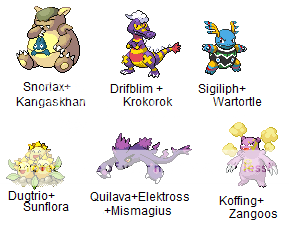
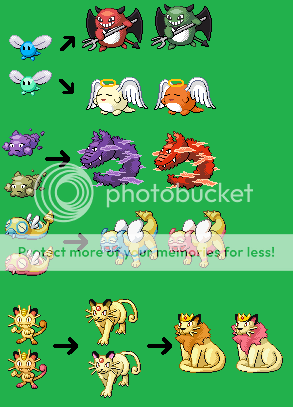
Here, have some new splices. Well one of them is a couple months old since it was for a contest, but the rest are new.

SpliceSheet59.png


Ever since I stopped receiving requests for splices, these sheets have been looking so puny. I suppose it isn't a surprise though. Why request something from someone when they won't get to it for quite some time.

Now I must make the tough choice of working on Fakemon, Super Poke World, or one of my many other projects to work on....

Who am I kidding. It's probably going to be something pointless and stupid, because actually finishing projects is for chumps who aren't lazy!
 
Nice Wartilyph/Sigitortle! i'm kinda jealous... Oh, and I think its nice cause well,the colors just, go together. It flows so smoothly. It is awesome!You need requests,right?
 
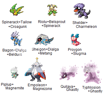
Just some more splices.

SpliceSheet60.png


For some reason I don't really feel like celebrating my 60th anniversary for splice sheets. It's also about to be the 4th year anniversary too. Yet for whatever reason, it just doesn't seem as awesome as previous years have. Maybe it's because for the last year I have done all that much splicing or anything. I have been caring for my other projects much more. Oh well, no big deal, 60 and 4 are just numbers.
 
Jappio, I don't even know why this thread gets so little comments. Your artwork is very, very good- I can only name one person with a similar level of splicing abilities,- and if you're reading this, you know who you are- And especially your knack for shading and correct placement makes these so well-crafted.

Probably my favourite out of these are the two metallic time-dragons, the ghost-firestarters and the magnetic water-line. If you're up for a request, think you could do a Prinplup/Magneton splice to make it complete?

I'm definitly going to be stalking this, and keep the good stuff coming ^^
 
For your request, go to page 2 and check out the splices on that page.

All of these splices are related to older splices actually. Someone made a bunch of requests. Supposedly is going to use them for a hack. Yet if it's like any other time someone tries to make a hack, probably will never get done.
 
Two more Fakemon updates.

I actually kept the old version of the poison dragon as a base and just altered it. First time I think so far where the old form was kept as a base like that. Hopefully that means things will start to be easier like he was going into more.

3rdgenFakemonSheet5-1.png
 
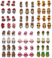
I wish I could call these scratches or actually be scratching them. Yet they are suppose to go with some already premade NPC type sprites, so I have to keep style, and with overworlds, unless the person your doing is really weirdly shaped, that's sadly not possible. So a lot of things like the legs and stuff are almost identical looking, even though I didn't use the originals as a base =/

Oh well, still happy with how they are coming out. Only two more party members, and then I might move onto the in battle sprites.

RPGOverworlds.png
 
Oh right, I should have mentioned but didn't think to. That's my character Shroomette, that I know is a blatant rip off of Toadette.

Abilities and back-story are very different than the regular Toadette. Appearance and attitude are identical. Again, I know it's a blatant rip off, but she's too adorable to change the design :p

A long while back I had actually made a more humanoid trainer splice of her:

Toadette.png
 
Ok, this sheet is now done and full. I'm happy with the outcomes personally, but as always I'm open to any comments you all might have.

3rdgenFakemonSheet5-2.png
 
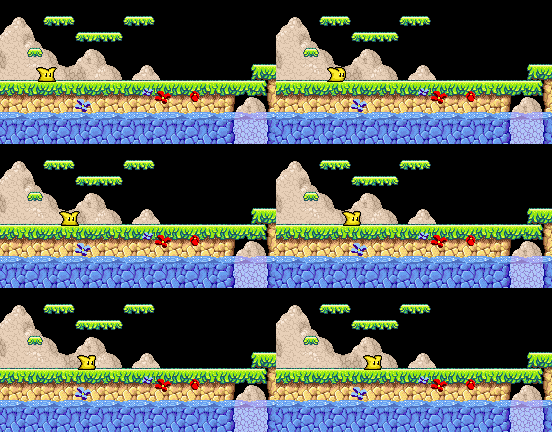
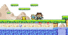
Well, just a little fooling around as usual. This may or may not see some type of future use. My friend has this little character known as Goo. Just a little blob guy. There is a game he is meant for, something Kirby-esque as far gameplay and such (this is why I decided to make him in a Kirby style). I don't know if there will be any actual game though, which is why there are only three actual sprites for the time being.

In the animation, there are two different styles. The first few frames have him moving, using his standing frame in the middle of the movement, yet in the later half of the animation I don't use the standing frame. Wasn't sure which looked better.

Background was ripped from Kirby: Nightmare in Dreamland by HyperGumba.

TestWalk.gif


And since this was a minor update, I messed around a little and made a familiar face in a style I'm not use to making him in.

WithRaizou.png
 
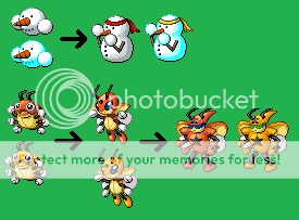
Ledian evolution bothered me a ton. Just couldn't figure out a design I liked for him for the longest time. Finally was able to settle on that, and I'm quite happy with how it turned out.

3rdgenFakemonSheet6.png
 
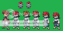
Potentially the style we'll be using for the RPG.

Ryu looks weird when he isn't super short. Not sure on size yet, probably going to wait till I get a few of the other characters made, and then I'll decide.

A few options for fur colors. Going to talk to the character's creator to pick one.

The guy on the left is from Soul Nomad. I'm a fan of NIS style sprites, and these I think will allow us to show of our character's designs well. A lot of thought has to be put into this type of thing though, so we might abandon the style. We have to keep in mind enemy sprites too, and how we handle them.

So I know it's probably not best to start working on the sprites like this before I get the creator's input, but I was in the mood to sprite something like this, so if we decide to do something else, then so be it.

RPGBattleRyuSoul.png
 
Wow, the spriting board here has been awfully dead lately. Sort of weird.

Well here we go, Team Rocket is pretty much complete.

I apologize for Jame's green hair. Trust me, I spent I think over an hour trying to change it. From the research I was able to dig up, you can't apparently change the palette on Bowser's sprite, so I don't think I will be able to alter it myself. I hear with enough hacking skill one can though, so actual hacks using these sprites will hopefully have people who can bother to change it.

Also for anyone out there who might be kind of stupid: The music, voices, and the zooming in are not in game. It is just video editing.

Changing Peach and Mecha Koopas will come later. Probably Wigglytuff and Wobufette. Might still do a joke switch of Peach for Ash in dress. Not sure if I'll stick with just Ash in dress, or go with his female counterpart from the Erika episode. Female counterpart could make sense canon-wise, Ash in dress would be more recognizable. I guess I can always just do three version too.

http://www.youtube.com/watch?v=tLiJa8SclwM
 
Could use a little bit of help everyone.

Working on some Fakemon, I was liking where I was going, then bam!

I now have three different designs for the 'eye' on his back. I wasn't intending it to be a real eye, just sort of a pattern. Yet I can't decide between the few ways I have it drawn. The first is nice and simple, but I worry about how it doesn't stick out well. The second sticks out a little better, but something seems off. The third sticks out great, but it's starting to look too real, too complex for a simple marking possibly. As I'm typing this, I tried turning the first one's color around so the eye was black instead of purple, and that might work.

So does one in particular look nice to any of you? Is there perhaps a 4th option that might work better? I tried a few other color combinations too, but I just don't know. Any comments, CnC, or critique would be greatly appreciated!

1ikk5t.png
 
Jappy should keep in mind looking too real for a symbol isn't much of a problem with Pokemon like the ice cream running about, nowadays!

As for the fakemon itself, I feel the first pattern might work if it was a darker purple. It's too light to be noticed, like you said,, and discerning it strains my eyes, oddly. The second one looks too lifelike, as if it's notsomuch attached to the spider in question. The third one is exactly the sort of manner in which how it sticks out but remains a pattern, in my opinion, but if you don't like the literal manner the eye works you should probably try and change something?

Just my thoughts ♥

PS: Also that video from the post before

It is amazing
 
Ok, so opinions on which is best are all over the place right now :p

Seriously, for the most part, all three designs have been equally liked seemingly.

So to complicate matters, I made even more designs:

dcg41w.png


I have some new palettes and a new eye design.

Right now I'm leaning towards 16, but I'd still love to hear what everyone else thinks.
 
Your sprites r awsome and in my opinion i like 16 but what if u made the pupil the same colour as the legs
 
I'm personally leaning towards 9, although 15 is pretty nice as well, as is 6. All of the designs are good anyway, so keep it up ^^
 
Thanks guys, glad you like.

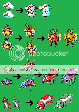
So voting on Ariados evolution didn't yield a perfect result. Overall, it was almost even between realistic and non-realistic. non-realistic had just a few more votes for it, and I personally liked it better. Sadly I now know that not everyone will like the choice I went with, but 51% at least will :p

Missile Pokemon is no longer an ice type. Ice skates weren't enough of a reason to make it an ice type, and I couldn't really come up with a different way to do it. It's all fine though, because I think it turned out better by going a more simplistic approach.

3rdgenFakemonSheet6-1.png
 
Did some fiddling around with Link again. Rather than add frames, I've decided to take some advice and add blurring instead.

Still not done with it yet. Still need to do the magic portion of it all, and a bit more movement in things like his hat and hair. Just sort of a progress update.

Withblurring.gif
 
It's definitely good progress. The motion blur of the sword does add a reasonable amount of quality, although it'd probably still look even better with more frames and smoother motion.

I'd love to see more~
 
Wow, your designs are pretty awesome, I am impressed, much better than anything I've ever done, even more so than the digimon and zoids sprites I've done. Those fakemons look absolutely official to me, and I would think that nintendo should hire you to design new ones for them for future generations. I was wondering though, since you do requests, would you try to create sprite versions of a few pokemon that I came up with? I have pics for some, but others I just have the ideas and names for what they might be. I'll give the links for the 3 that have pics, plus the info to go with them, but as for the other ones I'll hold off for now.

Basic Stage: Robomon
Type: Electric/Steel
Ability: Volt Absorb/Intimidate
Name Meaning: Robotic-Monstrosity
Evolves: lvl 25, Thunderstone(alt)
http://i201.photobucket.com/albums/aa19 ... obomon.jpg
(Similar in style and size of ivysaur, but a bit longer body and as you can see an actual tail)

1st Stage: Mecha
Type: Electric/Dark
Ability: Motor Drive/Volt Absorb
Name Meaning: Mechanical
Evolves: lvl 50
http://i201.photobucket.com/albums/aa19 ... /Mecha.jpg
(Similar body stance as Groudon might have, and is just a bit bigger than machop)

Final Stage: Lightningtor
Type: Electric/Psychic
Ability: Lightningrod/Volt Absorb
Name Meaning: Lightning-Torch
http://i201.photobucket.com/albums/aa19 ... ingtor.jpg
(For this I have no clue, other than it's the same size as deoxys, and can you possibly add some kind of special staff that he holds in his other arm)

If you can do them and you need more info on them just let me know.

Thanks, and keep up the good work.
 
Requests for splices that I occasionally do. Fakemon take far too much time, and I have far too many of my own to get to.

I can only imagine someone who actually did take requests on Fakemon would be constantly busy.
 
Nothing too serious or special. Was bored and toyed around with trying to sprite something with only one 'color'. Aka, I chose a color, and only altered the lightness and darkness. No hues shifting. Went with my second favorite Pokemon, Sandslash.

Sandslashmono.png
 
Nice work, sometimes it works that way and I can say it did with yours. I like alot of your work, maybe you can check out some of mine some time.
 
3rdGenFakemonSheet7.png


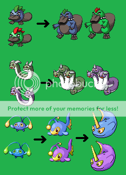
Finally got this sheet done. I've dropped the Qwilfish line, and just went with a platypus line.

Hydra is like way better now, I'm very content.

Narlight is pretty similar to what he was in the old days. One of the few things I did back then that I liked and felt I did a decent enough job on.
 
Top