• Welcome back to Pokécharms! We've recently launched a new site and upgraded forums, so there may be a few teething issues as everything settles in. Please see our Relaunch FAQs for more information.

Mr. Munchlax's X & Y Demo- The Next Evolution of Trainer Cards

NOTE: Now that X &Y are released, none of the cards featured here are personal projects.

For a while, I've been fiddling with ideas for trainer cards for pokémon x & y, & I've recently come up with a template that differs from anything else we've seen before. This is my own independent project, & not related to anything the pokécharms moderators & administrators are working on, so I'm mainly posting these for comments and constructive criticism.

VERSION 1 (NOW UNDERGOING REVISIONS)
mg6u.png
5g9y.png
46uh.png
dmhq.png
c387.png
rtvh.png

*NOTE: These cards are technically still prototypes since they're using screenshots instead of actual game models for the pokémon & all of the menu sprites for X & Y are not available yet

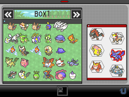
Not only do these use game models for a pokémon team- rather than the sprites, but an additional feature an additional side box to show some of the pokémon you have on hand.

They also come in various colors and uses Sugimor pictures (or Sugimori-like) for mugshots.

Please comment & critique

P.S. Magpie told me to post this thread here in case anyone things I put it in the wrong area
 
Last edited:

Doctor Oak

Staff member
Overlord
These are definitely great concepts, though the use of models (especially those ripped from screenshots or videos) does highlight the difficulty of visual clarity with such assets. I can see what you're going for with them in terms of the coloured backgrounds, but having a neutral one for all would probably make them all a lot easier to see on the card. In some cases, like Froakie, the colours are just so similar - and there are no defining lines around the character - so Froakie just disappears into the background.

The box data on the right, I'd say, would probably also benefit from a less is more approach. The size for each Pokemon and the lack of guttering just kinda gloms it all into one and makes it quite difficult to pick apart. Perhaps a reflection of the Battle Box concept instead would work better.

I do think that with X/Y, we'll need an entirely new format for the TCM given that we especially won't have any trainer sprites - and the way you've done the trainers here is exactly what I'd do for such a format.
 

Magpie

Feathered Overseer
Staff member
Moderator
I think I already said that I think they look pretty nifty. I like how you've done the trainers and I like the idea of having a box for 'Pokemon on Hand'. I like that box better on Dale's card that I can see in your signature, the slightly larger sprite-sizes makes it easier to see who's who and doesn't look as cluttered as a couple of the others do, to pick on a point Doctor Oak made.I think how you've captured the 3D models looks quite nice too, although a more neutral background might suit them better. The boxes that house the Pokemon sprites have a really thin white line around them, and I'm not sure if they're on purpose or not, but I'm not so keen on it, it makes them look stuck on rather than embossed out of the image. Other than that though I really like the overall designs you have on show here and I hope to see more :)
 
These are definitely great concepts, though the use of models (especially those ripped from screenshots or videos) does highlight the difficulty of visual clarity with such assets.

I like how you've done the trainers and I like the idea of having a box for 'Pokemon on Hand'. I like that box better on Dale's card that I can see in your signature, the slightly larger sprite-sizes makes it easier to see who's who and doesn't look as cluttered as a couple of the others do, to pick on a point Doctor Oak made.


Thanks for the comments & I completely understand what you meant about the game models. Truth be told, I still consider these cards prototypes since we don't have all of the game models, menu sprites, badges, and trainer artwork yet & I'm only using screenshots right now until actual game models are available online

Also, I get what you both are saying about how the "on hand" boxes are too cluttered, & how neutral party boxes would be better than colored boxes reflecting the pokémon's type, so I'm going to especially try and tweak it so it looks more visually pleasing,
 
Last edited:
Thanks for the comments & advice. After tweaking with the on hand area and the colored backgrounds for the party boxes, I came up with three different revisions (again, these are all still prototypes

Version 1
bx9p.png

This came from following Doctor Oak's advice on making the "on hand" section more like the battle boxes, after which I used this picture as a reference:
battlebox.png

Though I couldn't get enough spaces using the hexagon shapes, so I decided to make semi-thick triangles instead of the boxes from my original design. While the pokémon sprites were more identifiable & it left more breathing space, I still had a problem when certain parts of a pokémon's body like Corsola's horn and Mismagius's hat-like headpiece, so I used an erase gradient for areas that were too tall. I also want to note that, while most of the sprites used in this section are the menu sprites used in the Gen III-V games, I'm planning on using the new menu sprites for X & Y once they're released.

As for the backgrounds in the party boxes, I still wanted to have a little color in them even though I understand that the color was too distracting, so as a compromise I used extremely dull and neutral shades of red and blue that practically look gray.


Version 2:
ew75.png

This version is pretty much the same, except this time I took out the trainer sprite for Cheren & just added another triangle since I thought it would help simplify the "on hand" area. The reason why I added it in the first place was to use it as an icon identifying that this section showed my stored pokémon, similar to how the other cards had the professors and Nurse Joys. As for using Cheren at all, that's because of a compeltely different story I don't want to get into right now . . .

Version 3:
64iv.png

This final version is pretty much similar, except it includes item sprites, representing an item that your pokémon is holding. In this one, Chespin's holding a Miracle Seed, Clauncher's holding a Water Gem, & Torchic's holding a Blazikenite

Feel free to comment
 
Last edited:

Shiny Motley

2016 Singles Football
The idea is really nifty, and I really like it a lot. ♥ I personally prefer Version 2. I kept thinking that the trainer overworld was another Pokemon, and the use of items, while cool, makes the area with the Pokemon seem more cluttered than it should be imo. As for the box data area, perhaps just keeping the box shape instead of the triangle would work? I'm not entirely sure, as the area seems to be bigger in these versions and thus you can show more of the Pokemon's sprite as opposed to the old version, but it might be my eyes playing tricks on me.

Also, are you also replacing the badge space used on the site's TCM with the box data thing area? I just wanted to double check, in case you weren't planning on adding another area or something.
 
Also, are you also replacing the badge space used on the site's TCM with the box data thing area? I just wanted to double check, in case you weren't planning on adding another area or something.

I'm not completely sure what you mean, but if you look at the cards I showed on my first post, I'm planning on adding the badges in the gray area right next to the name and the friend code. The reason why I didn't include them in my revisions was because they haven't showed any of the Kalos badges yet
 
Another format I've been tinkering around with is an original card concept I call "battle cards." As the name implies, they're like trainer cards except they reflect a recent battle and show its outcome.Originally I had only one format for the battle cards, but since then they've evolved to have tiny additional features to reflect the trainers battling and indicate types of battles taking place such as normal battles, double battles, tournament battles, and gym battles:
mzem.png
rovp.png
83m.png
4s3.png
18lh.png
nf6d.png


For X & Y, I've taken the same concept for the battle cards and attempted to evolve them even further, though I admit I'm not sure if this format is as good as my design for the trainer cards. Like the sprite counterparts, I've made dummy versions for the various types of battles, using pokémon boxes & icons to differentiate them.
Gym Battle (& 3x3 Battles):
aiw.png
k45h.png

The Viola card is meant to show the basic format for the battle cards, while the card for Korrina focuses on the background since now my plan is to have images of the badges blended in. If you're wondering how I'm so sure this is Korrina's badge, I got the image from a challenge screenshot on the X & Y website
august_p10_02.jpg


6x6 Full Battle
41r.png

This is one of the formats I'm most worried about. I'll be the first one to admit that one of the flaws may be that the boxes are too small that you have trouble identifying some of the pokémon, but as of now it's the only way I could think of putting six boxes in one card. Another interesting thing to point out is that the icon behind the Team Flare grunt is actually the organization's symbol.

Double and Triple Battles:
1k6h.png
aq4e.png

These are pretty much the same, except one has two pokémon fitting in one box while the other has three. The boxes are placed horizontally rather than vertically because I thought displaying it this way would make it more easier to tell that they're double or triple battles. Unlike the gym battle and the battle with Team Flare, both of these cards have regular icons in the back (a pokéball logo), indicating that they're battles with an average trainer.

Horde Encounter:
3id9.png

This kind of has the same problem that the full battle card did, since the boxes for the pokémon horde are smaller than usual. Since I feel that the horde encounters will work the same as wild double battles (where you can catch the last pokémon standing), I added a pokéball icon next to one of the Litleos and shaded it black rather then blending it with the colored background, to indicate that it was caught. The symbol for the horde encounters is five pokéballs placed together
p06v.png


Sky Battle:
417h.png

Nothing that much different for the sky battle except that both sides have a symbol with two wings and a pokéball in the middle. If anything, I may just use regular trainer icons behind the trainers, and then place the sky battle icon in the center behind the party boxes
ovmt.png


Again, like the trainer cards, feel free to comment or critique on the battle cards if you wish
 
Last edited:
Wow, I'm amazed at all the work you put into these. One thing I would say about the trainer cards is, although the PC box section is great, it might be worth doing an alternate version without it. Other than that, I think they're fantastic. I like how the design has been adjusted for the 3D models, and the emphasis of the trainer is clever.

I really like the battle cards, they remind me of the end of a battle in Stadium when the two teams had the health situation of their Pokémon shown. I think the full battle cards with the columns could be fixed if the Pokémon boxes were less bubble shaped and were a bit more rectangular, almost like a 2 by 6 grid in excel or something.

Can't wait to see these when you have proper 3D models for each Pokémon and all of the updated mini-sprites.
 
I've been meaning to comment for a while, I think these are really well made. I really like the idea of having box Pokemon but it looks a little cramped for space. Unlike Ferne I actually like the coloured type backgrounds but I think the neutral backgrounds work if you're putting items on, talking about the items I feel they're a little small and hard to see.

The battle cards are also a good idea and I like the numbering in how they died my only problems I have to pick with them are both present in the Dale vs Tucker card which is the split boxes for evolutions as they occur after battle I don't find them necessary and the split boxes again look cramped. My other problem is they background for Tucker's greyed out Pokemon, I think it looks neater if it's one solid colour rather than split into two colours like it currently is, I don't see why one is split into two colours and the other isn't. Also are the grey Dewott and Totodile meant to represent that they were caught in battle, this again is a feature that isn't necessary as Pokemon aren't going to be captured mid trainer battle. Other than those complaints I think these are great
 
. . . One thing I would say about the trainer cards is, although the PC box section is great, it might be worth doing an alternate version without it. . . . I think the full battle cards with the columns could be fixed if the Pokémon boxes were less bubble shaped and were a bit more rectangular, almost like a 2 by 6 grid in excel or something . . .

Thanks for the constructive criticism. I'll try to work on a version of the trainer card without the reserve section, to see how it'd look. As for the full battle cards, I tried doing the frames in squares instead of circles, but I found that I still had the same problem I had before. So, what I decided to do instead was to work on a new format for the full battles, making it easier to identify each pokémon, and to make them more visually pleasing:
sg3f.png

I started off by using the battle screen from the BW episode "Rockin' the Virbank Gym" as a reference and then added all of the elements from my previous battle card onto this version.
4n2i.png

One of the minor differences with this design is that, instead of on the sides, the colors indicating the battle and who won are placed on the top and the bottom of the card, since the viewer will have to look up and down to read the card anyway. I also included in this card a demo of what mega-evolutions would look like in battle, which I also plan on incorporating in the regular battle cards as well. The rainbow colored gel is based on the official artwork that features Blaziken mega evolving, while the bursts of purple energy come directly from the image:
Blaziken_Mega_Evolution.png

I was also thinking of including the DNA symbol, but I think this is good enough since I don't want the frame to look too cluttered.

Other additional features for this version of the full battle card include a gray pokéball icon to indicate if they're using less than six pokémon, & small icons on the upper left and right hand corners to indicate the type of battle. Since the opponent in this card is Xerosic of Team Flare, I naturally included the organization's logo, though there are also symbols to indicate types of battles such as normal battles & sky battles:
87jp.png
dfrg.png


While the circle frames are smaller than the rounded rectangles on my previous battle cards, I feel that it's easier to identify the pokémon in this version since the circles are taller than the other frames I was using before, though I admit that some pokémon such as Frogadier and Yveltal may be more difficult to work out, so I may still try to play around with this. Also, since the text is smaller, I know that some people may have difficulty reading, so I may also have to rearrange the placement for this as well.

Feel free to comment or critique on this new version of the full battle cards.
 
I've been meaning to comment for a while, I think these are really well made. I really like the idea of having box Pokemon but it looks a little cramped for space. Unlike Ferne I actually like the coloured type backgrounds but I think the neutral backgrounds work if you're putting items on, talking about the items I feel they're a little small and hard to see.

The battle cards are also a good idea and I like the numbering in how they died my only problems I have to pick with them are both present in the Dale vs Tucker card which is the split boxes for evolutions as they occur after battle I don't find them necessary and the split boxes again look cramped. My other problem is they background for Tucker's greyed out Pokemon, I think it looks neater if it's one solid colour rather than split into two colours like it currently is, I don't see why one is split into two colours and the other isn't. Also are the grey Dewott and Totodile meant to represent that they were caught in battle, this again is a feature that isn't necessary as Pokemon aren't going to be captured mid trainer battle. Other than those complaints I think these are great


Thanks, though the sprite battle cards are meant to just give a demo, my main focus is the X & Y trainer and battle cards. I appreciate all of your comments though and I will definitely remember them when working on the cards. As for your question regarding the pokéball thing for Dewott and Totodile, that's supposed to indicate that the pokémon was called at without being defeated since I used a pokéball instead of a number that shows when it was taken down
 
Those new trainer cards are seriously fantastic. I really like how you've based it on one from the anime, and I think the Mega Evolution swirl looks really cool.

I have a possible solution for the text. You could have a large VS behind the two opponents' names, therefore leaving more room for the names themselves. You could even have 1 name below the other for something like this:

\\ Dale //
Xe\\ro//sic
------V
(Except it's a VS insead of just a V, which is all I could make with just text. Ignore the dashes, they're just there for formatting :p)
 
Thanks everyone for your support & criticism. With X & Y just a few days away, it won't be long before these cards are good to go. And, I have a special surprise for everyone at the end of this post. Anyway, I've reworked the cards a bit after looking at everything that's just been revealed & after getting a few new screenshots, I made some new changes to the trainer cards & battle cards, though I decided to keep them all in spoilers because I didn't want the post to be super long like last time:
aw7v.png

As many of you have requested, here's a version of what the trainer cards wold look like without the reserve boxes. I admit that it looks spacier, & if other people made these cards they would make them like this, but I know that I will continue to add the reserves for my own personal cards. That being said, one thing I could try to do to improve them is to space out the two columns so they don't look squished together
lzth.png
Here's another version of the trainer card, showcasing possible sources for the gym badges & a number of the pokémon game models. This is a model of Chesnaught I downloaded from Serebii.net, which as of now has high quality screenshots of most of the new pokémon. Also, if you look at the upper right corner, you can see a picture of the bug badge, similar to how the other badges were placed in the previous versions. Though I admit, it may not be the best quality, the reason for this was because I used a screenshot I ripped from a gameplay video, showing the player receiving the badge after defeating Viola.
rtym.png

I also doctored it up a bit on Photoshop to take out the beams of light, though if the quality still isn't that good, I may just try to vector the entire shape of the Bug Badge and then color it in using Bug type colors
Until I find a source with better quality images for either the pokémon and the badges, this will more than likely how I'll be getting my sources for the gym battle cards
dw2c.png
o96q.png

These are two samples for a "somewhat" standard battle, both of which show a 1x1 battle between my main protagonist Dale and a fictional Team Rocket operative named Willie. Not much as changed in the second version except I added a pokéball in the center, just as I was did for the full battle cards, to make look a little more interesting
Lastly I have two samples of the updated versions of the gym battle cards, though I admit that one of these cards contains spoilers for the battle
gr4t.png

This first version shows for the 2x2 battles between gym leaders such as Grant and Viola. As you can see, I used the same source on Serebii for the pictures of Tyrunt and Amaura (I've been trying so hard not to find out any of the gym leaders' pokémon so that I can be surprised when I play the game, but I accidentally glanced at this when I was reading about the pokédex leaks on another forum), while a transparent version of the gym badge can be seen in the back, similar to the pokéball in the previous cards. One thing I like to point out with gym battle cards is that the color scheme is always mean to reflect the type they specialize in. In Grant's case, this card is brown for Rock types. Unlike my snapshot source of the bug badge in my trainer card, I found a low-quality screenshot of the badges online & then did a few vector and shading effects on photoshop:
9ggy.jpg
While it may not be a problem to see the gym badge in this card, it may be more difficult in the gym battles where both sides use three pokémon such as the sample with Clemont on the bottom
mvr8.png

Like the card with Grant, I vectored the gym badge and colored it in on photoshop, though this time I air brushed the outlines, made the highlights & shadows more visible, & made the fills more transparent. The one problem with it, however, is that the pokémon boxes are blocking the picture of the badge. I may try to space the columns out more, but if not I still think it looks fine the way it is. I'm also considering doing the same effect for Grant's badge that I was doing with this badge, which is make it a Luminosity effect. By the way, this card doesn't have any pokémon on it because I don't know which ones Clemont uses, & I plan to keep myself from finding out until I face him in a gym battle myself.
Well, this may be my last update before X & Y are released &, if so, thanks again for everyone's support. And, as I said, I have a special offer featured at the spoiler at the bottom:
While I normally don't do requests, I've decided to make an exception as a way to say thanks for all of your help & support. Anyway, for a limited time only, I'll gladly do three requests of anyone who contacts me via a private conversation asking for a trainer card & or a battle card. Just let me know what you want & I'll reply back on whether or not I can make it at this time &, if so, what information I need from you. Remember, I'll only take three requests, so I'll be keeping a list at the bottom & update once the three requests are filled up. Also, I want to point out that I'll only be doing one trainer card &/or one battle card per person

As always, comments and constructive criticism would be greatly appreciated please
 
Last edited:
I think, Mr. Munchlax, you should use the first design and the second battle card design are good but the classic trainer card design should be made as an option by the maker of the specific card.
 

Attachments

  • trainer card.png
    trainer card.png
    68.4 KB · Views: 93
  • full battle card vs xerosic.png
    full battle card vs xerosic.png
    77.3 KB · Views: 95
I know the games are almost four weeks old but, after playing the game a bit and seeing a few features people like about X & Y, I've been tinkering around with another type of trainer card & I was hoping to see what everyone thought of them.

While I love the trainer and battle cards I've posted so far since they incorporate the new 3D models of the pokémon, I've been thinking of coming up with a banner style trainer card after looking at the PSS and battle videos online, especially since some people may still prefer using sprites. So, after brainstorming, I came up with this design

fmcj.png

Since the banner card is smaller (horizontally at least) I wanted to make the design simpler and focus more on areas that I wasn't able to do with my other trainer cards such as having larger gym badges and having full pictures of the new menu sprites (P.S. Badges are courtesy of Bulbapedia and the Global Link, while Menu Sprites are courtesy of Serebii). Anyway, I also took my trainer sprite from my Y game from my PGL account, and added it next to my team so there'd be plenty of room for the information on the left. One thing I want to point out is that, while my previous trainer cards are more colorful, I mostly used gray tones in the card since I remember how the pokémon boxes in my earlier cards were visually distracting due to the bright saturated colors.

Another feature I added to these cards is that, along with the name and 3DS friend code, they also include people's Friend Safari information, which lists your type and the pokémon that can be found in your area. After seeing people on forums exchanging friend codes and safari info, I thought that putting them in a trainer card would be simpler and have less hassle.

j06e.png

While this second banner card is basically the same thing, one thing I did differently was make a fake name for my game character and had my 3DS name in parentheses and smaller text. One thing I noticed with exchanging friend codes is that, with the 3DS, you have to use the name you have for the game console rather than the name you gave your character, so I felt that adding a 3DS name on the banner card would be another simple and easy way for people to exchange information.

Like always, feel free to comment and offer constructive criticism; however, if you like this banner card and want one yourself, leave a comment requesting one and I'll send you the template and information needed via private conversation
 
Last edited:
I really like that banner; it seems more like an official card. I also like how it's easily usable as it has menu sprites. Is it possible for me to have the template to use on 'Charms, or is this a personal project? I completely understand if it is, I just really like that banner.
 
I, personally, am not a huge fan of having the box Pokemon. To me it looks a little cramped and the fact that it's so small, it kind of makes it looked unbalanced. Aside from that they look really great! A fantastic idea! And I really like the longer ones that you just posted. Very cool. :)
 
While I posted this before, I don't think many people have seen it since I put them all in spoilers, so I'm reposting this without the spoilers so people can look and comment on them.
Trainer Card 1:
aw7v.png

As many of you have requested, here's a version of what the trainer cards wold look like without the reserve boxes. I admit that it looks spacier, & if other people made these cards they would make them like this, but I know that I will continue to add the reserves for my own personal cards. That being said, one thing I could try to do to improve them is to space out the two columns so they don't look squished together

Trainer Card 2:
uaia.png

Here's another version of the trainer card, showcasing possible sources for the gym badges & a number of the pokémon game models. The models for the pokémon come from Serebii and a website called Pkparíso. Also, if you look at the upper right corner, you can see a picture of the bug badge, similar to how the other badges were placed in the previous versions. Much like banner cards, I used the pictures from global link and bulbapedia to make the badges.

Battle Card 1:
dw2c.png
o96q.png

These are two samples for a "somewhat" standard battle, both of which show a 1x1 battle between my main protagonist Dale and a fictional Team Rocket operative named Willie. Not much as changed in the second version except I added a pokéball in the center, just as I was did for the full battle cards, to make look a little more interesting

Gym Battle Cards:
Lastly I have two samples of the updated versions of the gym battle cards:
32zm.png

This first version shows for the 2x2 battles between gym leaders such as Grant and Viola.
Similar to the pokéball on the previous cards, used a transparent version of the gym badge can be seen in the back, I got from a video of the gym battle on YouTube. One thing I like to point out with gym battle cards is that the color scheme is always mean to reflect the type they specialize in. In Viola's case, this card is dark green for Bug types.
While it may not be a problem to see the gym badge in this card, it may be more difficult in the gym battles where both sides use three pokémon such as the sample with Clemont on the bottom
mvr8.png

Like the card with Viola, I vectored the gym badge and colored it in on photoshop, though this time I air brushed the outlines, made the highlights & shadows more visible, & made the fills more transparent. The one problem with it, however, is that the pokémon boxes are blocking the picture of the badge. I may try to space the columns out more, but if not I still think it looks fine the way it is. I'm also considering doing the same effect for Viola's badge that I was doing with this badge, which is make it a Luminosity effect.

Lastly, since the banner cards have become so popular, I'm planning on offering the templates on this thread so people can make their own.
l267.png

wx36.png

t9xk.png

81we.png

rmay.png

This is the first version, with a red background behind the trainer avatar and the teams, & I made four additional templates that are different colors, but more will come soon. I'll try to post new versions as soon as possible. As for making the cards, here's the information needed to get them to look just right:

Program(s) Needed:
  • Paint or Photoshop
Sprites and other images (requires a bit of "save image as"-ing):
Here's the info for the text too:
  • Font: Corbel
  • Game Name size: 14.5 (bold)
  • 3DS name size: 11.5-12.5 (regular)
  • FC size: 10.5 (regular)
Recently, Toastie made a banner card based on my template, and here's how they would look if they were designed in Paint:
IRhI7Iu.png

As always, comments and constructive criticism would be greatly appreciated please. Also, please give credit if you decide to make your own banner cards
 
Last edited:
With the Gym Battle Cards, it would be pretty cool if it had Dale top left, vs in the centre and Clemont in the top right so that each name is on the 'correct side'. You could stick the 'X Wins' text in the bottom centre. Otherwise, awesome work! I might have to change my TC Banner to one of those fancy new background colours!
 
Hey,

even though it now seems a little pointless since the TCM has now made Gen VI modifications, I wanted to show these three cards at least. They're ones I worked on while I was in hiatus &, aside from the last one, they're all available upon request

The Banner Battle Card:
izxd.png

Since people liked the banner trainer card, I decided to create a similar version for my original banner card designs. Like the original TC card, these have more simpler designs since they use menu sprites& trainer icons from the PSS & PGL. However, like my previous battle cards, they have a different gel color for mega evolutions, as seen with Mega Ampharos.The battling format is partly based on how the battle status looks on the screen before & after the battle in the game, with the "WIN" "LOSE" status paced right beside each team (P.S. kudos to anyone who catches the Fairy Tail reference)


Hybrid Card:
o6uf.png

This is a style that combines both the original and banner battle cards,with the size being the same as an average trainer card and the Sugimori mugshot & models replaced by sprites. I also included the little side information for the Friend Safari like last time.


Rollover Card:
75lc.png

This is the only card that's private at the moment, since I don't have the knowledge yet to complete it but- in theory- this should cover the problem for people who thought having in-box pokémon featured on the card made it too distracting. As the name implies, this is a rollover trainer card, where it normally looks the way it does on top. However, when you put your cursor on it, the card would change into one of these images below, showing the pokémon you have in storage.
kusm.png
mtdb.png

As I said, I don't have the knowledge yet to completely make this, so if anyone knows how to completely do this on Photoshop, Illustrator, Dreamweaver, or whatever, please let me know.


Anyway, I'm not sure how obsolete these card are now with the updated TCM, but they're available to anyone who replies or pms me (except for the rollover card). Feel free to give any constructive criticism
 

KoL

Expert FPS Player
Staff member
Moderator
Woopsire don't double-post. There's an edit button on your posts for a reason.
 
Wow! These look amazing! Keep up the good work! One thing that you could work on another time is perhaps a way to show that one of the Pokemon on the team has Mega Evolved. Maybe a little symbol or something that represents Mega Evolving. Perhaps a Mega Stone. These are looking great!
 
Wow! These look amazing! Keep up the good work! One thing that you could work on another time is perhaps a way to show that one of the Pokemon on the team has Mega Evolved. Maybe a little symbol or something that represents Mega Evolving. Perhaps a Mega Stone. These are looking great!
Thanks a lot. I do have something in one of my full battle cards representing mega evolution with the background having the rainbow color scheme and the box surrounded by purple flashes of light that were found in the artwork of Blaziken of mega evolving, but if it's that unnoticeable I could try something else
 
I just like the designs that was already shown and make the other trainer cards look cool. Please

i like that full battle card. can you make it so two trainers can use six pokemon? Please.
 
Last edited by a moderator:
I've been receiving a lot of requests lately, so I created this system for anyone who wants me to make a trainer card. I apologize for not updating this sooner but, for some reason, I thought I already posted it here

Anyway, I placed the information I need from anyone wanting to make a requestat the end of this message. Just copy and paste the information & send it to me through a reply here on the forum. I'll get to it as soon as I can
  • Trainer Name
  • FC
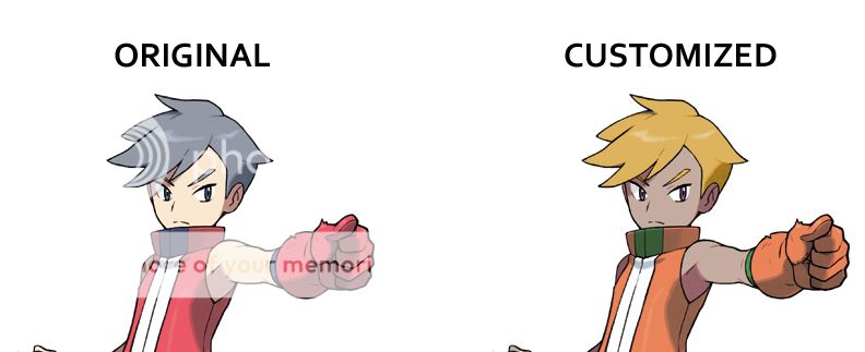
  • What character you want for your card (right now, the most I can do for request customizations is changing the color of hair, eyes, skin, and clothes on Photoshop)
  • What two colors you want for your card's color scheme (like how mine's red & blue)
  • Which regional badges you want (Kanto-Kalos) and how many
  • Main team pokémon (1-6 max)
  • Reserve pokémon (max 24)
EDIT: Here's example of what I can do as far as trainer customization
Example.jpg

As you can see, the most I'm doing for requests is taking any existing character artwork from the games and change the color of their hair, skin, eyes, &/or clothes
 
Last edited:
Top