• Welcome back to Pokécharms! We've recently launched a new site and upgraded forums, so there may be a few teething issues as everything settles in. Please see our Relaunch FAQs for more information.

Phanes' Signature Collection

I figured it'd be cool to be able to share my work lately, I've become a bit proud of them even though some are kinda low grade.
Let me know what you think, if you wish for me to try a pokemon signature for you in this style, I'm all up for it!

Camerupt
cameruptsiggy.png


Xatu
xatusiggy.png


Sableye
sableyesig.png


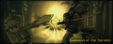
Triforce Guardians
triforcesiggy.png


Charmander
charmandersiggy.png


White Power Ranger
whiterangersiggy.png


Elemental Reploids
elementalreploids1.png


SSIV Juri
jurisiggy.png
 
Here's some more, hope you guys like them, C+C?
Some obvious...
hippowdonsiggy.png

ivysaursiggy.png

laironsiggy.png

squirtle.png


A Signature request by friends of mine:
cassidysiggy.png

emongasiggy.png


Tri-Power
Trio2.png


Valentine's Day
valentinebb9.png
 
Y0! I'm gonna give you my run around on these sigs! But be warned, I am going to be a harder critic than I usually am.

Alright, for this, I'm just gonna give you the run around about my favorite and least favorite one to keep it short. If you want a more detailed one on all of your sigs, just let me know. :-) My favorite one is the one that says "Love, Dreams, and Happiness". To me, it looks like it didn't take a lot of effort, but hey, if I fits and you like it, then it isn't my say. I like how it fits together as the pop culture background and a Pokemon vector. The colors don't exactly match but it looks good. Something else I noticed is those black "sparkles" to the right of the sig. They don't exactly fit into the whole scheme of the sig and they threw it off for me. Also, about the text on it. It looks like you lowered the opacity of the typography then added an outline. Of course, depending on the style of the sig, doing that with the text can look very nice but in this case, not to me. You could try to put the text in sort of a colorful base in bold letters that fit into the sig. Also, the text is a bit too obvious. You are trying to draw focus to your focal/render, not the letters.

2/5 for creativity.

My least favorite of them all is the Camarupt sig. Again, your text is way too bold and obvious. Also, the Camarupt is supposed to be the focal point of the sig, right? If I'm wrong about that then, please, let me know. Anyway, it is way too faded. It needs to be out there and sharpened, not in the background and faded. Maybe you could form the backgound images arounf him and sharpen him a bit to draw a bit more focus.

2/5...

I also noticed something about most of your sigs. They look like all you did is make a sild color layer, slap a brush on top of that, and then pop on a render. Although it looks pretty good with the Ivysaur one, it doesn't work for most. (Also, the text on the Ivysaur one is WAY to obvious.) It could also help you to learn how to use C4Ds and other effects.

Again, this is just my opinion. Let me know if you disagree with any of it. Hope I didn't offend anyone. :-)
 
Last edited by a moderator:
You didn't offend me, criticism is to help people regardless in how they word it.
I was hoping to make a brush but couldn't figure out how to make one (such as the Rocket R for Cassidy), the text I used was Hobo which is cartoonish, but if there's requested fonts you could tell me to download, I'm all up for it.
 
And of course, my latest piece, I think it came out a lot better than the others, problem is I couldn't figure out what to put in that blank space on the right. I tried the kingdom hearts logo, didn't look so well in this, I tried out the enhanced view of his face like some people do and that just didn't come out right.
oswaldsignature.png


Edit: Two latest ones, I was still wanting to shuffle around what Larvitar were to say, but for now, his name will do.
darkmagiciangirlsignatu.png


larvitar.png
 
I really like most of the work you've got on display here, my favorite one has got to be the Porygon-Z one, the effect on that is amazing, I love it~
From what I've read on the first post, I'm guessing you're taking requests?
If so, then I would like to request a signature;
Since you can do sigs that are out of the anime category, I would like a signature with Hayley Williams on it, and could the text say 'Paramore Fan' on it~ the colour and text font are completely up to you, whatever looks nice of course ^^
 
Alright, I gotcha, lately the internet has been down for me (yeah, for months, go figure), my apologies for bumping but I found a few good images that I'd like to work with and experiment.
paramoresignature.jpg
 
Got more work up for everyone to check out, please C+C

Elgyem
elgyembanner.jpg


Bianca/Bel
biancasiggy.jpg


King Dedede (remade)
kingdedede.jpg


Phanes
phanessignature.jpg


Bowser Jr
bowserjrsiggy.jpg


K. K.
kksiggy.jpg
 
Hi there! ^_^

I'm not very familiar with graphics like these, so my comments may sound kinda foreign. XP But here's my two cents.

I love this one:
oswaldsignature.png
The colors all go together, and it's simple but complex at the same time! Does that make any sense? XD The absence of text is good.

I don't like that the texture cover its face. It makes it seem blurry and unfocused, and it bothers the eyes just a bit.

Keep it up! Bye. ^_^

-Jeenso
 
Top