• Welcome back to Pokécharms! We've recently launched a new site and upgraded forums, so there may be a few teething issues as everything settles in. Please see our Relaunch FAQs for more information.

PokeKid's Advance Battle Frontier gallery

So after a few weeks of seeing all of the sprite work done here, i thought I'd take a wack at it, now i know most of what you will see here are recolors but im only asking for feedback so i can get better at this, so please tell me what you think. please post on what you think

Tai1.png
sora2.png
rebecaa.png
Matt.png
izzy.png
finalmax.png
cindy.png
ariel1.png

first up we have the Advance Battle Frontier Brains Sprites (above)
battlestationpeon.png

next we have some of the many diffrent type of battle station peons, (Trainer J did one for me, not included here, and i loved it so much i was inspierd to make this bunch,max is also included)
battle.png

here is a Vs Scene
and last but not least...here is the map for the battle station!!
BattleStation2.png

wait no thats not last here are all of the brains with mugshots and symbols
advance.png

and here is the advance frontier pass
frontierpass2.png
max1.png

and last my own try at the male black and white trainer
there is remakes on page two
 
Last edited by a moderator:
A

Anonymous

I think they are.....AWESOME! ;D All the sprites seemed to look...well COOL! I think you did a really good job I cant explain how good it is but its just amazing I think you did the best on the battle brains too.
 
Last edited by a moderator:

Rex

Resident Furry
Alright, lets start at the top, and work our way down, shall we?

Your trainers generally lack Shading. It's a very hard thing to get used to, I know, but it's probably one of the most important thing you can learn about spriting. Sprites, by default, REQUIRE Shading to look right, unlike general art. Thankfully for all of us, Tun was kind enough to make a tutorial on Trainer Sprites, which includes tips on shading. You should probably give it a read.

I've also noticed that you outline things a little too harshly. Try to let up on the black a bit, use darker colors that are a bit more similar to the one you're outlining instead. This is also a problem I had when I first started spriting, so I know that if you keep trying, you'll eventually get it. I'd also try to modify them a little more, I can see two that look like Recolors, and while one or two every so often are acceptable, you shouldn't let them take over your thread.

You're VS shot is very good, but you should probably move Max's mugshot down a bit so that it doesn't look like it's just floating there. Also, the thing on Max's hand could probably stand to be straightened out a bit.

As for your map, I can see where you simply cropped an overworld sprite from another screen and just plopped it down on your own map. Some quick work with the Eraser and Pencil Tools could fix that up for you. I'd also suggest removing the escalator from the Pokemon League Pokemon Center/Mart Map, since it doesn't go anywhere. Nearly all of the Maps could also stand for a bit more modification, to make them more original you see.

For your Mugshots, I again suggest more modification, three of them actually look like simple recolors. Overall, the Symbols themselves look alright, though Cinderella's Fist has one too many fingers for a normal human. Ariel's could also use a few touch ups on the fish and flora, and the wave probably shouldn't be so large. It actually looks like there should be a storm going over, for a wave that size.

Your pass is too blurry to make out, but from what I can tell, you've used Emerald's Battle Frontier for your own model. Again, I suggest more modification, so it isn't as blatant a copy. None of your Symbols look like their more blown up versions either, with the possible exception of the star.

Finally, your Fan Sprites of Black. Once again, I suggest more shading, and a bit less use of the color black. Also, the hat's visor could do with some lengthening, as it isn't very apparent that it actually is a baseball cap-esc. hat and not a Ski cap.

At the time, this is all the advice I can give you. Your sprites overall can use some work, but we're all improving here, and with some practice, you'll surely get better.
 
Okay My Two first words of wisdom would be
Smooth Lines.

Right now your have lines that continue from each other creating right angles in your sprites Which can be seen on Ariels hair.

Also Your Are Using the EVIL MS PAINT DEFAULT COLOURS! Those colours hurt my eyes. You should expermient and find your own colours or even take colours from other sprites, that is what do occasionally. But I usually spend at the least, 20 minutes finding colours. Tha Map Could use some work. It seems unfinished and the floor tiles clash horribly.

BIGGEST ISSUE: Shading, shading, shading. Remeber to shade your sprites appropriately. Your sprite lack shading on the hair and clothes as well as the skin on some of them. Also If you are feeling afraid of mixing and editing on your Mugshots. Do what I do...

Copy and paste the current version of your Mugshot after a substantial edit and put it out of the way. That way if you mess up you have a replica of the sprite before something went wrong.

Finally I would suggest that you learn how to tranprent your sprite as it makes the presentation nicer on forums. But that is simple using easy programs like GIMP.

Good Luck and I hope that You will contue spriting so you can become better. Remeber that all sprtiers started at the beggining. Even the best.
 
Last edited by a moderator:
Honestly, shade. Please. It hurts my eyes.

But overall, I love the idea, and the name Max Masters is awesome.

A map like that and trainers such as those would look absolutely fantastic with some work, and I'd reccommend to keep trying and keep improving (and even if you think you're not, you are. By spriting alone, you are improving) and soon enough, a revamped version of what you just posted would be absolutely fantastic.

Keep up the ideas, and keep spriting, boy. I was worse when I started.
 
thanks Rex, windsaver and anitisocal,
and antisocal the name Max Masters came from two things one the villain in jumpstarts educatinal spy game Spy Masters, was named max masters
and secound (excusse my spelling) his full name is :Maximillion Maxwell Masters, intials are MMM
 
The main peice of advice I can give you is that you have to start shading your sprites. Simply take a darker color from the same "family" from the color on the sprite and use that to shade. If you want you can use my trick and place an object/draw a light source next to your sprite so you can think of where it would be lit/shaded. Overall you have great ideas but just need a bit more detailing and "fleshing" out for your sprites.

Another thing to add would be to have more definate outlines on your sprites. Some dark color to border them. That plus shading should make you a pretty darn good spriter. I like the spacey look on the Frontier Brains, they have pretty snazzy outfits.
 
the ones with the outer space outfits are the trainers you would meet at the battle station the frointer brains are the first set above the caption
 
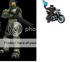
Now i know the title of my gallery is Battle Frontier sprites, but with all the feedback i got so far i decided to use it and try a sprite of master cheif from Halo, useing the feedback i have recevied. now i still want feedback on my other sprites on this page, but tell me what you think about this new sprite!

mastercheif.png
 
A very nice display of details here. Your getting better at this! Shading could be a bit more pronounced near the major joints but overall its looking pretty good.
 
That is a great job, while taking negative feedback in your stride boy. I am very impressed. Keep spriting like that and you'll be none the wiser.

Defenitely, defenitely an ipmrovement and I commend you for using the advice. Very impressive, boy!
 
PokeKid has done it again! After takeing in windsavers advice on presentation, i decided to reamp my halo master cheif sprite and gave it a nice backround based of the colors of the halo 3 game cover! please comment!

1mastercheif.png
 
Looking good the shading looks better here. the gun is actually pretty well done too with a nice amount of details.

Well done.
 
thanks:) i starting to get a lot better at spriteing and shading, expect more new sprites in the future everyone and expect remakes/reshading of my old ones!
thanks again guys, a little more and i might start my own shop soon!


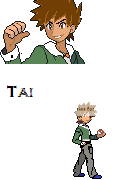
edit: here is the first of the recolors and shading of the advance frontier brains, first off straight from digimon session 1 and 2, battle ruins prince
Tai!
tai3.png


tell me how it looks now! also i used the colors from the anime phto of him from digimon session 2

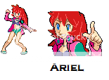
Edit again: Pokekid's on a roll today! i just finshed Recoloring and rediting my Ariel sprite! now she looks more like the disney little mermaid now!
ariel3.png

enjoy
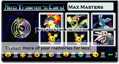
edit again again: sorry for the so many edits but i started on trainer cards now! well i did make one for my sig, i found 6 blank trainer card templates online and i used gimp and made a trainer card for max masters in my sig! the sprite i used for this one and my sig are difrent, the one in my sig was made by trainer j and he said i could use it for that card, but the one in this one is the new max sprite i made
so enjoy!
FinalTrainercard3.png
 
Last edited by a moderator:
Top