... wow. The sprites could do with at least some work.
First off, the trainers. They're okay, except the heads looks a bit messy, blurry, unclear... something along those lines. The guitar and the hat, along with his right arm (our left), could do with shading, compared to the legs. But it seems as if I've seen those legs somewhere else... might be just me. The second person's hair could do with some work. It looks like part of his head was suddenly chopped off. Meaning, it's not rounded at the top like a head should be, if you get what I mean. Too little hair even for a male.
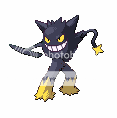
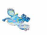
Now onto the splices. I can tell you did try, but it really does look like randome copy-paste of one Pokemon's parts onto another Pokemon that's the base. You just took away some of the Pokemon's outlines to make the parts look connected. No, maybe you could try some more when you're splicing. And the recoloring. The fourth one down looks like a plain recolor to me, with a new beak. I'm pretty sure a recoloring is a no-no here. And I can still see some red on from the Electrode base on the third one down.
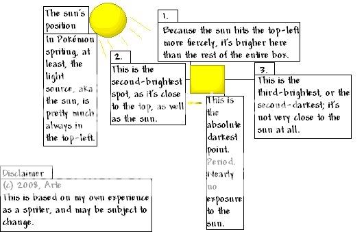
Also, shading. You're doing better here than I do in some aspects, but you need a consistent light source. Usually in DP sprites the light source is in the upper left hand corner. Here's a pretty good way to show what I mean, a diagram made by trusty ol' Arte.
Hope this helps. And as for a request... meh, try making a good splice of Raichu and Frosslass. Trying to make you work a bit here. ;P
 this is the hero
 this is the rival