• Welcome back to Pokécharms! We've recently launched a new site and upgraded forums, so there may be a few teething issues as everything settles in. Please see our Relaunch FAQs for more information.

Red's GIMP Thread: Now Taking Requests

Sir Red

Charms' Caped Crusader
So yeah, whilst 'Charms was done I learnt how to make sigs in GIMP. Seeing as I've only been doing this for just over a week, I'm obviously far from good right now. I'm really just testing out various things and am starting to use various tutorials to learn different styles and techniques and such.

New Rule: You must have at least fifty(50) posts to request a sig. I want to make these for folks who will actually use them/be around. (Exceptions will be made if I feel so, but that is only for folks who have been around for a long time but just don't post much.)

Anywho, here's what I've made thus far in order of their creation:

RukiaIchigoSig.png


EgyptianMageSig.png


OathkeeperSig.png


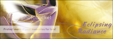
EclipsingRadianceSig.png


ViviSig.png


ShockwaveSig.png


DSsig.png


Nightwing.png


BatmanAvy.png


KnowledgeIsPowersig.png


Axelsig2.png


ShanderaaSig.png


ChaosTheory.png


ThorSig.png


BiancaBarrySig.png


Ho-ohSig.png


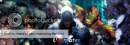
UltimatesSig.png


FlawlessNirvana.png


ForJustice.png


RedRobinSig.png


Requests:

Format:
Subject/Stock: (Helpful if you provide me with the image(s) yourself, but not mandatory)
Background: (Color or what not *shrugs*)
Theme: (If you want a centralized theme or feel of the sig)
Text: (If you have a specific font in mind, let me know)
Anything Else: (Anything else you want)

Request List
1) Louie Forest
2) Nim
3) dafg

A note: If the request list is full, all new requests will be ignored. Please, just look and see if there are spots open before requesting.

Constructive criticism and comments are very much appreciated. -^^-
 
Re: Red's GIMP Thread

I gave your thread a nice look-through, and you're definitely on your way as a Signature Maker. If nothing else, your backgrounds are amazing in general. Though you do tend to clutter up your signatures a bit. I know that sometimes you can see issues with earlier signatures and be like "MAN THAT DOESN'T HELP NOW", but it can be a thing to keep looking for.

One of the bigger issues that I can point out is your lack of focus. When you made your newer signatures, you sat down and started to make them, but you never stopped adding layers. I haven't the foggiest who the character in the last signature is, but it seems to be cluttered over by the foggy overlay on top of it. The same with the Bleach Sig before it. I can see that you're trying to force the picture into a more subdued look, and I can understand that, but at the same time you have to come to terms with the fact that (And this is something I'm still struggling with) the pictures in Signatures is more important than the actual text.

However, you're doing great things and I hope you choose to continue your work!
 
Last edited by a moderator:

Sir Red

Charms' Caped Crusader
Re: Red's GIMP Thread

I got to admit, I was overjoyed when I saw that one of my signature making idols posted in my thread. :3

I've noticed that myself that I tend to go a bit crazy with the brushes sometimes, but I just have too much fun with it at the time and then don't really notice it till later. Overly clutterliness is something I'll have to watch for in the future.

As for the last two, I was following a tutorial that I found on Deviantart (well, as best as I could). Mine didn't come out really anywhere near as good as the one in the tutorial, but the good thing about it was that I was able pick up a few new things from it. (Also, it's Rukia, again, in the last sig... I just found too many good stocks with her in them. >>;; )

Thank you very much for the for the tips and comments, Kal, twas very much appreciated. -^^-

Edit: I made two variations of a sig last night. Here they are:

SoraKeybladeSig.png


SoraKeybladeSig2.png
 
Re: Red's GIMP Thread

I'm gonna say that I like the bottom signature more, but they're both very well done. I like the bottom more because it isn't over-layered with that filter on top of it. Something that you could do, however, would be to take that filter, place it over the top of Sora and his background, and then erase the bits over the top of Sora with the Sparks brush. It's a little trick I learned from LoN a while back. :3 Erasing the bits of layers you don't like is instrumental in making good signatures. It sounds dumb, but it does wonders.
 
Last edited by a moderator:

Sir Red

Charms' Caped Crusader
Re: Red's GIMP Thread

Thank you very much for the tip, kind sir. Also, thank you for the comments once more. Your posts are helping me quite a bit in more ways then one.

I'm not sure if I downloaded the Sparks brush... unless it comes as a default and I didn't see it... >>;;
 

Sir Red

Charms' Caped Crusader
Re: Red's GIMP Thread

Made another sig. This one I did as Kal suggested and erased some stuff that looked bad and I actually quite like the way it turned out.

EgyptianMageSig.png


I wonder how long I'll be able to keep up this pace of sig making...

Anyways, C & C appreciated.
 
Re: Red's GIMP Thread

Dusknoir banner looks great, but they are all very impressive! :p
 
Last edited by a moderator:

Sir Red

Charms' Caped Crusader
Got a new sig to post here, tried something a bit different with the background and I kinda liked the way it turned out:

OathkeeperSig.png


Also, I've now decided to start taking on requests. So, if you desire a signature then come on by. I'll whip you one up lickity split. -^^-

Request format and request list can be found at the bottom of the first post, please look at them before requesting, otherwise your request will not be accepted.
 
D'awwww.

It's so cute :'D

Random thought- Have you ever tried just using a solid border?

Select -> Select All

Edit -> Stroke Selection 1px Solid

It might look good on some of these. I do like your little tinted-glass picture-frame border thing you've got going on, but experiment with plain borders. Sometimes it can keep all the focus on the picture, as opposed to the flashyflashflash border.

Also I'll make sure to request one of your sigs later. :3
 
Last edited by a moderator:

Sir Red

Charms' Caped Crusader
I frelling love you Kal. Thank you for the continued advice and tips. 'Sreally helping me a whole bunch. :3

And I've been meaning to try out some different borders and such, so I'll do it on my next one. -^^-
 
I FEEL THE LOVE MAN.

-Fist bump-

Also; It's no problem, dude. I'm just trying to sling you some advice when I can. When you start getting ARTSY, I'll get you some more fancy tips and tricks.
 
Last edited by a moderator:
Hey can I give thy first request? Anyway...
Background:purple green and black swirl
Theme: Darkness, Espeon and Umbreon for the pokemon
Text:parchment, if not, anything cool
THanks!
 
HEY, bitchcakes ~ <3333

These are pretty damned awesome. 8D
I especially like the Drifblim, Froslass (herp derp, trust me ~ xD), Keyblade and Oathkeeper ones. :> I think all of your sigs flow really well, but some of them look as if you need to ... I don't know, spice them up a bit? xP (ignore me, I have no idea about making sigs xD)

I've been requesting a lot of sigs lately, so why not request from yooouuu ~ ♥

Subject/Stock:
308i1hj.jpg
[drawn by me 8D] Preferably placed on the left ~
Background: Uhh ... swirly blue? Purple? xD I dunno, anything that suits. :>
Theme: Sort of, like ... demented love, I guess. |D;
Text: "Je veux ton amour
Et je veux ta revanch
Je veux ton amour ~" In something fancy. (and purple 8D)
Anything Else: what no that's not a Lady GaGa quote >_> <_<

Looking forward to see the above and anything else you have got to show in the future ~ ♥
 

Sir Red

Charms' Caped Crusader
Yeah, sure thing Tun. This'll be a bit interesting, but we shall see how it turns out. :3

Also, I'm not that big of a fan of my Froslass one... background is icky in my opinion... But thanks for the comments and advice. -^^-
 
Hey Red! I have some stuffz to say. 8D

First, you have some skillz. :p

I don't really have too much to say advice-wise because Kal already said it. You have already started doing this I see, but I also recommend the erasing of some parts of effects so the focal point is more...well the focus of the signature. It makes it stand out against the rest of the sig and makes it look all nicelike. You have been doing that well, I just wanted to voice my opinion about it too. ^^;

Keep siggin!
 

Sir Red

Charms' Caped Crusader
Updates time~!! I finished both requests and here they are (if there's anything wrong with them, just let me know and I can fix/redo them):

I love Eevee!:
FearTheTwinsSig.png


I was actually happier with this when I finished then I originally thought I would be, so that's always a good thing. :p

Tun:
TunSig.png


I liked this sig, right up until the text... sorry about it... If you want, I can see what I can do about making it better. It's just that sigs are easier to do with less text. =\

Anyways~, I was in the process of making a sig that I really liked and all I had left to do was a border and text, but GIMP felt it would be cooler to go ahead and crash before I could save anything. >_< *is gonna try again on that sig tomorrow, albeit a bit disheartedly*

Also, thank you for the comments and advice Blisk. -^^- Thanks for taking the time to check out my work. :3
 
RedRising said:
Tun:
TunSig.png


I liked this sig, right up until the text... sorry about it... If you want, I can see what I can do about making it better. It's just that sigs are easier to do with less text. =\
HOLY GNARGH, RED

ILU/IT <333

I actually quite like the text. :> It fits nicely, and I'm sorry for giving three lines of text D: ... gawd, it's so pretty ~ ♥ I especially LOVE the blue and purple effects in the background. They look all nice and swirly and circley and wheeeee ~ ♥

(Btw: I'm going to use the sigs I've requested so that for one week, I use Kal's, the next week I use Toastie's, the third week I use yours, the fourth week I use Blisk's and it'll just go on in a weird cycle 'nd suff ♥)
 
The borders on your new sigs fit really well, Red! They're a little on the thicker side, but that fits them really well!

You did really well with the massive amounts of text on Tunduli's sig, though the text does look bland. :x

Try looking up a tutorial on it or something. Tutorials always help me when I'm stuck :'D
 
Last edited by a moderator:
I agree on the borders - much better! For the text, even just doing an outline of black around the text makes it look better in some cases. It will make it stand out more if it's hard to see. :D
 

Sir Red

Charms' Caped Crusader
How exactly would I go about doing that? :3 That would be something very helpful to have in my back pocket.
 
First right click the layer that has the text and click 'Alpha to Selection'.

userbar13ts4.png


Then create a new layer under the text layer. Click Select>Grow and select 1 px. Fill in the area with a bucket or brush with black.

Voila! If you did this right, you should have an outline around the text. ;D

(Thought the image might be helpful. XD )
 

Sir Red

Charms' Caped Crusader
Ah, very nice. Thank you very much, Blisk. Gonna try that in my next sig. :3 *loves people for being so helpful*

Edit: Two sigs that I made over the last two days. Not really sure how I feel about either of them, but decided to upload them anyways.

HitsugayaSig.png


EclipsingRadianceSig.png
 
... Eff.

That Espeon one is amazing.

REALLY amazing. Like srsface. It has flow and art and glow and lighting and ahhhhh~

Great work mang. Keep it up 8D
 
Last edited by a moderator:
Not bad at all the only tip id give you that is more technical and not affecting your creativity much would be to use more distinct colors for your text. You often pick a color that is in the background directly behind it which makes it hard to read. Outlines around the text help alot with that too.
 

Sir Red

Charms' Caped Crusader
Your praise of my Espeon sig may be a bit hasty there Kal. I tried using a stock on that one as opposed to a render, so as a result the background was already there. >>;;

Although I did have to create render of the Espeon from it myself to create the blur and such, and I also smudged and blurred around, followed by some brushing here and there.

Also~, thanks for the comments and tips Jeydis. :3 Also, I usually try and rip the colors for the brushes and font from the render I'm using, so same colors being on top of another often come as a result of that. I'll try not to do it in the future as much.
 
RedRising said:
Your praise of my Espeon sig may be a bit hasty there Kal. I tried using a stock on that one as opposed to a render, so as a result the background was already there. >>;;

Although I did have to create render of the Espeon from it myself to create the blur and such, and I also smudged and blurred around, followed by some brushing here and there.

Also~, thanks for the comments and tips Jeydis. :3 Also, I usually try and rip the colors for the brushes and font from the render I'm using, so same colors being on top of another often come as a result of that. I'll try not to do it in the future as much.
Keep in mind that I dont mean taking a color thats really diffrent, just a couple tones darker usually does it.
 

Sir Red

Charms' Caped Crusader
So after doing that Espeon sig I decided to try out doing a sig with a stock and absolutely no renders. It felt a bit not really brushing about a background, though. I like some parts of it, but I'm not really sure about this one. =\

BatmanSig.png
 

Magpie

Feathered Overseer
Staff member
Moderator
Oh look, pretty signatures~

That Espeon one you've done recently is so beautiful! You've picked an awesome picture and colour combination. I really love how the background seems to flow in the direction the Espeon is facing. Great stuff. I also like the sig you've just done. The composition is nicely done and it looks rather nice~

Anyway ~ awesome signatures, Red. I shall have to visit more often :D
 

Sir Red

Charms' Caped Crusader
Thank you very much, Magpie. :3

I made a new signature for myself, I used some of one of LoN's tutorials for it. I would have followed it completely, but whenever I tried to my computer would die on me for some reason. So instead I used some of the techniques that I picked up from LoN's tut and tried to use them in this sig.

ViviSig.png
 
RedRising said:
I made a new signature for myself, I used some of one of LoN's tutorials for it. I would have followed it completely, but whenever I tried to my computer would die on me for some reason. So instead I used some of the techniques that I picked up from LoN's tut and tried to use them in this sig.
Thats always the best way to use tuts, Red :) Take what you like from it and put your own spin on things. If you dislike a step, ignore it. Things like that.

This is a really nice one too ^^ I like it.

I'd try to watch out when you're using the displace filter, though. It can leave some nasty sharp edges, like on the top left corner. Thats personally what I'd move to erase. You're really improving, though, and its great to see :) Keep it up!
 
You've done fantastic on your art, Oniisan. I especially liked your Eclipsing Radiance signature, as well. (Out of curiosity, are we still doing it providing we stay in touch? I would be looking forward to it.) Other than that, my other favorites are:

Egyptian Mage
Fear the Twins
The vulpix
(And)
RedRising of the Dark Knight
 

Sir Red

Charms' Caped Crusader
So I was using GIMP earlier to make the background of a sprite transparent so that I could put it on the Wiki when I suddenly was struck by the urge to make a new sig. This was mainly me just messing around with stuff, seeing as this is the first time I've made anything on GIMP in a month. There are certain things I like about this sig, and various things that I don't. Anywho~, here's the sig that I made (go-go thread revival~!):

ShadowSig.png
 
I was wondering where your thread had disappeared to! Good to have you back, Red. ♥

I shall be keeping tabs on you just as I have in the past :)
 

Sir Red

Charms' Caped Crusader
So I decided to more or less revive this thread, seeing as I randomly felt like making a sig. X3

Anyways, I'll also post my past entries in the Sig of the Week Contest.

ShockwaveSig.png


I actually one with this one. :V And despite a few things, I'm quite proud of how it turned out. :3

DSsig.png


Tried something new here...didn't turn out so well... >>;;

And these I made tonight for myself. :3

Nightwing.png


BatmanAvy.png


The two Batmen. The original Dynamic Duo in all their glory. :V
[me=Sir Red]fangasms all over the place[/me]

Anyways~, I guess I'm still kinda taking requests...yeah. :'D
 
Yay, the shop is back open! Your sigs are really good! I love the bubble effect on Buizel! May I make the first request?


Subject/Stock: Put the first picture at the bottom (Under the text), the second on the bottom right of the sig, and the third picture at the bottom left. (Links at the end of request. Make Miltank face the right.)
Background: May I have red, purple, green and brown leaves for the background, please.
Theme: Nature
Text: Put 'Knowledge Is Power' in the middle, in electric green.
Anything Else: On the left of the text, put a brown dice with elements on it instead of dots. Also put a purple flower at the top right.

1. http://i253.photobucket.com/albums/hh58 ... amshot.png
2.
53.png

3. Please can you get the shiny Miltank picture? (HG/SS sprite) I cant find one.

Thanks, your sprites rock!
Happy Halloween! :3
 
Last edited by a moderator:
Glad to see you're back Red, you haven't lost your touch either :)

I wish you luck with that request there, also :o
 
Top