I've started this thread as a central place for minor showcases regarding the upcoming relaunch that aren't major enough to deserve their own news entry. This is also a great place for people to share their feedback on what's been shown so far, and offer suggestions as to what they'd like to see on the new site - even if it's something completely unrelated to what has been shown 
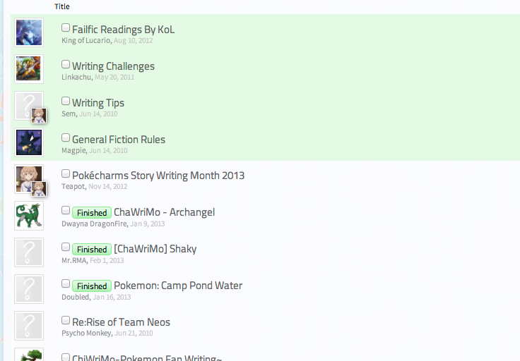
First up, a partial look at a forum listing - this is half a shot from the General Writings forum:

You can see a few new things here - firstly, and most interestingly, there's something we call thread prefixes: they're a way for users to categorise threads. Right now we're mostly using them for the RP and writing boards.
Essentially, we're removing the Writing Archive forum and moving completed writings back into the main forum. When a writing is considered "finished", a user can add the [Finished] prefix themselves to mark it as such, instead of needing to ask the staff to move it. You can click on the prefixes to find all threads with that prefix - so if you just wanted to read finished fiction, you could click on the Finished tag and it would filter the list down to only finished works.
The other thing worth noting is the thread icons aren't there anymore - they've been replaced with a small, square version of the original poster's avatar. What's particularly useful is that threads you have posted in are marked in the bottom corner of the icon by your avatar - you can see from the screenshot that I have posted in Writing Tips and the ChaWriMo thread.
I'll be showing more as time goes on - what do you all think of what you've seen so far? I'm curious to hear opinions on both the thread prefixes listed here and the stuff I've already shown at http://chr.ms/comingsoon.

First up, a partial look at a forum listing - this is half a shot from the General Writings forum:

You can see a few new things here - firstly, and most interestingly, there's something we call thread prefixes: they're a way for users to categorise threads. Right now we're mostly using them for the RP and writing boards.
Essentially, we're removing the Writing Archive forum and moving completed writings back into the main forum. When a writing is considered "finished", a user can add the [Finished] prefix themselves to mark it as such, instead of needing to ask the staff to move it. You can click on the prefixes to find all threads with that prefix - so if you just wanted to read finished fiction, you could click on the Finished tag and it would filter the list down to only finished works.
The other thing worth noting is the thread icons aren't there anymore - they've been replaced with a small, square version of the original poster's avatar. What's particularly useful is that threads you have posted in are marked in the bottom corner of the icon by your avatar - you can see from the screenshot that I have posted in Writing Tips and the ChaWriMo thread.
I'll be showing more as time goes on - what do you all think of what you've seen so far? I'm curious to hear opinions on both the thread prefixes listed here and the stuff I've already shown at http://chr.ms/comingsoon.

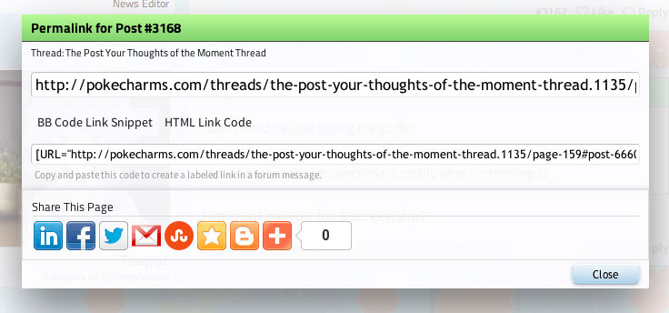
 brings up a box that lets you link directly to an individual post, or share it:
