• Welcome back to Pokécharms! We've recently launched a new site and upgraded forums, so there may be a few teething issues as everything settles in. Please see our Relaunch FAQs for more information.

Snapdragon's Scribbles

Little secret: I hate coloring and shading, so I kind of monstrously suck at them. XD Ditto on backgrounds, in case the blatant lack of them hasn't clued you in to that.

Anyway... I may not have Opencanvas anymore, but I'm not dead!

Hooray, it's Panzer.
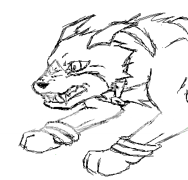
panzergross.png

Yaaay, more uncolored lineart! Gee, Snapdragon, you're not lazy at all.
This was me practicing canine facial expressions. I'm not very good at them, as you can see.
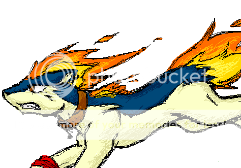
Andante.png

Hooray, it's Andante.
The lineart on this makes me cringe. Seriously, look at how gross.
More canine anatomy practice, along with an attempt at a dynamic pose.
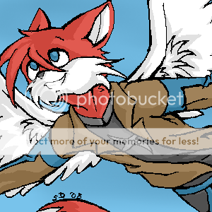
jetplasmafanart.png

Ugh.
I don't like drawing "Sonic style," I'm not too big on furries, and I hate random bird wings slapped onto mammals.
All the same, this was a request, so yeah.
He's far too skinny, his jacket could use more shading, and yeah that background sucks.
But this was more about lineart than anything for me. See? I don't always draw like I'm having a grand mal seizure.
 
Nice. The pose again looks better than you think :) (on all 3)
Panzer looking very angry. I'm assuming someone took his cookie? xD The quilava looks good too.

You know, It annoys me that you can admittedly draw something you hate and say it looks rubbish. Cus its still better than anything I could ever do @-@

;D

Seriously, you do gooood.

~Slink

PS Pixeity, I just got what you were saying. Yes. I am VERY slow.
 
Okay, I can see my oekaki skills fail to impress. Tough crowd. XD

The good news is that the internet is full of beautiful people who were willing to give me serial numbers for the most recent version of openCanvas. Which is much fancier than the obsolete version I was working with before, but should still do the trick for making my art less... ugh.

Thus, I present a farewell to oekaki images, and one final shipainter hurrah.
newo_nolines.png


It's my first attempt at lineless art and I didn't let myself use the blur tool, so be gentle.
 
All your artwork is fantastic. I think people dont realize thats Dragonite and not charizard in your one picture though because it's colored darker like a Charizard and the Antennae arent as prominent as they should be... they kinda just look like un-needed lines.
 
.:: - Wooper is so cute! I like Dragonite but it does look like a Charizard... Perhpas that's why I like it (I LOVE CHARIZARD!) - ::.


.:: - Zach - ::.
 
Snapdragon, your Oekaki skills rock.
I wish I had HALF the lineart talent that you have with Andante. That is one GORGEOUS Quilava. I wish it were my pokemon.
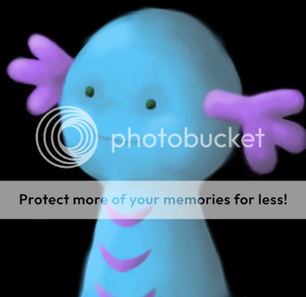
The Wooper is adorable, and all the art in this thread rocks and I haven't an inkling why I haven't complimented you yet. Great work!
 
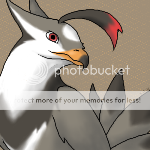
We Know you're not Dead Snap. The Staraptor looks gorgeous. And we all know you're great at drawing. Colouring and shading looks very detailed. But one question still remains....Why not a Swellow? :p Nice Job Snap!
 

Shiny Motley

2016 Singles Football
Why not a Swellow?

Because he wanted to annoy you, Jet.

Anyways, Snapz, that's one big bird you have there... What's its name again? Starapti? Hrm. *coughs* Another great work of art by Snapdragon...

I'm sooooooo one of your fans for life now.
 
I like it. Simple, but very eye catching.
I think an Oekaki zangoose would look really nice too *hint, hint*

*cough*

~Slink
 
[size=8pt]C8
-caws indignantly-

Staraptor's beak makes me happy.
The beak, the typical SPROING-y piece of feather/hair/dead cells often seen on anything and everything these days, and the 'I eet u nao' eye of red and staring.

The coloring is really soft and good on one's eyes as well.
Ahhhhhh~
:I[/size]
 
I absolutely love the Staraptor! It's my favorite normal/flying Pokemon. You made a fierce looking little sprite to a large picture of infinite adorableness! I couldn't help but go 'Awww...' when I saw it. After the 'Awwww...' is was 'That is so awesomely kick-butt cool!' the shading is really good, as it matches the light source exactly. (which I assume it is in the top left corner. Am I right?) My shading is not as good as yours, so I look at your topic and other peoples to help me.

I loveses the expression. It's just so awesomely adorable.

I know I just said 'awesome' a lot, but this is totally sha-weet!
 

baratron

Moderator of Elder Scrolls
Staff member
Moderator
The Exploding Metagross? Is Made Of Awesome.

See, I'd normally give constructive criticism, but these pictures are too good for that. I like the fire and the shading ;).
 
Top