• Welcome back to Pokécharms! We've recently launched a new site and upgraded forums, so there may be a few teething issues as everything settles in. Please see our Relaunch FAQs for more information.

Toru's Spriting Thread - Now taking requests but please read the rules!

Okay, a few of you may know this, but many of you will probably not know that from time to time, I sprite. Hence, this Topic. Here is just a few of my Fusion Sprites.

BRING ON THE SPRITES!

Darkrai+Charizard
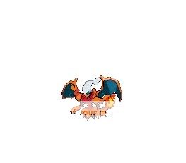
Darizard.jpg

A pretty good result in my opinion, however a bit iffy in some places.

Haunter+Vileplume
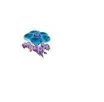
Hauntplume.jpg

Heheh, I gave this one a little colour negativity, but it didn't turn out quite well...

Riolu+Lanturn
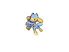
Rioturn.jpg

This one was out of boredom, But came out good.

Nosepass+Tangela
NosepassTangela.jpg

Blatantly for the lulz, and was actually a request from Tangrow...In the chatroom.

A Bublba Egg :D
BulbaEgg.jpg

My attempt at making a Bulbasaur egg, but was nothing compared to GPX's version >_<


Yes folks, Toru is taking sprite requests. Now now, calm down children, and form an orderly line, and be sure to read the rules below:

1. Please use this template when requesting a sprite:

Type of Sprite:(Fusion? Cosplay? Egg? e.t.c.)
Male or Female:(This will obviously not apply for some categories. If so, just put n/a here.)
Pokemon Used for Sprite:(This is self explanatory.)

2. I will state in the topic title whether I am taking requests or not. If you ask for a request while I am not, No sprite for you. EVER. Consider yourself banned from making a request.

3.I will state how long the sprite will take me, and when finished I will PM you the sprite.

4. Have fun!

Now, without further ado, let the requesting commence! :D
 

Magpie

Feathered Overseer
Staff member
Moderator
Just moved you over to the spriting forum, so that it's in the right place ^^

Haunter + Vileplume made me smile, I really like how his eyes fit with the 'hat'. Nose + Tangela is very good too, he's a good fusion XD

I'll look forward to seeing the sprites off your other PC ^^
 
Because you told me to.

w00t for MS Paint. That, and my mouse, are my only tools of trade, 'sides my judgment and all that jazz.

Anyhoo, might suggest that you move the sprite up to the left corner, 1 pixel from the left, top, right, and bottom, so that there isn't so much what space around them. It's a little distracting. you could do it so that the image is 80x80 as well, to show if it would fit into a regular battle area. Just a suggestion.

Now to the sprites. I think that your sprites are okay. I'm not very good at Pokemon fusions myself, so i can't give you any advice. Just that you seem to be pretty good at it, and that I would like to see you progress to using more sprites as you move along.

Great work, will be waiting to see more.
 
You still have room for improvement in your spriting endeavors. You have a nice start, and some Ok ideas, but there are some easy to fix flaws you could work on. You show potential though, and I'm sure with just a little bit of effort your sprites could really start to shine.

[quote author=Toru]
Darizard.jpg

[/quote]

This one has one major and noticeable problem. The image has been pixelated and messed up due to an issue with how you saved and or uploaded it. This problem seems to exist with all your sprites too. With sprites, you want to save in the ".png" format, or even .gif at least. These file types generally take up more room, but keep the sprite clean and neat. If you though have them as .jpeg, they get messy. What once was only one shade of color is now many. It makes it so pretty much every pixel is a different color.

So when saving a sprite, make sure you click the drag down box in the save window to select the right file type. You're looking for the thing that ends in ".png". A lot of the times if you save a sprite the wrong way even once, you may never be able to return to it's prior form. Also watch out how you upload it. If you use the wrong place or have the wrong options clicked, it may convert it to .jpg and mess it up.

Now beyond the whole file issue, I'll try my best to look at the other issues. This will be hard though since they are scrambled now.

The wing on the left seems cut off. There looks to be an orange line going bordering it too. It should be more like the other wing. The thing that would have to be done is that you'd have to do your own custom to make the wing complete. I understand though if you feel unready to do your own scratching though. If you are unwilling to move onto that type of stuff, you'll just probably have to pick the pieces you use more wisely.

The other issue I can see is on the right side. The shoulder, the flame, and the wing are overlapping each other I believe in a weird way. I can't tell though since they are all blending in. The shoulder though should be on top, the wing in the middle, and the flame in the far back.

[quote author=Toru]
Hauntplume.jpg

[/quote]

This guy is a cool concept. One issue though is how you did the negative swap. It looks cool, but the shading has been reversed, which is a problem The normal process for turning things to their negative colors is to reverse the palette, and then use that new palette to recolor the original. That way you can match light colors up with light colors, and dark with dark.

The body looks a tad squarish, and the hand on the right isn't glowing either.


[quote author=Toru]
BulbaEgg.jpg

[/quote]

The egg is ok, but the splotches I think could be a little bigger.

Just to some up, save as the proper type, and work on adding stuff on in a more clean fashion. Good luck.
 
I may also accept requests, but maybye later.

not a stupid username, I did state that I may accept requests, but right now I'm kind of busy. That is why I cannot currently accept your request. I apologize for the inconvinience.
 
Top