• Welcome back to Pokécharms! We've recently launched a new site and upgraded forums, so there may be a few teething issues as everything settles in. Please see our Relaunch FAQs for more information.

Fabulous Art

Yoshimitsu

Former Moderator
Shut up I'm cool.

I have no idea how often I'll post here.

I don't do requests or anything, I just want honest feedback and how to improve sort of comments, also what people like and dislike and stuff.

To kick things off:

Snapshot_20110513_1.jpg


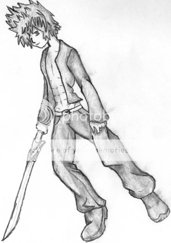
An adaptation of a Roxas picture, turned into my character, Yoshimitsu.

And also:

Snapshot_20110516.jpg


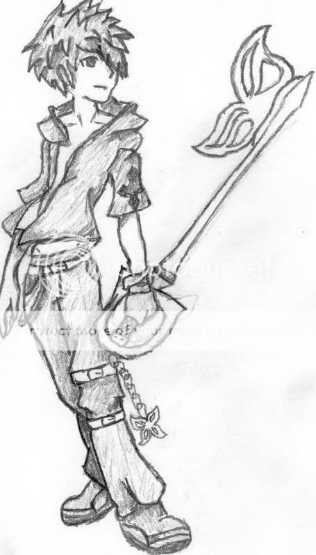
An adaptation of RX's latest artwork, who people have told me is me. I adapted the style, hair and keyblade as well as fashion to some degree while still keeping RX's art intact.
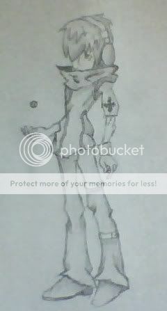
 
They both look great El, I like the adaptation of Roxas because you can still tell that it was based on him, but it's definitely got your own style in it. The same goes for the second picture, which I like a lot more to be honest ^^; I like the stance and the, I dunno how to phrase what I'm thinking so I'll just say feel of it. I'm pretty awful at drawing myself so "how to improve" comments won't be coming from me very often. But keep at it, I like it a lot.
 
I THINK IT LOOKS REALLY NICE EL. YOU SHOULD POST HERE A LOT MORE OFTEN. I'D UPDATE MY SPRITE THREAD BUT NOBODY COMMENTS ON IT.
 
Last edited by a moderator:
To me, the stance in the second picture looks very impossible with our physics. I can imagine a character leaning back that far falling down in a heartbeat.

On another note, I love the way you drew the clothes. They look simple, but the lines perfectly portray the wind flapping the material.
 
^ This :'D

Liking him so far. Now for a huge, complicated TWEWY battle scene :'D
*Indie is brick'd*
 

Linkachu

Hero of Pizza
Staff member
Administrator
Yoshimitsu said:
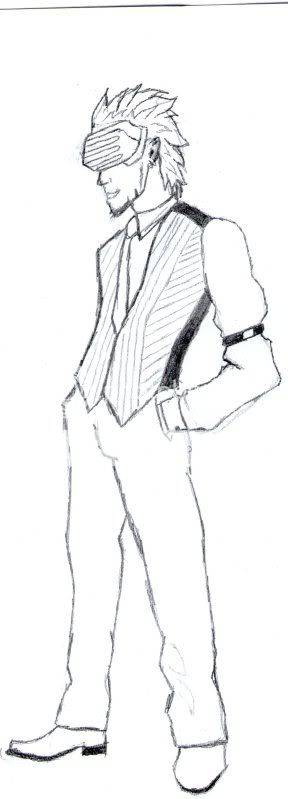
POSSIBLE CHARACTER?!

Make it so! >=o

Interesting clothing, but it makes me wonder what color scheme you'd use for this. ;D
I also ♥ the random headphones. They're fun.
 

Sem

The Last of the Snowmen
Former Administrator
I love this as well, and I also like the character you made out of him. I wanna RP with him |D
 
Last edited by a moderator:

Sem

The Last of the Snowmen
Former Administrator
The only thing I can really say for this is "badass" |D I love how Yoshi looks here, like he no longer has any regard for life and will sell me to slave traders for a quick buck.

Drawing-wise I really like the style and you've definitely improved. Nice job =D
 
Last edited by a moderator:

StellarWind Elsydeon

Armblades Ascendant
Staff member
Administrator
I've already said this over MSN, but you're certainly getting quite awesome at drawing. XD I can kinda see Secad's point about physics - but considering the fact that you're using a lot of Nomura material as refs/inspiration and the guy wouldn't know physics if they hit him in the face with the Emerald Weapon, yes. XD
 
Eh, I've never read (or even heard) of Nomura, but if it fits with the theme Yoshi's going for, it's not entirely bad.

A comment on the hands--they don't seem to have the skin folds in the fingers like the arms do. They look kind of like tentacles that way.
 

StellarWind Elsydeon

Armblades Ascendant
Staff member
Administrator
Secad: I refer to Tetsuya Nomura, the guy responsible for the character designs in both TWEWY and Kingdom Hearts. >>; Also, hands are an utter bitch. XD
 

Yoshimitsu

Former Moderator
Snapshot_20110730_1.jpg


The reason he doesn't have a head is because I saw a sword I liked, so I drew the sword. After that, I decided I wanted a hand to show the size of the sword, then drew the arm as well. At this point, I figured I may as well finish the drawing, but the location on the page made his head and shoulder disappear.
 

Shiny Motley

2016 Singles Football
Oooh, that explains it. XDDD

I likes it a lot, El. :o the clothes look so nice and stuffs, and the sword is just epic~ If I ever get a sword, that's the one I'm getting :3
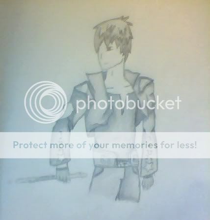
 
This guy is slick, I'll leave it at that.

I like the jacket and the pants especially, even though they both look like something you could get from a designer story, it even has their logo on the sleeves :X. Joke aside, I like the clothes.

The arm however, looks a little robotic to me. Probably because of the angles of the arm. The bicep bends at an angle, and the forearm just looks like it's hanging loose, like in the robot dance. It just looks like an odd angle to be holding a weapon from. I would suggest to either bend the forearm a bit, or lower the bicep a bit to bring the rest of the arm closer to the body. Either one will work wonders for the picture.

Edit: spoke to El, it's a flute actually. Do not get confused like I did :X
 

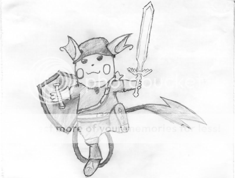
Linkachu

Hero of Pizza
Staff member
Administrator
Linkachuuuuu!~ ♥ *huggles it*

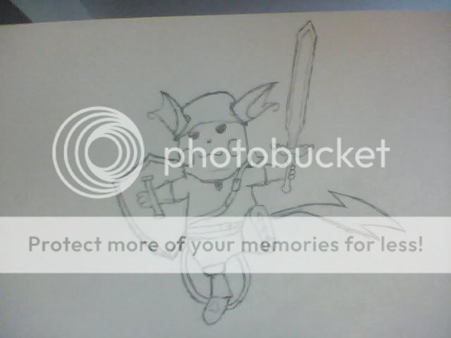
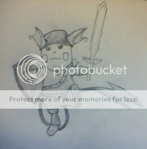
It's adorable, and I love how you decked Linkachu out in everything from the standard hat/sword/shield to the belts and boots.

I know you said this was a random pic, but thanks El. :3
 

Yoshimitsu

Former Moderator
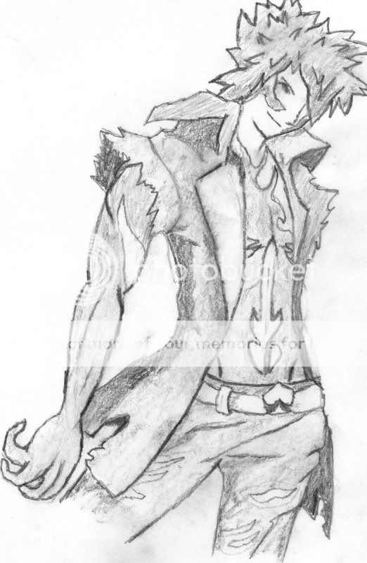
Snapshot_20110913_1.jpg


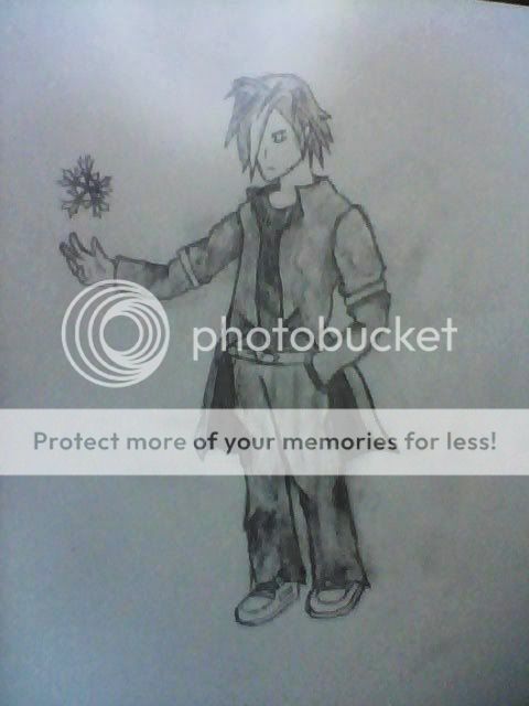
Shading experiment using a description of Sem's character as the basis. Not entirely keen on the posing or anything, but I adore the hair and the snowflake.
 

Sem

The Last of the Snowmen
Former Administrator
I adore everything. I love the coat and the hair is good. I like the pose as well and the shading looks pretty neat. ilu~
 

Shiny Motley

2016 Singles Football
Holy crud you're on a roll with all your arts, El. o_O

I really like how you draw spikey hair and whatnot~ Like, it's so nice. ♥

Linkachu is so freakishly cuuuute :'D I like the sword's hilt, or whatever it's called (I don't know weapon parts, so I can't be sure). And that new character of yous is really smexy with his omgcool expression~

*makes up her mind to follow this thread from now on*
 

Sem

The Last of the Snowmen
Former Administrator
I'd say you're improving rather quickly, and you definitely could go a lot further and be sexy-amazing.

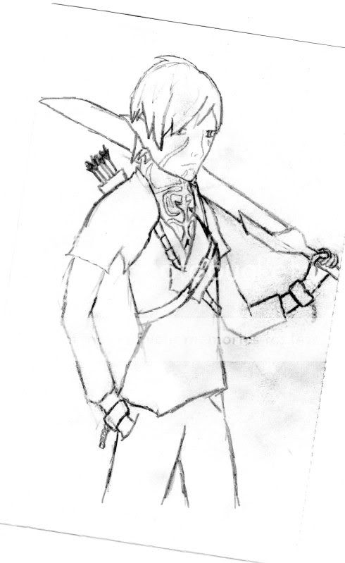
I'm going to comment specifically on your piece with your elf-assassin. The drawing's pretty well done and is the best of your recent works imo. The markings are nicely done and he looks pretty good proportionately aside from his arms.

Good job =D
 

Yoshimitsu

Former Moderator
I wont deny, I have an issue where it comes to arms. The elbows are where it seems appropriate, as opposed to where they should be.

I'm working on it, i swear.
 

Mr.RMA

Magearna before it was cool
Alright, I said I couldn't multitask, but I'm gonna try anyways. From what I can tell, I have to say your art looks really good. The emotion of the faces really give off either what their general personality might be, or what they're possibly thinking at the moment. The shapes of the bodies seem pretty realistic in proportion, at least in human/humanoid terms, which I assume is what you were going for for most if not all of them. I'm also liking the looks of the weapons. Each one really seems to have a good amount of detail to it. The hair textures look very nice as well and seem to help support the overall description and look of the characters instead of detracting from them. Also, the Linkachu drawing is completely epic on all accounts, that goes without saying =D Alright, there's my jumbled up list of comments. Hope some of it was helpful to you in some way. Definitely looking forward to seeing whatever else you post next.
 

Yoshimitsu

Former Moderator
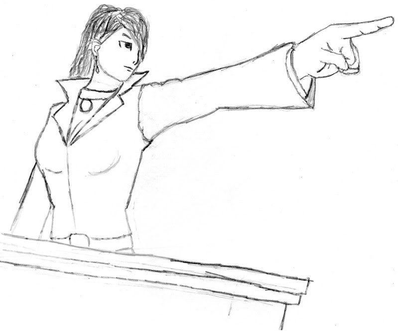
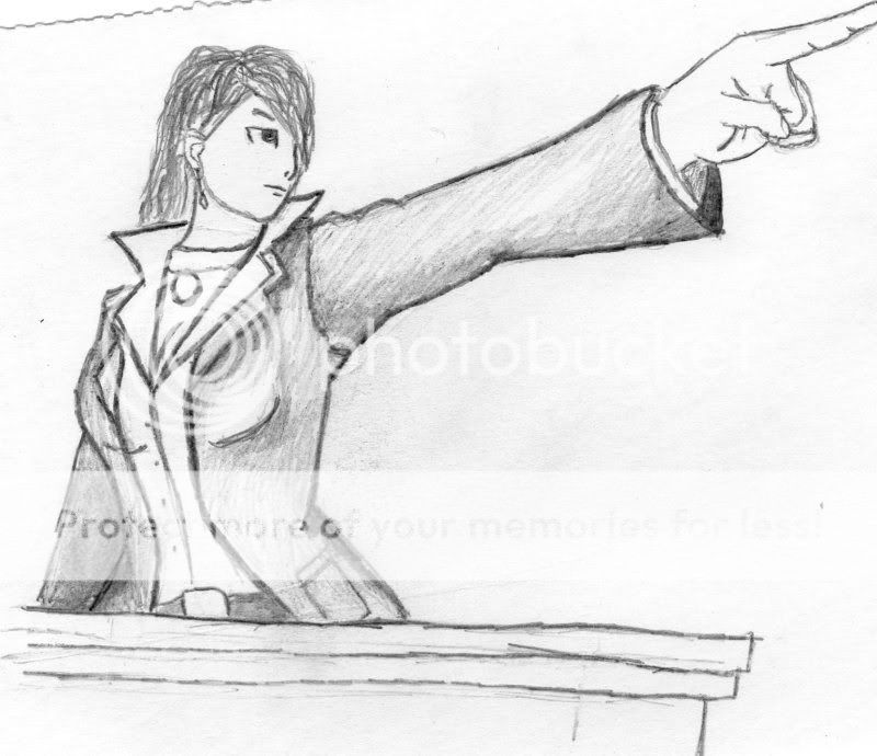
Objection.jpg


img022.jpg


Illiana, Defense Attorney.

For those not in the know (or who can't tell either way), she's wearing her summon bead on her necklace and her hair is meant to be wavy. This is still a work in progress, but I figured I'd share what i have anyway!
 

Yoshimitsu

Former Moderator
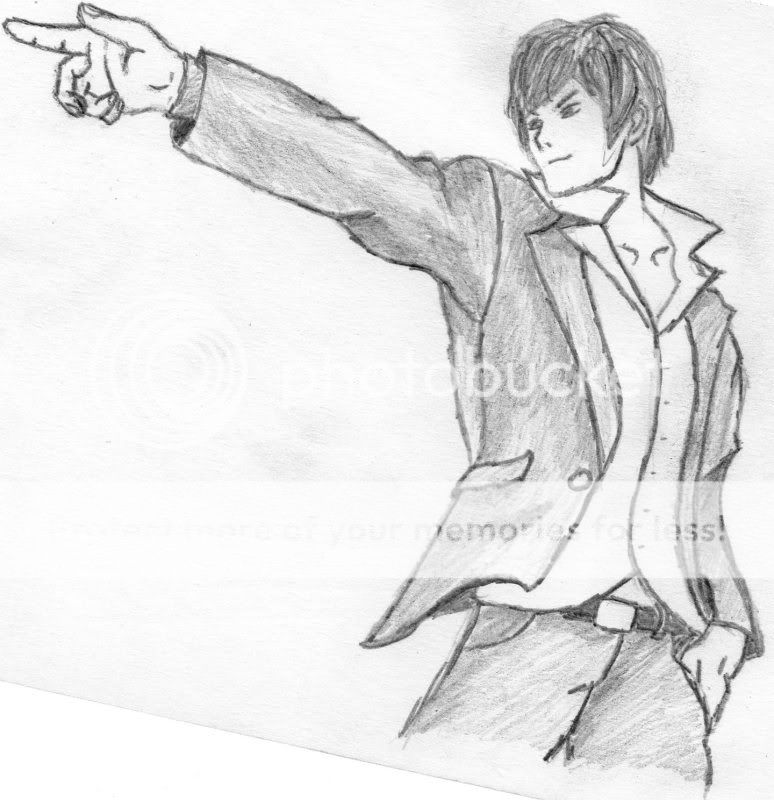
img025.jpg


Nopcsa, Prosecutor.

Apart from Pohatu's drawing and my own mental image (he wears a light blue suit in my imagination), I pretty much had nothing to go on with Nopcsa's appearence so I took a few liberties (like the semi-unbuttoned shirt). Also all my attorney characters will forever have collars like that.
 
I'm really just super impressed by how quickly you've been improving in the past, what, month? :V
And I really just adore these last two pictures, the shading looks really good and I love the flow of the clothes. And, even though I'm not actually sure what he looks like (I am a terrible board member and do not read RPs ooooooooops), Nopcsa's face is just spot-on, I love the smarmy expresssion and for some reason I just really like the nose.
Couldn't tell you why :B

But it looks good mang <33
 
Because I hate putting a bro down (and because you told me to :p).

So yeah, from what I've seen from you before, there's been a lot of improvement. Overall proportions and minor details look great, especially the hands. The highlight of your work though is the shading - the shadows have been placed very well, and show distinct depth in the character's clothing. I would like to see some more of your work, because it definitely is getting better!

Keep up the good work, Rainbow Pirate El :'D
 
El, I do need to comment on your actual thread instead of just giving my opinion in the chat. I really adore these last two drawings in particular (in addition to everything that I see in your thread ;o) because I am a huge Attorney fan.

The thing that really catches my eye immediately on both of them are the hands, they're very well done in terms of actually having a lot of detail without looking /too/ overly detailed, if that makes sense. Like Belle and Toru say, as well, the shading is very well done.

One thing that I'm very jealous of in your drawings is the way you draw your clothes, they're so detailed and defined and I wish that I could do that too. Keep up the good work, El, I wanna see you continue to improve :3
 
Top