Re: LoN's Signature Shop/Gallery (Requests: OPEN!!!)
I really like that new sig. Although I always go on about needing to have text in a prominent position, I think what you've done works well here. It blends in well, and is fairly easy to notice and very much readable.
I have a few criticisms. Firstly, the right side of the man's hood has this red outline, which looks a bit weird. It seems to have been present in the original, but it would have looked better if you'd fixed it.
Second, I think you've made the area around the man's hands too bright. It's very difficult to look at. I understand that a fire is meant to be bright, but it is affecting the clarity of the image. Also, I'm not really a fan of how you've done the background, with that smudged red effect. I think that shade of red is too light. I presume you're using it to achieve a 'grungy' feel and to increase the warmth of the tone? I would've used a darker shade and perhaps added a subtle vignette.
Finally, this is just personal opinion, but I preferred the darkness of the shadows in the original, I think you've made them too light. Midtones and highlights are fine.
Sorry, that looks like a rant now that I'm reading it, but there were a few small things that I thought could be improved upon. Overall, it's a fantastic sig. I love the way the composition leads you towards the text, and the fire you've added looks really cool.
")
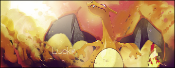
 It's still a really good sig, however. I particularly like the definition on Charizard's wings; it really makes them pop out of the screen.