-
Welcome back to Pokécharms! We've recently launched a new site and upgraded forums, so there may be a few teething issues as everything settles in. Please see our Relaunch FAQs for more information.
You are using an out of date browser. It may not display this or other websites correctly.
You should upgrade or use an alternative browser.
You should upgrade or use an alternative browser.
Stark's Sig Shop/Gallery (Requests: OPEN!!!)
- Thread starter Stark
- Start date
- Status
- Not open for further replies.
Re: LoN's Signature Shop/Gallery (Requests: Closed)
Very nice new sig. I'm not going to say too much about why it's good, because that's kind of been said already.
I think the text could've looked nicer with a slight gradient overlay, and the background brushes look a bit gaussian blurred (not sure if this is intentional, or whether it was the brush). Personally, I'd reduce the opacity on that layer, although maybe that's just me
Still, these criticisms are pretty minor. I love the lighting and the vibrance. Very professional!
Re: LoN's Signature Shop/Gallery (Requests: OPEN!!!)
How to request:
Give me as little or as much information as you want") If you give me less, I'd prefer that because I can do what I want to do, what I think is best. However, if you want to give me more information, by all means do so. At least give me the subject and, if you want it, text.
If you give me less, I'd prefer that because I can do what I want to do, what I think is best. However, if you want to give me more information, by all means do so. At least give me the subject and, if you want it, text.
I do, have three rules:
1) Your Post Count on the forum MUST be 100 or higher.
2) Do not rush me! It'll be done when its done. I do have a full-time job after all.
3) For goodness' sake, use common sense. I also reserve judgement to decline or ignore requests.
I know I used to whip these up in the space of a few hours at most, but times have changed I'm afraid. Now I can take a few days
Tl;dr version: Request away, but only if you have 100+ posts.
Thank you for your constructive criticism, Toastie. Truly valued ^^
How to request:
Give me as little or as much information as you want
If you give me less, I'd prefer that because I can do what I want to do, what I think is best. However, if you want to give me more information, by all means do so. At least give me the subject and, if you want it, text.I do, have three rules:
1) Your Post Count on the forum MUST be 100 or higher.
2) Do not rush me! It'll be done when its done. I do have a full-time job after all.
3) For goodness' sake, use common sense. I also reserve judgement to decline or ignore requests.
I know I used to whip these up in the space of a few hours at most, but times have changed I'm afraid. Now I can take a few days
Tl;dr version: Request away, but only if you have 100+ posts.
Thank you for your constructive criticism, Toastie. Truly valued ^^
Re: LoN's Signature Shop/Gallery (Requests: OPEN!!!)
Well, since no one is requesting and I love you and everything LoN, I will make a request because it's been a long time since I've sported a nifty LoN sig of sexiness.
I'm going to leave it up to you, since you're talented at layouts and everything, but I would absolutely love a Signature with Hanako from Katawa Shoujo as the focus and I don't really care about having words on it.
Re: LoN's Signature Shop/Gallery (Requests: OPEN!!!)
http://nervelon.deviantart.com/art/Kata ... -348469027
Here you go, sir! Critique always appreciated, along with any changes you might want!
http://nervelon.deviantart.com/art/Kata ... -348469027
Here you go, sir!
Critique always appreciated, along with any changes you might want!Re: LoN's Signature Shop/Gallery (Requests: OPEN!!!)
LoN is doing sigs again :'D
If you don't mind, good sir, I would absolutely love a sig with this lovely person~ As for text, just "Shocari" works.
Thanks in advance ♥
LoN is doing sigs again :'D
If you don't mind, good sir, I would absolutely love a sig with this lovely person~ As for text, just "Shocari" works.
Thanks in advance ♥
Re: LoN's Signature Shop/Gallery (Requests: OPEN!!!)
Fffffffff-- Thank you so much, LoN, I absolutely love it!!
I really like the background, I think that it works really well for the picture that I sent you. There isn't much I could say as far as anything needing to be changed, it looks great and I do love this character a lot so you really wouldn't hear me complain anyway
Thank you, kind sir :'D
Re: LoN's Signature Shop/Gallery (Requests: OPEN!!!)
http://nervelon.deviantart.com/art/Nuwa ... -348650361
Tried some new stuff...
http://nervelon.deviantart.com/art/Nuwa ... -348650361
Tried some new stuff...
Re: LoN's Signature Shop/Gallery (Requests: OPEN!!!)
Oh look, here I am
I would like a signature that fits my name, Magpie A nice Magpie-themed signature would be epic I think, with a dramatic, swirly background. I trust your artistic flare completely, so I'll leave it up to you, beyond the choice of 'must feature Magpie goodness' xD I'd maybe also like to suggest darkish colours, maybe shades of dark blue? I have a thing for the night sky and stars and stuff, if that maybe helps with a direction?
Text would just be 'Magpie'
If that's not enough to go on (or too much, haha) just give me a poke~
Oh look, here I am
I would like a signature that fits my name, Magpie
A nice Magpie-themed signature would be epic I think, with a dramatic, swirly background. I trust your artistic flare completely, so I'll leave it up to you, beyond the choice of 'must feature Magpie goodness' xD I'd maybe also like to suggest darkish colours, maybe shades of dark blue? I have a thing for the night sky and stars and stuff, if that maybe helps with a direction? Text would just be 'Magpie'
If that's not enough to go on (or too much, haha) just give me a poke~
Re: LoN's Signature Shop/Gallery (Requests: OPEN!!!)
http://nervelon.deviantart.com/art/Magpie-348826920
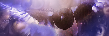
Is this alright, Ferne?
http://nervelon.deviantart.com/art/Magpie-348826920
Is this alright, Ferne?
Re: LoN's Signature Shop/Gallery (Requests: OPEN!!!)
Can I get a purple Venonat signature with Riley on it, please? I'll trust your artistic direction.
Can I get a purple Venonat signature with Riley on it, please? I'll trust your artistic direction.
Re: LoN's Signature Shop/Gallery (Requests: OPEN!!!)
Okay, thanks ^^
Okay, thanks ^^
Re: LoN's Signature Shop/Gallery (Requests: OPEN!!!)
It's more than alright, it's outright amazing ;__________;
The background is just so perfect and the Magpie is so dynamic and its feathers blend so well and eeeeeeeee it's amazing
Thank you sooooooooooooooo much :')
LoN said:http://nervelon.deviantart.com/art/Magpie-348826920
Is this alright, Ferne?
It's more than alright, it's outright amazing ;__________;
The background is just so perfect and the Magpie is so dynamic and its feathers blend so well and eeeeeeeee it's amazing
Thank you sooooooooooooooo much :')
Re: LoN's Signature Shop/Gallery (Requests: OPEN!!!)
No problem, Ferne
Hey, Riley, you're up next:
http://nervelon.deviantart.com/art/Venonat-348972439

Anything need changing?
No problem, Ferne
Hey, Riley, you're up next:
http://nervelon.deviantart.com/art/Venonat-348972439
Anything need changing?
Shiny Motley
2016 Singles Football
Re: LoN's Signature Shop/Gallery (Requests: OPEN!!!)
can I have a music-themed sig with the text Shiny Eevee? I'm leaving this pretty vague because I wanna see how you kinda interpret this and I'm too lazy to think of what exactly I want XD
can I have a music-themed sig with the text Shiny Eevee? I'm leaving this pretty vague because I wanna see how you kinda interpret this and I'm too lazy to think of what exactly I want XD
Re: LoN's Signature Shop/Gallery (Requests: OPEN!!!)
Nope, I love it, thanks good sir
Nope, I love it, thanks good sir
Re: LoN's Signature Shop/Gallery (Requests: OPEN!!!)
I love the stylistic touches you've used for these banners and how vibrant the colors are. You do a great job at melding the images with the background designs too. I'm happy to see you doing these again because you definitely have an eye for 'em! Even if I don't reply much I'm an avid stalker of this topic.
I can't offer much in the way of constructive criticism (nor honestly feel right doing so considering how nice these banners are) but I find that the words are a bit on the subtle side. Magpie's name on her image, for example, sorta fades into the background and could be missed if one wasn't looking for it. I'm sure that's an intentional choice on your end and it really doesn't detract from the sigs, it's just a trend I've noticed with several of them.
Re: LoN's Signature Shop/Gallery (Requests: OPEN!!!)
You're welcome, Riley. I hope its purple enough! I couldn't only make it purple.
It would probably be more polite if you left that last "too lazy" part out entirely. I'll get to this now.
That's enough criticism to be welcomed, Katie ^^ Anyone else, take note from Katie. Even if you think its not worth much or not skill based, its welcomed.
@Katie - You're right, it is intentional. Text is the most difficult part, funnily enough. You can't just go 12px Arial black and thats it. You need to make it look as if it belongs as much as the rest... that's the hard part.
As long as it seems to fit, that's ideal.
Rileyixx said:Nope, I love it, thanks good sir
You're welcome, Riley.
I hope its purple enough! I couldn't only make it purple.Shiny Eevee said:can I have a music-themed sig with the text Shiny Eevee? I'm leaving this pretty vague because I wanna see how you kinda interpret this and I'm too lazy to think of what exactly I want XD
It would probably be more polite if you left that last "too lazy" part out entirely. I'll get to this now.
Linkachu said:I love the stylistic touches you've used for these banners and how vibrant the colors are. You do a great job at melding the images with the background designs too. I'm happy to see you doing these again because you definitely have an eye for 'em! Even if I don't reply much I'm an avid stalker of this topic.
I can't offer much in the way of constructive criticism (nor honestly feel right doing so considering how nice these banners are) but I find that the words are a bit on the subtle side. Magpie's name on her image, for example, sorta fades into the background and could be missed if one wasn't looking for it. I'm sure that's an intentional choice on your end and it really doesn't detract from the sigs, it's just a trend I've noticed with several of them.
That's enough criticism to be welcomed, Katie ^^ Anyone else, take note from Katie. Even if you think its not worth much or not skill based, its welcomed.
@Katie - You're right, it is intentional. Text is the most difficult part, funnily enough. You can't just go 12px Arial black and thats it. You need to make it look as if it belongs as much as the rest... that's the hard part.
As long as it seems to fit, that's ideal.
Re: LoN's Signature Shop/Gallery (Requests: OPEN!!!)
Double post with an update.
http://nervelon.deviantart.com/art/Shin ... -348985282

Anything else you need, Shiny? I hope you like blue.
Double post with an update.
http://nervelon.deviantart.com/art/Shin ... -348985282
Anything else you need, Shiny? I hope you like blue.
Re: LoN's Signature Shop/Gallery (Requests: OPEN!!!)
If this is not too much trouble, could I please have a sig with Zekrom(Regular or Shiny, doesn't matter) with it's tail lit up, and the text "ShinyZekrom"? The rest is up to you, because I have noticed you are excellent at making these and I am curious to see how you would do this.
If this is not too much trouble, could I please have a sig with Zekrom(Regular or Shiny, doesn't matter) with it's tail lit up, and the text "ShinyZekrom"? The rest is up to you, because I have noticed you are excellent at making these and I am curious to see how you would do this.
Shiny Motley
2016 Singles Football
Re: LoN's Signature Shop/Gallery (Requests: OPEN!!!)
It would probably be more polite if you left that last "too lazy" part out entirely. I'll get to this now.[/quote]
Sorry, I meant that last part as a joke. ^^; I didn't mean to be rude... I'll take care to make sure that doesn't happen again. ;;
As for the sig
I'm like
hypnotized by the amazingness <333
And I love blue~! It's one of my favorite colors and it makes it look so cool and almost electrifying~!
... dat hand. omg.
*faints*
Shiny Eevee said:can I have a music-themed sig with the text Shiny Eevee? I'm leaving this pretty vague because I wanna see how you kinda interpret this and I'm too lazy to think of what exactly I want XD
It would probably be more polite if you left that last "too lazy" part out entirely. I'll get to this now.[/quote]
Sorry, I meant that last part as a joke. ^^; I didn't mean to be rude... I'll take care to make sure that doesn't happen again. ;;
As for the sig
I'm like
hypnotized by the amazingness <333
And I love blue~! It's one of my favorite colors and it makes it look so cool and almost electrifying~!
... dat hand. omg.
*faints*
Re: LoN's Signature Shop/Gallery (Requests: OPEN!!!)
The latest sigs are pretty amazing. When you announced requests were open, it was like you'd opened floodgates or something
My only criticism would be that sometimes the text seems like an afterthought, when it should really be one of the focal points of the sig. For instance, I think Magpie's could have done with an inner drop shadow on the text, and in Shocari's sig, I think you should've either done the same or put the text in the white space to the left, as it's a little hard to read when it's tucked up next to the character there, especially with all the effects, although those are really cool.
However, you've really improved in your last two sigs. The text in Riley's is easily readable and fits in with the background nicely, and I really like the way you've warped the text in Shiny's sig. It doesn't have many fancy effects, but it doesn't really need any. It fits perfectly with the colour scheme and the composition.
I'm not sure if I'll request a sig, because I've recently started re-using the one you made me a few years ago, and I still love it! Keep up the good work, you're still improving and it's great to see
Re: LoN's Signature Shop/Gallery (Requests: OPEN!!!)
http://nervelon.deviantart.com/art/Shin ... -349137348
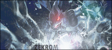
Is this alright?
It doesn't have to be the focal point, I disagree there. However, I agree with the text being an afterthought on occasion, its so awkward ><
Thanks for your criticism, its so rare I get something like this and I truly value it. Thank you!
http://nervelon.deviantart.com/art/Shin ... -349137348
Is this alright?
Toastie said:The latest sigs are pretty amazing. When you announced requests were open, it was like you'd opened floodgates or something
My only criticism would be that sometimes the text seems like an afterthought, when it should really be one of the focal points of the sig. For instance, I think Magpie's could have done with an inner drop shadow on the text, and in Shocari's sig, I think you should've either done the same or put the text in the white space to the left, as it's a little hard to read when it's tucked up next to the character there, especially with all the effects, although those are really cool.
However, you've really improved in your last two sigs. The text in Riley's is easily readable and fits in with the background nicely, and I really like the way you've warped the text in Shiny's sig. It doesn't have many fancy effects, but it doesn't really need any. It fits perfectly with the colour scheme and the composition.
I'm not sure if I'll request a sig, because I've recently started re-using the one you made me a few years ago, and I still love it! Keep up the good work, you're still improving and it's great to see
It doesn't have to be the focal point, I disagree there. However, I agree with the text being an afterthought on occasion, its so awkward ><
Thanks for your criticism, its so rare I get something like this and I truly value it. Thank you!
Re: LoN's Signature Shop/Gallery (Requests: OPEN!!!)
....... O.O
I am in awe. You did a wonderful job with this, and I love the fact that the "Zekrom" part is easier to see than "Shiny," as it is not a Shiny Zekrom, but it highlights the "Zekrom" part. Very well done.
LoN said:http://nervelon.deviantart.com/art/Shiny-Zekrom-349137348
Is this alright?
....... O.O
I am in awe. You did a wonderful job with this, and I love the fact that the "Zekrom" part is easier to see than "Shiny," as it is not a Shiny Zekrom, but it highlights the "Zekrom" part. Very well done.
Re: LoN's Signature Shop/Gallery (Requests: OPEN!!!)
I really like the Zekrom one, it has really good effects on it. I think my only draw with this is the fact I can't tell that the word Shiny is there without the S. Other than that great as usual
I really like the Zekrom one, it has really good effects on it. I think my only draw with this is the fact I can't tell that the word Shiny is there without the S. Other than that great as usual
Sir Red
Charms' Caped Crusader
Re: LoN's Signature Shop/Gallery (Requests: OPEN!!!)
Blah! The request well has dried up a bit. Time to put you back to work, LoN-sensei.
I really liked what you did with Shiny's vague concept of "music", thus I am going to request a sig with simply the concept of "writing/literature". If you would like something more to work with than that, please let me know. It's just that out of all of your recent signatures, the one you made for Shiny is my favorite.
Also, I am planning to post a full run down of all of your recent works. I just know that it will most likely turn into quite the long post and I wanted to get my request out of the way right now.
Re: LoN's Signature Shop/Gallery (Requests: OPEN!!!)
Hmm... I remember a similar request I had in the past. I think it was someone who wanted one based on writing.
I'll get to this tomorrow, and I eagerly await your longer post
Edit: Red, I'll need some more direction than what you've specified on this one. My current ideas aren't working for me.
Hmm... I remember a similar request I had in the past. I think it was someone who wanted one based on writing.
I'll get to this tomorrow, and I eagerly await your longer post
Edit: Red, I'll need some more direction than what you've specified on this one. My current ideas aren't working for me.
Sir Red
Charms' Caped Crusader
Re: LoN's Signature Shop/Gallery (Requests: OPEN!!!)
You know what, I've decided to change my sig request. Instead of doing such a vague concept, I'm going to go with a more straight forward idea. If you could please make me a sig using this image of the band Japandroids. If you want one without the logo, a quick Google search for Japandroids should find it for you. Let me know if you need anything else.
Full Sig run-through!!!
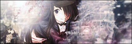
Chad: I really love the left side of this sig and the lighting you did here. As well as how it blends with the render. Well, the head portion of the render at least. There is something about the body of the girl in the sig that makes it difficult for me to really differentiate her from parts of the background. The similar colors and the blending/lighting make her body kind of look like a mass of randomness. You did a brilliant job with the head portion, but I think the position of her body mixed with the effects make it very difficult to get a proper grasp on what exactly she is supposed to look like. Honestly, the more I look at it I think it is really the position she is in that causes this problem. A different position and my issue goes away.
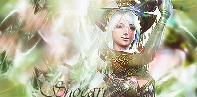
Sho: This one is more my personal opinion than anything else, but I just don't care for the muted colors in the sig. :x Though the flowing background on the outsides and then the sudden jagged, almost broken glass-like effect in the middle seems a bit off. The flow just seems odd there. I love the effect over the text, though. It makes Sho's name look very awesome.
Magpie: I love the glow lighting effect you did on the wings here. I normally do not care for real-life animals in sigs (as I have grown accustom to seeing cartoon things in sigs), but this one works well. The dark, almost night sky looking, background works very well with the render. I just think a softer lighting effect on the head could have worked better and kept with the darker feel of the sig.
Riley: Oh my god do I love the background on this one. The use of negative space on the right is terrific and then the flowery acrylic looking designs spiraling out towards the negative space is so aesthetically pleasing. I also really like the aura-y waves coming off on the left side. Very well done on the background. My only problem here is the render, but I can't fault you for using the stock Venonat picture. Also, this may be my favorite use of lighting on your part, as it really accents the white florals.
Shiny: As I already mentioned briefly, I love this sig so much. I really do not have a single bad thing to say about it, really. The blending of the render into the background works so well, as does your use of the lines (the proper name of which escapes me right now). The flow of the sig works so well with the flow of the image too. And the colors, my god the colors. I love the white and shades of blue here. This is also your best use of text. It is simply, accentuates the color scheme and flows with the render. Amazing job.
Zekrom: The background and lighting effects on this one are fantastic. It really gives off the sense of impending doom from Zekrom coming down to destroy worlds. Not too much to say on this one other than that I would have liked the lighting to be a bit softer on Zekrom. Possible like there are shadows cast upon its face or something. Nothing major.
Well, I hope some of that helps you. Pointed out what I thought was good and what I thought was off a bit. All-in-all, though, fantastic work. ^^
You know what, I've decided to change my sig request. Instead of doing such a vague concept, I'm going to go with a more straight forward idea. If you could please make me a sig using this image of the band Japandroids. If you want one without the logo, a quick Google search for Japandroids should find it for you. Let me know if you need anything else.
Full Sig run-through!!!
Chad: I really love the left side of this sig and the lighting you did here. As well as how it blends with the render. Well, the head portion of the render at least. There is something about the body of the girl in the sig that makes it difficult for me to really differentiate her from parts of the background. The similar colors and the blending/lighting make her body kind of look like a mass of randomness. You did a brilliant job with the head portion, but I think the position of her body mixed with the effects make it very difficult to get a proper grasp on what exactly she is supposed to look like. Honestly, the more I look at it I think it is really the position she is in that causes this problem. A different position and my issue goes away.
Sho: This one is more my personal opinion than anything else, but I just don't care for the muted colors in the sig. :x Though the flowing background on the outsides and then the sudden jagged, almost broken glass-like effect in the middle seems a bit off. The flow just seems odd there. I love the effect over the text, though. It makes Sho's name look very awesome.
Magpie: I love the glow lighting effect you did on the wings here. I normally do not care for real-life animals in sigs (as I have grown accustom to seeing cartoon things in sigs), but this one works well. The dark, almost night sky looking, background works very well with the render. I just think a softer lighting effect on the head could have worked better and kept with the darker feel of the sig.
Riley: Oh my god do I love the background on this one. The use of negative space on the right is terrific and then the flowery acrylic looking designs spiraling out towards the negative space is so aesthetically pleasing. I also really like the aura-y waves coming off on the left side. Very well done on the background. My only problem here is the render, but I can't fault you for using the stock Venonat picture. Also, this may be my favorite use of lighting on your part, as it really accents the white florals.
Shiny: As I already mentioned briefly, I love this sig so much. I really do not have a single bad thing to say about it, really. The blending of the render into the background works so well, as does your use of the lines (the proper name of which escapes me right now). The flow of the sig works so well with the flow of the image too. And the colors, my god the colors. I love the white and shades of blue here. This is also your best use of text. It is simply, accentuates the color scheme and flows with the render. Amazing job.
Zekrom: The background and lighting effects on this one are fantastic. It really gives off the sense of impending doom from Zekrom coming down to destroy worlds. Not too much to say on this one other than that I would have liked the lighting to be a bit softer on Zekrom. Possible like there are shadows cast upon its face or something. Nothing major.
Well, I hope some of that helps you. Pointed out what I thought was good and what I thought was off a bit. All-in-all, though, fantastic work. ^^
Re: LoN's Signature Shop/Gallery (Requests: OPEN!!!)
http://nervelon.deviantart.com/art/Sir- ... 350167596v

All done, hope you like!
And thank you again for your gigantomassivehuge essay. It was so helpful to read through! People, take notes from THIS GUY!
http://nervelon.deviantart.com/art/Sir- ... 350167596v
All done, hope you like!
And thank you again for your gigantomassivehuge essay. It was so helpful to read through! People, take notes from THIS GUY!
Re: LoN's Signature Shop/Gallery (Requests: OPEN!!!)
I think with such a big subject you've done a good job, LoN. The warming of the orange glow combined with the darkness on the floor really fits well together. The text is in a good place and is readable and suits the sig well, I would have liked it to be in a more central position but it looks good there. The orange-red smoke puff next to Red is the only thing I don't like it seems a little out of place. Perhaps lower the opacity or use a softer shade and I think it could do with some blending in. Hope this helps
I think with such a big subject you've done a good job, LoN. The warming of the orange glow combined with the darkness on the floor really fits well together. The text is in a good place and is readable and suits the sig well, I would have liked it to be in a more central position but it looks good there. The orange-red smoke puff next to Red is the only thing I don't like it seems a little out of place. Perhaps lower the opacity or use a softer shade and I think it could do with some blending in. Hope this helps
Re: LoN's Signature Shop/Gallery (Requests: OPEN!!!)
Thanks though! How do you think the text could be more central? I'm open for suggestions.
Damn it! Someone noticed that bit xDRileyixx said:I think with such a big subject you've done a good job, LoN. The warming of the orange glow combined with the darkness on the floor really fits well together. The text is in a good place and is readable and suits the sig well, I would have liked it to be in a more central position but it looks good there. The orange-red smoke puff next to Red is the only thing I don't like it seems a little out of place. Perhaps lower the opacity or use a softer shade and I think it could do with some blending in. Hope this helps
Thanks though! How do you think the text could be more central? I'm open for suggestions.
Sir Red
Charms' Caped Crusader
Re: LoN's Signature Shop/Gallery (Requests: OPEN!!!)
As I told you the other day when you first showed it to me, I love this sig. I especially love the use of negative space on the left (I'm a sucker for things like that), as it draws the users eye to the dark figure and then to the bright flaming drums. I originally critiqued the text, but it has grown on me. I really like the styles and placements of the font. They are simple enough, but also have a fair amount of style. Also, I did not notice the bit that Riley was talking about (doesn't really bother me, though). >>
Also, you are quite welcome for the comments. ^^
Re: LoN's Signature Shop/Gallery (Requests: OPEN!!!)
Well I know there isn't much room but I was possibly thinking in front of his face I think the dark text may create a nice contrast with the almost white hot flames
Well I know there isn't much room but I was possibly thinking in front of his face I think the dark text may create a nice contrast with the almost white hot flames
- Status
- Not open for further replies.