-
Welcome back to Pokécharms! We've recently launched a new site and upgraded forums, so there may be a few teething issues as everything settles in. Please see our Relaunch FAQs for more information.
You are using an out of date browser. It may not display this or other websites correctly.
You should upgrade or use an alternative browser.
You should upgrade or use an alternative browser.
LoN's Signature School
- Thread starter Stark
- Start date
Ok, after a lot of experimenting, The computer restarting in the middle of me making it, and GIMP having to close, I've finally got a sig to show. I haven't put a border nor words on it, because I've only got one font to work with, and it's not very amazing, and the border? I'm not very fond of borders, and Lon did say to see which one looked better... and in my eyes the non-border one looked like the better of the two.

I rather like it...

I rather like it...
That stuff happens, you'll get used to it after a whileOk, after a lot of experimenting, The computer restarting in the middle of me making it, and GIMP having to close, I've finally got a sig to show.

Nice first outcome Aura!
Whoa! It seems a lot happened after I was gone, umm I wasn't able to get a picture of media player, sorry. I will start working on the sig right away.
...well. Aura's the first and only person so far with an outcome that's moving in the direction that will make something like this:
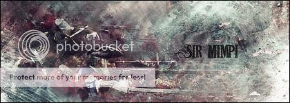
By using an image for a background instead of brushes. You can usually still tell what the image was if you saw the original, but it doesn't matter This used a picture of the lifestream from FFVII: Advent Children.
To pick out a couple of signatures from people in this thread, Aura's used an Assassin's Creed screenshot for a background, whilst Dani's used a forest. Really -doesn't- matter what you choose
Once I've un-Christmas-ised myself I'll get a tutorial going for the Lifestream signature above.
And on an unrelated note...
* LoN e-scolds Katie and sets her a detention for slacking.
By using an image for a background instead of brushes. You can usually still tell what the image was if you saw the original, but it doesn't matter
 This used a picture of the lifestream from FFVII: Advent Children.
To pick out a couple of signatures from people in this thread, Aura's used an Assassin's Creed screenshot for a background, whilst Dani's used a forest. Really -doesn't- matter what you choose

Once I've un-Christmas-ised myself I'll get a tutorial going for the Lifestream signature above.
And on an unrelated note...
* LoN e-scolds Katie and sets her a detention for slacking.
Just made a bunch =D
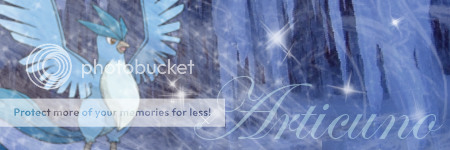
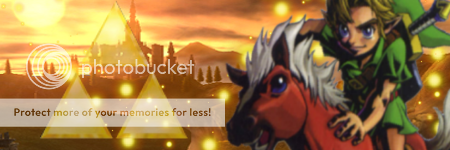



Casey's (Draco's) Umbreon, Crono.


Casey's (Draco's) Umbreon, Crono.
When I said that, I meant that Aura's current signature made by me, used an Assassin's Creed screenshot.Aura's used an Assassin's Creed screenshot.
Rain, not sure if you were going for the blurry focal points or not (mostly noticeable on Blastoise I'd think, but you can see it on all of them). If you weren't aiming for this blurryness (if that's a word
 ) you can sharpen the image.
I'd recommend going about it like this:
Edit->Copy Visible, Paste Into->click on New Layer on your Layers dialog, or then go to Layer->New Layer.
This will paste a copy of everything that GIMP sees in the window onto a new layer, so you won't see any visible change at all except a new layer with the image on it.
Next, go to Filters->Enhance->Sharpen. Sharpen it by the amount you want (I did 75 for the Link one), then erase what looks bad (I erased most of the sparks and around the triangle thingy that I forgot the name of).
And if you were going for the blurryness, fine! As long as you've learned something with ^that^. And I hope you have
 Because I'm fighting through viruses and scans to post this up ;D
* LoN picks up the hammer of common sense and shield of HijackThis and dives back into his PC files.
=D Thanks LoN, but I was going for teh blurry, I like it for some reason. But thank you for helping in case I didn't want it ^^ I really appreciate it.
Awesome new sigs guys ^^
I really like the Clefable one, Rayn =D
Edit: Here are two more, I like the Ho-Oh one, but I'm not too fond of the Ganon one.
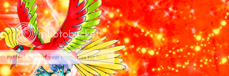
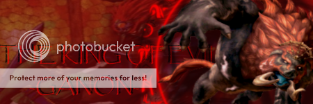
Edit: Here are two more, I like the Ho-Oh one, but I'm not too fond of the Ganon one.


Lets crank you guys up a couple of gears 
Right, lets move onwards now. Most of you guys have got to grips with the brushes and the basic tools, but for now most of those will only be used to make minor adjustments as you go through. For example if an area looked to bright you might sling a dark grunge brush on a new layer above it to make the offending area darker.
First, we'll activate the most crucial of tools for the signature maker. Music. Go ahead and do it, make sure it'll keep playing
Ok, I said I was going to say how I made this signature:

Well, be forwarned: This is 34 layers Doesn't mean at all that it's difficult, if you follow my guidance then it'll just -not- be a five minute job.
Before we start, you'll be wanting an image to use as a background. I recommend something abstract (such as the one I used here, the lifestream. Google it if you don't know it), something urban like a cityscape, or something natural like a lake or forest. Once you have that, great. Keep it somewhere (you might want to start a folder to keep these 'stocks' in).
The next item you'll want is some images called "C4D"s. These are images that are, well, fancy In short, and they're called C4Ds because most are made in a program called Cinema 4d. An example would be this:
http://i180.photobucket.com/albums/x290/LoN_Colossus/HPNOTIQC4D2.png
http://i180.photobucket.com/albums/x290/LoN_Colossus/HPNOTIQEffectC4D1.jpg
http://i180.photobucket.com/albums/x290/LoN_Colossus/HPNOTIQFractal3.png
Doesn't matter if the background is black, you'll be setting them on layer modes that means the black won't matter.
You can find these on google, or other sites such as:
http://www.premiumrenders.com/gallery/index.php?c=5
http://planetrenders.net/renders/thumbnails.php?album=1
http://planetrenders.net/renders/thumbnails.php?album=10
Familiar sites? If they aren't, they should be
Once you've found the images you like, we can start!
Open up your favourite canvas size, and copy your background in. I used the Lifestream in the example above, and as I write this I'll be doing it as well. So as I write this I'll be using a stock from Assassin's Creed, they always have nice cityscapes
Duplicate the stock layer so you have two layers, GreyC the bottom one (Filters->Enhance->GreyCstoration, leave the settings as they are) and Sharpen the top (Filters->Enhance->Sharpen, set it about 30/40 or so). Set the Sharpened layer to the Layer Mode of "Darken Only". This means that the top image will only show pixels that are darker than the ones on the image underneath, obviously Lighten Only is the reverse
I've got to this:

Next, paste in a lighter stock image than the one before (anything really as long as its lighter, I just used a lighter area of the same image from Assassin's Creed - And thus duplicated the original layer, if not you can always re-paste it). Gaussian Blur this by 30 (Filters->Blur->Gaussian Blur), then Desaturate it. Desaturation will remove all colour, leaving it Greyscale (Colours->Desaturate). Set this layer on Soft Light (A similar effect to Overlay).
I'm up to this:

Remember, if you're image isn't up to what you think as you're going through this, you can always do something to change it! Like now, if your image is still too dark for you, add in a blank white layer and set it to Soft Light. This'll lighten the image again, and if you use your noggin you'll realise you can do the same with a black layer if its too bright already
Now add in on a new layer (generally always add in on a new layer, if in doubt.) your render. I'm using Cloud, 'cause he's frellin' awesomeness in a can. Sharpen it by the amount you choose necessary. I'm at this now:

Next, we'll do a trick that some of you may already know, some not. It copies what YOU CAN SEE in your GIMP window into a new layer, very useful technique. Edit->Copy Visible, Edit->Paste Into, New Layer (or Layers->New Layer). Now you have a fresh layer with everything you can see on it (works well with hiding layers too, the little eye on each side).
So you won't see any visible change, just to clear this up. Now we'll smudge the side of our render, do it all in one direction to create some flow. Find your "Vine" brush (if you sort your brush folder alphabetically, it'll be down the bottom somewhere. If you don't know what it is, it's different shades of green leaves with lines between. Looks like pondweed or whatever the plant is. Find that brush, then click the "Smudge" tool. Looks like a finger Next, on your Brushes Dialog find the spacing bar, and drag that to 1. This shows how often the brush will impact on the page (so if you're painting with the sparks brush, higher spacing means less sparks. Lower spacing means one almost continuous spark). Therefore our Smudge will be long and continuous, which is what we want. Smudge your render now!
Once smudged, you'll have something like this:

Next, put it on Lighten Only. Because most of my render is Black, I changed mine to Darken Only. It's up to you to decide which is better, here's my layer on Darken Only:

After deciding what layer mode you're using, now you do a concept which some may think is obvious, others not. Erasing what looks bad! I erased the area that shows in green, and used the Sparks brush for that. I generally erase with the Sparks brush because it doesn't leave a defined eraser line, which I like.


I next went back to my original stock, found a part that's interesting (the birds in the sky) and made it a new layer on the top.

I changed the "Opacity" (how visible a layer is) to 85% (find this under the Layer Mode setting on the Layer Dialog), and then played around with a layer mode that worked well. Dodge/Multiply, Screen, Soft/Hard Light, Lighten/Darken only would work well I'd imagine. I set mine to Multiply, and erased the bad areas.
I erased the parts that I painted green here (to show where I erased):

Copy Visible and Paste into a new layer again. Make sure your foreground colour is black, and background is white. (Easy way to do this: Click the little pair of squares that are black and white ) Next, click the Gradient Tool (Black->White Square) and make sure your gradient is "FB to BG (RGB)". Then go to Colours->Maps->Gradient Map. This will colour the image with the colours from the active gradient, cool eh?
I'm now at this:

Set this layer on a Layer mode and Opacity level that works, I'd imagine Overlay at a low-ish level of Opacity.
I'm up to this stage:

Next, you might feel that areas of your signature will need some more "effect" to it. You might want to use a small soft brush or two in black on a new layer, set it to overlay or similar. I like to do this:
Copy Visible, then Duplicate your new layer so you have two copy visibles. Click your top layer, and go Layers->Transform->Flip Horizontally. Now you'll have one copy visible, and one flipped the other way.
Go to the top flipped layer, hide it by clicking the eye, and then click your unflipped layer and Filters->Maps->Displace.
You WILL end up with a heavily distorted image (displace moves one image using another as a guide). I've got this:
Erase the bad (probably most of it )
)


Now, drag those C4Ds you had. Paste one on a new layer in a way that adds to the flow when we smudged. Set it to screen or dodge and erase what looks bad. (If the C4D colours don't go with your signature, try colourising it Colours->Colourise)
Pasted in:

Desaturated:

Layer mode->Screen/Dodge:

Bad erased:


Add in any more that you feel necessary. I added one more.


Next, you may want to smudge more. You might want to do the displacement map again, or add some more black soft brushes on soft light. Up to you. I chose to redo the displacement map:


Right, nearly done. For those of you who have splatter brushes, now's when they're handy. Those of you who don't, your loss Go get some!
Open a new layer, get the splatter brush. Maybe scale it down, and splatter around on black.

Hide this layer, then click on it again. Go Layer->Transparency->Alpha To Selection (you can also get this via right clicking on the layer on the layers dialog, and clicking Alpha To Selection. What this'll do is make a selection around everything on that layer.)
Next, Copy Visible. This'll only Copy in the splatter selection! Paste it in a new layer, and move the layer around till you get what you like. Erase the bad. Try to make it flow again, as with all your effects!
Won't do a green for where I erased this time because of the transparent splatter area.

Finally, we are basically done with the effects. Now to colour the image. Remember way back up the tutorial we did a black/white gradient map? We use these in colour to colour our signatures. Some people like to colour at the end, other people prefer to add their colour near the start then build it up with black/white gradient maps as they go through. In this tutorial I'll show you a set of gradient maps that work well at the end.
Copy Visible, Paste into a new layer. Duplicate this 5 times so you have 6 extra layers. Hide all these layers.
Unhide the first duplicate (bottom of the pile of duplicates), set your colours to Blue and Yellow. Colour->Map->Gradient Map, set this layer to Colour on 30%.

Unhide the second, Green and Blue. Gradient Map. Set it to Soft Light on 30%.

Unhide the third, Blue and Orange. Gradient Map. Set this to Overlay on 15%.

Unhide the forth, no gradient map. Set it to Value on 30%.

Unhide the fifth, no gradient map. Set it to Screen on 10%.

Unhide the sixth and final, no gradient map. Set it on Normal at 10%.

If you feel you need any more colour changes, now's the time to do it. I think mine's fine how it is.
Next, we decide if the image is best this way, or flipped. Image (not layer) -> Transform -> Flip Horizontally. (This flips all layers instead of one).
I like mine flipped:

Next, add text. Easiest way is pick a relevant colour to the signature (probably use the colour picker, the one next to the magnifying glass) and slap it on. The way I've been doing it recently, however, goes like this:
Decide where you want your text. I want mine on the blue area to the left. Then, pick a simple font and write your text on an area that has colours which contrasts with your area you want the text. I'm choosing Cloud's hair in this case. Write your text there in any colour.

Next, hide the text layer. Alpha to selection and Copy visible. Paste it on a new layer, and drag the new layer to where you wanted text. Voila! Relevant coloured text

You can barely see my text, so I'm going to lighten the area a little. I brushed some sparks under the text, and then Alpha To Selectioned it. Next, Edit->Fill with FG/BG colour (whichever is white). I set that to overlay.

Finally, how you should ALWAYS end making a signature. Copy Visible, Paste a new layer and Sharpen it! I did mine by 30.

You can stop here and add a border, or you can do a couple more Gradient Maps.
Copy Visible, paste the new layer down. Duplicate it twice, then hide all 3.
Unhide the first one, Silver and White on Normal, 20%.

Unhide the second, Black and White, Overlay on 65%.

Unhide the last one, and don't do a Gradient Map, just set it to Colour on 40%.

Finally, add your border and you're done!

...
......
.........
I'd swear my playlist has gone around nearly three times now, hope you guys learn something from this
Oh, here's the images I used:
Cloud, the Assassin's Creed image, and C4D 1 and C4D 2.

Right, lets move onwards now. Most of you guys have got to grips with the brushes and the basic tools, but for now most of those will only be used to make minor adjustments as you go through. For example if an area looked to bright you might sling a dark grunge brush on a new layer above it to make the offending area darker.
First, we'll activate the most crucial of tools for the signature maker. Music. Go ahead and do it, make sure it'll keep playing

Ok, I said I was going to say how I made this signature:
Well, be forwarned: This is 34 layers
 Doesn't mean at all that it's difficult, if you follow my guidance then it'll just -not- be a five minute job.
Before we start, you'll be wanting an image to use as a background. I recommend something abstract (such as the one I used here, the lifestream. Google it if you don't know it), something urban like a cityscape, or something natural like a lake or forest. Once you have that, great. Keep it somewhere (you might want to start a folder to keep these 'stocks' in).
The next item you'll want is some images called "C4D"s. These are images that are, well, fancy
 In short, and they're called C4Ds because most are made in a program called Cinema 4d. An example would be this:
http://i180.photobucket.com/albums/x290/LoN_Colossus/HPNOTIQC4D2.png
http://i180.photobucket.com/albums/x290/LoN_Colossus/HPNOTIQEffectC4D1.jpg
http://i180.photobucket.com/albums/x290/LoN_Colossus/HPNOTIQFractal3.png
Doesn't matter if the background is black, you'll be setting them on layer modes that means the black won't matter.
You can find these on google, or other sites such as:
http://www.premiumrenders.com/gallery/index.php?c=5
http://planetrenders.net/renders/thumbnails.php?album=1
http://planetrenders.net/renders/thumbnails.php?album=10
Familiar sites? If they aren't, they should be

Once you've found the images you like, we can start!

Open up your favourite canvas size, and copy your background in. I used the Lifestream in the example above, and as I write this I'll be doing it as well. So as I write this I'll be using a stock from Assassin's Creed, they always have nice cityscapes

Duplicate the stock layer so you have two layers, GreyC the bottom one (Filters->Enhance->GreyCstoration, leave the settings as they are) and Sharpen the top (Filters->Enhance->Sharpen, set it about 30/40 or so). Set the Sharpened layer to the Layer Mode of "Darken Only". This means that the top image will only show pixels that are darker than the ones on the image underneath, obviously Lighten Only is the reverse

I've got to this:

Next, paste in a lighter stock image than the one before (anything really as long as its lighter, I just used a lighter area of the same image from Assassin's Creed - And thus duplicated the original layer, if not you can always re-paste it). Gaussian Blur this by 30 (Filters->Blur->Gaussian Blur), then Desaturate it. Desaturation will remove all colour, leaving it Greyscale (Colours->Desaturate). Set this layer on Soft Light (A similar effect to Overlay).
I'm up to this:

Remember, if you're image isn't up to what you think as you're going through this, you can always do something to change it! Like now, if your image is still too dark for you, add in a blank white layer and set it to Soft Light. This'll lighten the image again, and if you use your noggin you'll realise you can do the same with a black layer if its too bright already

Now add in on a new layer (generally always add in on a new layer, if in doubt.) your render. I'm using Cloud, 'cause he's frellin' awesomeness in a can. Sharpen it by the amount you choose necessary. I'm at this now:

Next, we'll do a trick that some of you may already know, some not. It copies what YOU CAN SEE in your GIMP window into a new layer, very useful technique. Edit->Copy Visible, Edit->Paste Into, New Layer (or Layers->New Layer). Now you have a fresh layer with everything you can see on it (works well with hiding layers too, the little eye on each side).
So you won't see any visible change, just to clear this up. Now we'll smudge the side of our render, do it all in one direction to create some flow. Find your "Vine" brush (if you sort your brush folder alphabetically, it'll be down the bottom somewhere. If you don't know what it is, it's different shades of green leaves with lines between. Looks like pondweed or whatever the plant is. Find that brush, then click the "Smudge" tool. Looks like a finger
 Next, on your Brushes Dialog find the spacing bar, and drag that to 1. This shows how often the brush will impact on the page (so if you're painting with the sparks brush, higher spacing means less sparks. Lower spacing means one almost continuous spark). Therefore our Smudge will be long and continuous, which is what we want. Smudge your render now!
Once smudged, you'll have something like this:

Next, put it on Lighten Only. Because most of my render is Black, I changed mine to Darken Only. It's up to you to decide which is better, here's my layer on Darken Only:

After deciding what layer mode you're using, now you do a concept which some may think is obvious, others not. Erasing what looks bad!
 I erased the area that shows in green, and used the Sparks brush for that. I generally erase with the Sparks brush because it doesn't leave a defined eraser line, which I like.

I next went back to my original stock, found a part that's interesting (the birds in the sky) and made it a new layer on the top.

I changed the "Opacity" (how visible a layer is) to 85% (find this under the Layer Mode setting on the Layer Dialog), and then played around with a layer mode that worked well. Dodge/Multiply, Screen, Soft/Hard Light, Lighten/Darken only would work well I'd imagine. I set mine to Multiply, and erased the bad areas.
I erased the parts that I painted green here (to show where I erased):

Copy Visible and Paste into a new layer again. Make sure your foreground colour is black, and background is white. (Easy way to do this: Click the little pair of squares that are black and white
 ) Next, click the Gradient Tool (Black->White Square) and make sure your gradient is "FB to BG (RGB)". Then go to Colours->Maps->Gradient Map. This will colour the image with the colours from the active gradient, cool eh?
I'm now at this:

Set this layer on a Layer mode and Opacity level that works, I'd imagine Overlay at a low-ish level of Opacity.
I'm up to this stage:

Next, you might feel that areas of your signature will need some more "effect" to it. You might want to use a small soft brush or two in black on a new layer, set it to overlay or similar. I like to do this:
Copy Visible, then Duplicate your new layer so you have two copy visibles. Click your top layer, and go Layers->Transform->Flip Horizontally. Now you'll have one copy visible, and one flipped the other way.
Go to the top flipped layer, hide it by clicking the eye, and then click your unflipped layer and Filters->Maps->Displace.
You WILL end up with a heavily distorted image (displace moves one image using another as a guide). I've got this:
Erase the bad (probably most of it
 )
)

Now, drag those C4Ds you had. Paste one on a new layer in a way that adds to the flow when we smudged. Set it to screen or dodge and erase what looks bad. (If the C4D colours don't go with your signature, try colourising it
 Colours->Colourise)
Pasted in:

Desaturated:

Layer mode->Screen/Dodge:

Bad erased:


Add in any more that you feel necessary. I added one more.


Next, you may want to smudge more. You might want to do the displacement map again, or add some more black soft brushes on soft light. Up to you. I chose to redo the displacement map:


Right, nearly done. For those of you who have splatter brushes, now's when they're handy. Those of you who don't, your loss
 Go get some!
Open a new layer, get the splatter brush. Maybe scale it down, and splatter around on black.

Hide this layer, then click on it again. Go Layer->Transparency->Alpha To Selection (you can also get this via right clicking on the layer on the layers dialog, and clicking Alpha To Selection. What this'll do is make a selection around everything on that layer.)
Next, Copy Visible. This'll only Copy in the splatter selection!
 Paste it in a new layer, and move the layer around till you get what you like. Erase the bad. Try to make it flow again, as with all your effects!
Won't do a green for where I erased this time because of the transparent splatter area.

Finally, we are basically done with the effects. Now to colour the image. Remember way back up the tutorial we did a black/white gradient map? We use these in colour to colour our signatures. Some people like to colour at the end, other people prefer to add their colour near the start then build it up with black/white gradient maps as they go through. In this tutorial I'll show you a set of gradient maps that work well at the end.
Copy Visible, Paste into a new layer. Duplicate this 5 times so you have 6 extra layers. Hide all these layers.
Unhide the first duplicate (bottom of the pile of duplicates), set your colours to Blue and Yellow. Colour->Map->Gradient Map, set this layer to Colour on 30%.

Unhide the second, Green and Blue. Gradient Map. Set it to Soft Light on 30%.

Unhide the third, Blue and Orange. Gradient Map. Set this to Overlay on 15%.

Unhide the forth, no gradient map. Set it to Value on 30%.

Unhide the fifth, no gradient map. Set it to Screen on 10%.

Unhide the sixth and final, no gradient map. Set it on Normal at 10%.

If you feel you need any more colour changes, now's the time to do it. I think mine's fine how it is.
Next, we decide if the image is best this way, or flipped. Image (not layer) -> Transform -> Flip Horizontally. (This flips all layers instead of one).
I like mine flipped:

Next, add text. Easiest way is pick a relevant colour to the signature (probably use the colour picker, the one next to the magnifying glass) and slap it on. The way I've been doing it recently, however, goes like this:
Decide where you want your text. I want mine on the blue area to the left. Then, pick a simple font and write your text on an area that has colours which contrasts with your area you want the text. I'm choosing Cloud's hair in this case. Write your text there in any colour.

Next, hide the text layer. Alpha to selection and Copy visible. Paste it on a new layer, and drag the new layer to where you wanted text. Voila! Relevant coloured text


You can barely see my text, so I'm going to lighten the area a little. I brushed some sparks under the text, and then Alpha To Selectioned it. Next, Edit->Fill with FG/BG colour (whichever is white). I set that to overlay.

Finally, how you should ALWAYS end making a signature. Copy Visible, Paste a new layer and Sharpen it! I did mine by 30.

You can stop here and add a border, or you can do a couple more Gradient Maps.
Copy Visible, paste the new layer down. Duplicate it twice, then hide all 3.
Unhide the first one, Silver and White on Normal, 20%.

Unhide the second, Black and White, Overlay on 65%.

Unhide the last one, and don't do a Gradient Map, just set it to Colour on 40%.

Finally, add your border and you're done!

...
......
.........
I'd swear my playlist has gone around nearly three times now, hope you guys learn something from this

Oh, here's the images I used:
Cloud, the Assassin's Creed image, and C4D 1 and C4D 2.
(Not just replying because you poked me on mirc XD)
I'm really sorry for taking up a spot here and not giving any response in return. I just haven't been able to buckle down and do this. Me thinks I'll give up my spot to someone else more attentive and just follow your reference work as a guide when I have the inspiration to work on something. It looks pretty thorough. ^^
The work you've done so far is appreciated, LoN, and good luck with the remainder of this thing

Nice outcome Rayn!  Its a Clone Trooper, by the way, though you could also argue it's a Stormtrooper but I'm not gonna even start going there, I'd be here for hours.
I -love- how you did the text, the second layer especially.
A couple of questions, do you have links to the background/render you used?
And, why is it so yellow?
Few other ideas you (anyone, not just Rayn) might want to try.
When you get to the displacement step, when you copy visible, duplicate and flip a layer, you might want to try one copy visible, NOT duplicating it and using a layer covered with the sparks, vine or pepper brush.
I generally use the sparks with that particular technique, haven't tried the pepper yet.
The other idea, is instead of doing a two colour gradient map is pick one of the pre-set gradients. Click the gradient tool, and use gradients such as Incandescent (good one to use) and Shadows, for example, instead of a Blue->Orange.
 Its a Clone Trooper, by the way, though you could also argue it's a Stormtrooper but I'm not gonna even start going there, I'd be here for hours.
I -love- how you did the text, the second layer especially.
A couple of questions, do you have links to the background/render you used?
And, why is it so yellow?

Few other ideas you (anyone, not just Rayn) might want to try.
When you get to the displacement step, when you copy visible, duplicate and flip a layer, you might want to try one copy visible, NOT duplicating it and using a layer covered with the sparks, vine or pepper brush.

I generally use the sparks with that particular technique, haven't tried the pepper yet.
The other idea, is instead of doing a two colour gradient map is pick one of the pre-set gradients. Click the gradient tool, and use gradients such as Incandescent (good one to use) and Shadows, for example, instead of a Blue->Orange.
Yeah... the render place said "Storm Trooper" and yadda yadda. They're basically the same, except for like colors and junk.
BG was http://www.ndesign-studio.com/portfolio/illustration/abstract-life/... thinking about it, I probably shouldn't be using it because I don't think it was for free use. Crap. It's not really recognizable though ^^;.
http://www.premiumrenders.com/gallery/image-storm-trooper-star-wars-1921/ See? It does say "Storm Trooper".
*Blames BG for Yellowness*
I made another one with Feraligatr. Don't like this one as much as my Trooper one.

Didn't even bother putting a border. Meh, it's fine. I need more fonts... *Goes to get some more*
Go go Flygon. The first time I did the the text thing on my Trooper sig I didn't know quite what happened. But Now I know and it's ganna happen all the time on da siggies I do.

...I'll stop now.

BG was http://www.ndesign-studio.com/portfolio/illustration/abstract-life/... thinking about it, I probably shouldn't be using it because I don't think it was for free use. Crap. It's not really recognizable though ^^;.
http://www.premiumrenders.com/gallery/image-storm-trooper-star-wars-1921/ See? It does say "Storm Trooper".
*Blames BG for Yellowness*
I made another one with Feraligatr. Don't like this one as much as my Trooper one.

Didn't even bother putting a border. Meh, it's fine. I need more fonts... *Goes to get some more*
Go go Flygon. The first time I did the the text thing on my Trooper sig I didn't know quite what happened. But Now I know and it's ganna happen all the time on da siggies I do.

...I'll stop now.

Last edited by a moderator:
Nice that we've got more outcomes for people to look at, good job Kal and Rayn 
A question for each of you -
Rayn - How did you do the text effect for the Lucario one?
Kal - You got a name/link of the fonts you used in the Final Fantasy pair? I like those and wish to steal
Oh, one more idea. Anyone tried adding a soft brush/radial white->transparent gradient in one corner for lighting? (Place it in the corner where the lighting would be, for how the light is on the render - worst explanation ever, but if the light shines from the left, stick it on the left).
To get something like this:
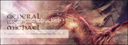

A question for each of you -
Rayn - How did you do the text effect for the Lucario one?
Kal - You got a name/link of the fonts you used in the Final Fantasy pair? I like those and wish to steal

Oh, one more idea. Anyone tried adding a soft brush/radial white->transparent gradient in one corner for lighting? (Place it in the corner where the lighting would be, for how the light is on the render - worst explanation ever, but if the light shines from the left, stick it on the left).
To get something like this:
Okay, it's the same for all of them with that text...Rayn - How did you do the text effect for the Lucario one?
-Hide it with the eye thing
-Alpha to selection
-Go to the next layer under it
-Color with sparks brush where the selection thing is going around, if you want it brighter, just click a lot on the letter you want
And hopefully, it'll look something like that.
[quote author=LoN_Colossus link=topic=5266.msg85282#msg85282 date=1230923296]
Oh, one more idea. Anyone tried adding a soft brush/radial white->transparent gradient in one corner for lighting? (Place it in the corner where the lighting would be, for how the light is on the render - worst explanation ever, but if the light shines from the left, stick it on the left).
[/quote]
I'm going to try the lighting thing next time...
Okay I didn't do the lighting thing, but I did a Link one. Yay.

I know, I'm hating the unminimizable toolbox tooAnd I can't minimize some of the things that I enjoy minimizing. Frelling Toolbox staying on top of my picture ALL THE TIME.
The new GIMP looks better, but it doesn't function as practically as it should.
 You can kill it off by right clicking on either its icon at the bottom bar or its bar at the top of the window, and click minimize. But that's it
As for the signature, nice one. One question, what did you use to erase with?
Well, I've been juggling with WMM for the past... age and a half. So I've decided I'm just going to save the video as one, and host it somewhere for people to download. Not Youtube, though.Trying out a video tutorial for this signature:

When I get it up, I don't knowI have the video all done though, just gotta find out how to work Youtube

So I'm just uploading it now

Edit: It's done uploading, here's the link for the filefront page: Filefront page
And the link to directly download it: Direct download
I tried to make a sig, but it failed every time. Sorry about the trouble, but I really need help please.
That sentence is vaguer than saying "Find it on the internet", and considering said internet has millions of sites and grows at some ridiculous rate, that's... quite vague. Like, really vague. Need some help here.I tried to make a sig, but it failed every time. Sorry about the trouble, but I really need help please.
Nice outcomes there Aura!

Anyone tried the video yet?
Just found something that might be of use to us lot.
It's a program called "Chaoscape" that you can use to create images similar to C4Ds.
It's free, and fairly easy to use in my opinion, so probably insanely difficult for some of you guys
Here's the site where you can get it from, http://www.chaoscope.org/
I'm not going to go too in depth for how to download it, because it should be straight forward. Click 'Download'
As for the actual program, still working out bits and pieces.
I had to change my language setting from French to English, so if you need to do that then click the button on the top toolbar on the far left, and then options and find how to change it to English from there.
Next, you'll want to go File->New. Pick any you like, I still have no idea how they'll come out like
Then, click Attractor, then search. Once it's done, play around with the Attractor and View toolboxes, and once you're ready to save, click Attractor->Render.
Then File->Save Image As.
So far, after a little bit of GIMP too, I've managed to make this:
[attachment deleted by admin]
It's a program called "Chaoscape" that you can use to create images similar to C4Ds.
It's free, and fairly easy to use in my opinion, so probably insanely difficult for some of you guys

Here's the site where you can get it from, http://www.chaoscope.org/
I'm not going to go too in depth for how to download it, because it should be straight forward. Click 'Download'

As for the actual program, still working out bits and pieces.
I had to change my language setting from French to English, so if you need to do that then click the button on the top toolbar on the far left, and then options and find how to change it to English from there.
Next, you'll want to go File->New. Pick any you like, I still have no idea how they'll come out like

Then, click Attractor, then search. Once it's done, play around with the Attractor and View toolboxes, and once you're ready to save, click Attractor->Render.
Then File->Save Image As.
So far, after a little bit of GIMP too, I've managed to make this:
[attachment deleted by admin]
Update that I should have said ages ago, Katie said she's not doing this any more because she hasn't found time, so I'm replacing her place with Jirachi/Rain/Shado  Enjoy
Enjoy 
Random gift art for the nice people! (Aka those committed here)
For Rayn -

For Rain -

For Dani - Don't know if you like Flareon, but you'll like this one If you don't like it, I'll have it, 'cause its kickass in a can

There are some more on the list too! I just wanna go do other stuff now
 Enjoy
Enjoy 
Random gift art for the nice people!
 (Aka those committed here)
For Rayn -
Code:
[IMG]http://i180.photobucket.com/albums/x290/LoN_Colossus/Avatars%20and%20Signatures/giftartrayn.png[/IMG]For Rain -
Code:
[IMG]http://i180.photobucket.com/albums/x290/LoN_Colossus/Avatars%20and%20Signatures/giftartraintigurrrs.png[/IMG]For Dani - Don't know if you like Flareon, but you'll like this one
 If you don't like it, I'll have it, 'cause its kickass in a can
Code:
[IMG]http://i180.photobucket.com/albums/x290/LoN_Colossus/Avatars%20and%20Signatures/giftartflareonfordani.png[/IMG]There are some more on the list too! I just wanna go do other stuff now

heh I've been fiddling with Chaoscope, and I found it pretty easy to use =D
I've yet to find a few hours of free time to try and make a sig XP
I've yet to find a few hours of free time to try and make a sig XP


